As the Commodore 64 ages, it seems to be taking on a second life. Case in point: Vision BASIC is a customized, special version of the BASIC programming language with a ton of features to enable Commodore 64 programs to be written more easily and with all sorts of optimizations. We’ve tested out both the original 1.0 version of Vision BASIC, and now with version 1.1 being released there are a whole host of tweaks and updates to make the experience even better!
One of the only limitation of Vision BASIC is the requirement for expanded RAM. It will not run on an unexpanded C64 — but the compiled programs will, so you can easily distribute software made using Vision on any C64. A feature introduced in version 1.1 is support for GeoRAM, a different RAM expansion cartridge, and modern versions of GeoRAM like the NeoRAM which has battery-backed RAM. This allows almost instantaneous booting into the Vision BASIC development environment.
Some of the standout features include a doubling of compilation speed, which is huge for large programs that take up many REU segments in source form. There are new commands, including ALLMOBS for setting up all sprites with a single command; POLL to set up which joystick port is in use; CATCH to wait for a particular scanline; and plenty more! Many existing commands have been improved as well. As in the original version of Vision BASIC, you can freely mix 6510 assembly and BASIC wherever you want. You can use the built-in commands for bitmaps, including panning, collision detection, etc., or you can handle it in assembly if you want! And of course, it comes with a full manual — yes, a real, printed book!
One of the nice features of Vision BASIC is the customization of the development environment. On the first run, after agreeing to the software terms, you enter your name and it gets saved to the Vision BASIC disk. Then, every time you start the software up, it greets you by name! You can also set up a custom colour scheme, which also gets saved. It’s a very pleasant environment to work in. Depending on how much additional RAM you have, you can hold multiple program segments in different RAM banks. For example, you could have all your source code in one bank, all your bitmaps and sprites in another, and your SID tunes in yet another. The compiler handles all this for you when you go to compile the program to disk, so it’s easy to keep large programs organized and easy to follow.
If you’ve always wanted to write a game or application for the C64 but just didn’t know how to get started, or you felt daunted at having to learn assembly to do sprites and music, Vision BASIC is a great option. You will be blown away at the number of commands available, and as you become more experienced you can start to sprinkle in assembly to optimize certain parts of your code if desired.
If you cut your teeth on Z-80 assembly and have dabbled in other assembly languages, you might not find much mystery in creating programs using the next best thing to machine code. However, if you have only used high level languages, assembly can be somewhat daunting. [Shikaan] has an introductory article aimed to get you started at the “hello world” level of x86-64 assembly language. The second part is already up, too, and covers control structures.
You can argue that you may not need to know assembly language these days, and we’ll admit it’s certainly not as important as it used to be. However, there are unusual cases where you really need either the performance or the small footprint, which is only possible in assembly language. What’s more, it is super useful to be able to read assembly from your high-level tools when something goes wrong.
Of course, one of the problems is that each assembly language is different. For example, knowing that the x86 assembly doesn’t completely transfer to ARM instructions. However, in most cases, the general concepts apply, and it is usually fairly easy to learn your second, third, or fourth instruction set.
While version control used to be reserved for big corporate projects, it is very mainstream these days. You can attribute much of that to Git, the software that has nearly displaced other version control. Git works well, it is versatile, and it scales well. It is easy to use as an individual developer or as part of a worldwide team. But Git is also one of those things that people don’t always study, they just sort of “pick it up” as they go. That motivated [Glasskube] to create “The Guide to Git I Never Had.”
If you are ready to click away because you are not a software person, hang on. Git is actually useful for many different kinds of data, and there are a number of hardware projects that use Git in some form. That’s especially true if the project has some code associated with it, but there are projects that consist of PCBs, reverse engineering documentation, or schematics.
Simplistically, Git tracks a bunch of files and lets you rewind in time to answer the question: what did this look like a month ago? Or a year ago? However, the real power lies in producing and merging branches.
For example, you might be working on a product and decided to add feature “A.” Meanwhile, your partner decides to work on feature “B.” No problem. You can each work in your own separate branch and get everything working. You don’t even have to be connected to a server until the very end.
When either of you are ready, you can merge your branch with the main branch. Often, this can be done automatically, but Git knows when it is in over its head and will ask for help. When you are both done merging, both of your changes are “live.” If you do it right, Git can also help answer the question: why did we make that change two years ago? It is surprising how often that’s important.
Once the nerve center of Windows operating systems, the Control Panel and its multitude of applets has its roots in the earliest versions of Windows. From here users could use these configuration applets to control and adjust just about anything in a friendly graphical environment. Despite the lack of any significant criticism from users and with many generations having grown up with its familiar dialogs, it has over the past years been gradually phased out by the monolithic Universal Windows Platform (UWP) based Settings app.
Whereas the Windows control panel features an overview of the various applets – each of which uses Win32 GUI elements like tabs to organize settings – the Settings app is more Web-like, with lots of touch-friendly whitespace, a single navigable menu, kilometers of settings to scroll through and absolutely no way to keep more than one view open at the same time.
Unsurprisingly, this change has not been met with a lot of enthusiasm by the average Windows user, and with Microsoft now officially recommending users migrate over to the Settings app, it seems that before long we may have to say farewell to what used to be an intrinsic part of the Windows operating system since its first iterations. Yet bizarrely, much of the Control Panel functionality doesn’t exist yet in the Settings app, and it remain an open question how much of it can be translated into the Settings app user experience (UX) paradigm at all.
Considering how unusual this kind of control panel used to be beyond quaint touch-centric platforms like Android and iOS, what is Microsoft’s goal here? Have discovered a UX secret that has eluded every other OS developer?
A Simple Concept
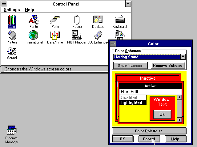
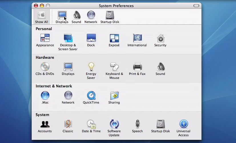
The Windows 3.1 Control Panel (1992). (Source: ToastyTech.com)
Settings which a user may want to tweak on their computer system range from hardware devices and networks to the display resolution and wallpaper, so it makes sense to put all of these configuration options within an easy to reach and use location. Generally this has meant something akin to a folder containing various clickable icons and accompanying text which together make clear what settings can be configured by opening it. In addition, the same setting dialogs can be accessed using context-sensitive menus, such as when right-clicking on the desktop.
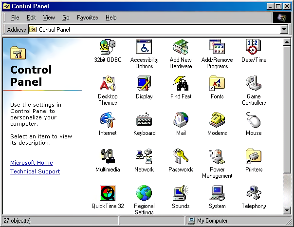
The Windows 98 Control Panel. (Source: ToastyTech.com)
It’s little wonder that for the longest time operating systems have settled for this approach, as it is intuitive, and individual items can have stylized icons that make it even more obvious what settings can be configured by clicking on it, such a keyboard, a mouse, a display, etc. As graphical fidelity increased, so did the styling of these icons, with MacOS, Windows, BeOS and the various desktop environments for OSs like the Linuxes and BSDs all developing their own highly skeuomorphic styles to make their UIs more intuitive and also more pleasant to look at. A good overview of the Windows Control Panel evolution can be found over at the Version Museum website.
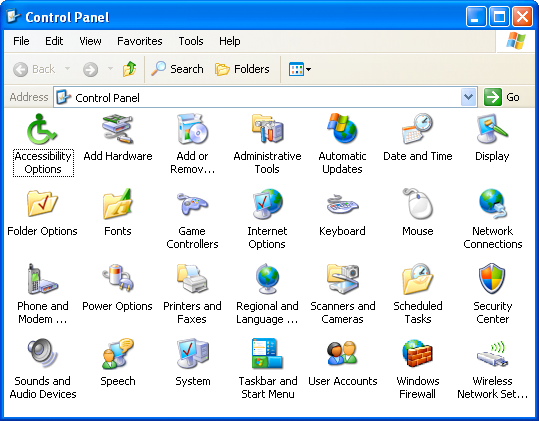
The Windows XP Control Panel in ‘Classic’ view. (2001) (Source: suffieldacademy.org)
Coming from the still somewhat subdued style of Windows XP after years of Windows 9x and Windows NT/2000, Windows Vista and Windows 7 cranked this style up to eleven with the Windows Aero design language. This meant glass, color, translucency, depth and high-fidelity icons that made the function of the Control Panel’s individual entries more obvious than ever, creating a masterpiece that would be very hard to beat. The user was also given two different ways to view the Control Panel: the simplified category-based view, or the ‘classic’ view with all icons (and folders for e.g. Administrative Tools) visible in one view.
Windows 7 Control Panel (2009) in category view. (Source: techrepublic.com)
Meanwhile Apple did much the same thing, leaning heavily into their unique design language not only for its desktop, but ultimately also for its mobile offerings. Everything was pseudo-3D, with vivid colors adorning detailed renderings of various physical items and so on, creating a true feast for the eyes when taking in these lush UIs, with efficient access to settings via clearly marked tabs and similar UI elements.
The Mac OS X Panther System Preferences in 2003. (Source: Gadget Unity TV)
This way of organizing system settings was effectively replicated across a multitude of environments, with operating systems like Haiku (based on BeOS) and ReactOS (re-implementing Windows) retaining those classical elements of the original. A truly cross-platform, mostly intuitive experience was created, and Bliss truly came to the computing world.
Naturally, something so good had no right to keep existing, ergo it had to go.
The World Is Flat
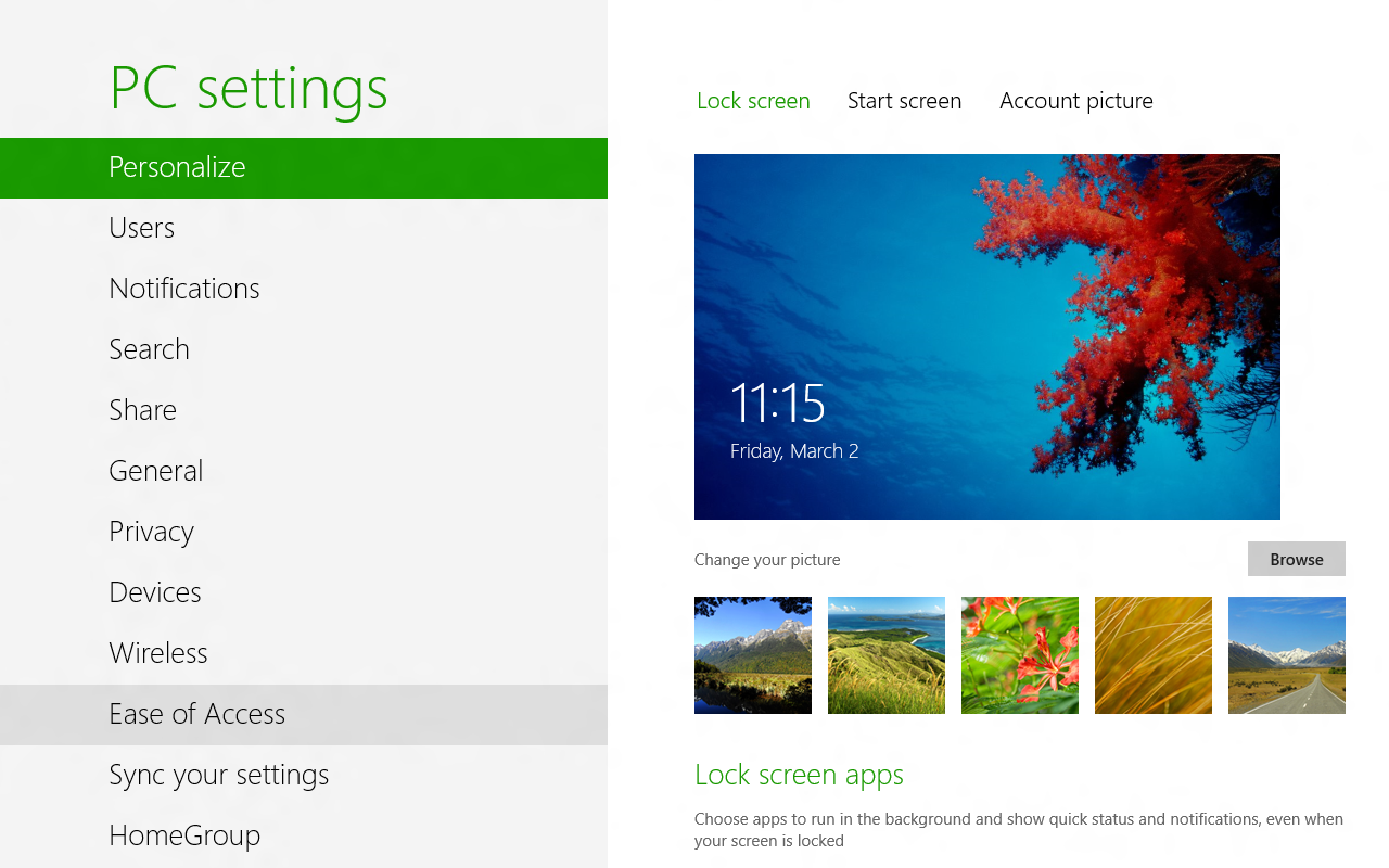
The first to make the big change was Microsoft, with the release of Windows 8 and its Metro design language. This new visual style relied on simple shapes, with little to no adornments or distractions (i.e. more than a single color). Initially Microsoft also reckoned that Windows users wanted every window to be full-screen, and that hot edges and sides rather than a task bar and start menu was the way to go, as every single system running Windows 8 would obviously have a touch screen. Fortunately they did backtrack on this, but their attempt to redesign the Control Panel into something more Metro-like with the Settings app did persist, like an odd growth somewhere on a body part.
Windows 8’s PC Settings app (2012). (Source: softpedia.com)
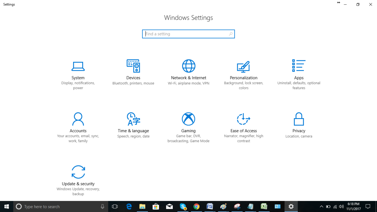
Although the Control Panel remained in Windows 8 as well, the course had been set. Over time this small lump developed into the Settings app in Windows 10, by which time Metro had been renamed into the Microsoft Design Language (MDL), which got a recent tweak in what is now called the Fluent Design Language (FDL) for Windows 11.
Central to this is the removal of almost all colors, the use of text labels over icons where possible (though simple monochrome icons are okay) and only rectangles with no decorations. This also meant no folder-centric model for settings but rather all the items put into a text-based menu on the left-hand side and an endless scroll-of-doom on the right side containing sparsely distributed settings.
This led to the absolutely beautifully dystopian Settings app as it exists in Windows 10:
The Settings app in Windows 10 back in ~2015. Hope you don’t like colors.
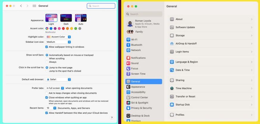
All of this came as skeuomorphic designs were suddenly considered ‘passé’, and the new hotness was so-called Flat Design. Google’s Material Design as developed in 2014 is another good example of this, with the characteristic ‘flat UI elements adrift in a void’ aesthetic that has now been adopted by Microsoft, and a few years ago by Apple as well starting in 2022 with MacOS Ventura’s System Settings (replacing System Preferences).
Monterey’s General system preferences (left) are different from Ventura’s General system settings (right). (Credit: MacWorld)
Rather than a tabbed interface to provide a clear overview, everything is now a blind hierarchy of menu items to scroll through and activate to access sub-, sub-sub-, and sub-sub-sub- items, and inevitably realize a few times that you’re in the wrong section. But rather than being able to click that other, correct tab, you now get to navigate back multiple views, one click at a time.
It isn’t just Windows and Apple either, but many of the big desktop environments like Gnome have also moved to this Flat Design Language. While various reasons have been provided for these changes, it’s undeniable that FDL makes a UI less intuitive (because there’s less useful visual information) and makes for a worse user experience (UX) with worse ergonomics as a result (because of the extra scrolling and clicking). This is especially obvious in the ‘independent applets’ versus ‘monolithic settings app’ comparison.
One-Track Mind
Imagine that you’re trying out a couple new wallpapers in Windows while keeping an eye on Windows Update’s latest shenanigans. You then need to quickly adjust the default audio device or another small adjustment unrelated to any of these other tasks. If you are using Windows 7 or earlier with the Control Panel applets, this is normal behavior and exceedingly common especially during hardware troubleshooting sessions.
If you’re using the Settings app, this is impossible, as only view can be active at a given time. You think you’re smart and right-click the desktop for ‘Personalize desktop’ so that the other Settings view stays intact? This is not how it works, as the Settings app is monolithic and now shifts to the newly selected view. Currently this is not too noticeable yet as many applets still exist in Windows 10 and 11, but as more and more of these are assimilated into the Settings app, such events will become more and more common.
It would seem that after decades of UI and UX evolution, we have now reached a definite point where UX is only getting worse, arguably around the release of Windows 8. With color banished, anything even remotely pseudo-3D frowned upon and UIs based around touch interfaces, there will soon be no difference between using a desktop PC, tablet or smartphone. Just in the worst way possible, as nobody has ever written about the amazing ergonomics and efficient UX of the latter two devices.
Perhaps our only hope may lie with the OSes and desktop environments that keep things real and stick to decades of proven UX design rather than give into Fad Driven Development.
Rest in peace, Windows Control Panel. We hope to see you again soon in ReactOS.
Docker and other containerization applications have changed a lot about the way that developers create new software as well as how they maintain virtual machines. Not only does containerization reduce the system resources needed for something that might otherwise be done in a virtual machine, but it standardizes the development environment for software and dramatically reduces the complexity of deploying on different computers. There are some other tricks up the sleeves as well, and this project called PI-CI uses Docker to containerize an entire Raspberry Pi.
The Pi container emulates an entire Raspberry Pi from the ground up, allowing anyone that wants to deploy software on one to test it out without needing to do so on actual hardware. All of the configuration can be done from inside the container. When all the setup is completed and the desired software installed in the container, the container can be converted to an .img file that can be put on a microSD card and installed on real hardware, with support for the Pi models 3, 4, and 5. There’s also support for using Ansible, a Docker automation system that makes administering a cluster or array of computers easier.
Docker can be an incredibly powerful tool for developing and deploying software, and tools like this can make the process as straightforward as possible. It does have a bit of a learning curve, though, since sharing operating system tools instead of virtualizing hardware can take a bit of time to wrap one’s mind around. If you’re new to the game take a look at this guide to setting up your first Docker container.
Some old computer languages are destined to never die. They do, however, evolve. For example, Fortran, among the oldest of computer languages, still has adherents, not to mention a ton of legacy code to maintain. But it doesn’t force you to pretend you are using punched cards anymore. In the 1970s, if you wanted to crunch numbers, Fortran was a good choice. But there was another very peculiar language: APL. Turns out, APL is alive and well and has a thriving community that still uses it.
APL has a lot going for it if you are crunching serious numbers. The main data type is a multidimensional array. In fact, you could argue that a lot of “modern” ideas like a REPL, list types, and even functional programming entered the mainstream through APL. But it did have one strange thing that made it difficult to use and learn.
[Kenneth E. Iverson] was at Harvard in 1957 and started working out a mathematical notation for dealing with arrays. By 1960, he’d moved to IBM and a few years later wrote a book entitled “A Programming Language.” That’s where the name comes from — it is actually an acronym for the book’s title. Being a mathematician, [Iverson] used symbols instead of words. For example, to create an array with the numbers 1 to 5 in it and then print it, you’d write:
⎕←⍳5
Since modern APL has a REPL (read-eval-print loop), you could remove the box and the arrow today.
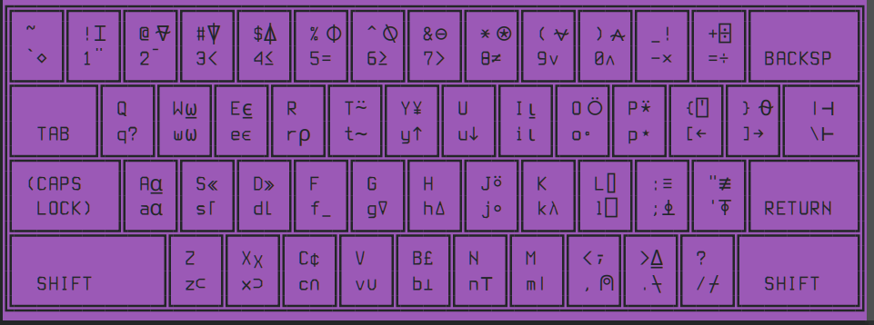
What Key Was That?
Wait. Where are all those keys on your keyboard? Ah, you’ve discovered the one strange thing. In 1963, CRTs were not very common. While punched cards were king, IBM also had a number of Selectric terminals. These were essentially computer-controlled typewriters that had type balls instead of bars that were easy to replace.
With the right type ball, you could have 26 upper-case letters, 10 digits, a few control characters, and then a large number of “weird” characters. But it is actually worse than that. The available symbols were still not numerous enough for APL’s appetite. So some symbols required you to type part of the symbol, press backspace, then type more of the symbols, sometimes repeating the process several times. On a printing terminal, that works fine. For the CRTs that would soon take over, this was tough to do.
For example, a comment (like a REM in Basic or a // in C++) is represented by a thumbnail (⍝). In other words, this would be an APL comment:
⍝ This is a comment
To make that character, you’d type the “arch” part, backspace, then the “dot” part. Not very speedy. Not very practical on old CRT terminals, either.
The characters aren’t the only strange thing. For example, APL evaluates math right to left.
That is, 3×2+5 is 21 because the 2+5 happens first. You just have to get used to that.
A Solution
Of course, modern screens can handle this easily and most people use an APL keyboard mapping that looks like your normal keyboard, but inserts special symbols when you use the right Alt key (with or without the shift modifier). This allows the keyboard to directly enter every possible symbol.
Of course, your keyboard’s keycaps probably don’t have those symbols etched in, so you’ll probably want a cheat sheet. You can buy APL keycaps or even entire keyboards if you really get into it.
What’s GNU With You?
While there have been many versions of APL over the years, GNU APL is certainly the easiest to setup, at least for Linux. According to the website, the project has more than 100,000 lines of C++ code! It also has many modern things like XML parsers.
A US APL keyboard layout
The real trick is making your keyboard work with the stranger characters. If you are just playing around, you can consider doing nothing. You can see the keyboard layout by issuing the ]KEYBD command at the APL prompt. That will give you something like the adjacent keyboard layout image.
From that image, you can copy and paste odd characters. That’s a pain, though. I had good luck with this command line:
With this setup, I can use the right alt key to get most APL characters. I never figured out how to get the shifted alternate characters, though. If you want to try harder, or if you use a different environment than I do, you might read the APL Wiki.
An Example
Rather than do a full tutorial, here’s my usual binary search high low game. The computer asks you to think of a number, and then it guesses it. Not the best use of APL’s advanced math capabilities, but it will give you an idea of what it can do.
Here’s a survival guide. The upside-down triangle is the start or end of a function. You already know the thumbnail is a comment. A left-pointing arrow is an assignment statement. A right-pointing arrow is a goto (this was created in the 1960s; modern APL has better control structures, but they can vary between implementations). Square boxes are for I/O, and the diamond separates multiple statements on a single line.
∇ BinarySearchGame
⍝ Initialize variables
lower ← 1
upper ← 1024
turns ← 0
cheating ← 0

⍝ Start the game
'Think of a number between 1 and 1024.' ⋄ ⎕ ← ''

Loop:
turns ← turns + 1
guess ← ⌊(lower + upper) ÷ 2 ⍝ Make a guess using binary search

⍞ ← 'Is your number ', ⍕ guess, '? (h for high, l for low, c for correct): '
response ← ⍞

→ (response = 'c')/Finish ⍝ Jump to Finish if correct
→ (response = 'h')/TooHigh ⍝ Jump to TooHigh if too high
→ (response = 'l')/TooLow ⍝ Jump to TooLow if too low
→ InvalidInput ⍝ Invalid input

TooHigh:
upper ← guess - 1
→ (lower > upper)/CheatingDetected ⍝ Detect cheating
→ Loop

TooLow:
lower ← guess + 1
→ (lower > upper)/CheatingDetected ⍝ Detect cheating
→ Loop

InvalidInput:
⍞ ← 'Invalid input. Please enter "h", "l", or "c".' ⋄ ⎕ ← ''
turns ← turns - 1 ⍝ Invalid input doesn't count as a turn
→ Loop

CheatingDetected:
⍞ ← 'Hmm... Something doesn''t add up. Did you make a mistake?' ⋄ ⎕ ← ''
cheating ← 1
→ Finish

Finish:
→ (cheating = 0)/Continue ⍝ If no cheating, continue
→ EndGame

Continue:
⍞ ← 'Great! The number is ', ⍕ guess, '. It took ', ⍕ turns, ' turns to guess it.' ⋄ ⎕ ← ''

EndGame:
⍞ ← 'Would you like to play again? (y/n): '
restart ← ⍞
→ (restart = 'y')/Restart ⍝ Restart the game if 'y'
→ Exit ⍝ Exit the game otherwise

Restart:
BinarySearchGame ⍝ Restart the game

Exit:
⍞ ← 'Thank you for playing!' ⋄ ⎕ ← '' ⍝ Exit message
∇
What’s Next?
If you want to get an idea of how APL’s special handling of data make some programs easier, the APL Wiki has a good page for that. If you don’t want to install anything, you can run APL in your browser (although it is the Dyalog version, a very common choice for modern APL).
If you don’t want to read the documentation, check out [phoebe’s] video below. We always wanted the IBM computer that had the big switch to go from Basic to APL.
[saurabhchalke] recently released whisper.unity, a Unity package that implements whisper locally on the Meta Quest 3 VR headset, bringing nearly real-time transcription of natural speech to the device in an easy-to-use way.
Whisper is a robust and free open source neural network capable of quickly recognizing and transcribing multilingual natural speech with nearly-human level accuracy, and this package implements it entirely on-device, meaning it runs locally and doesn’t interact with any remote service.
Meta Quest 3
It used to be that voice input for projects was a tricky business with iffy results and a strong reliance on speaker training and wake-words, but that’s no longer the case. Reliable and nearly real-time speech recognition is something that’s easily within the average hacker’s reach nowadays.
We covered Whisper getting a plain C/C++ implementation which opened the door to running on a variety of platforms and devices. [Macoron] turned whisper.cpp into a Unity binding which served as inspiration for this project, in which [saurabhchalke] turned it into a Quest 3 package. So if you are doing any VR projects in Unity and want reliable speech input with a side order of easy translation, it’s never been simpler.