Leaded fuel is considered one of the greatest environmental failures in modern human history. Adding tetraethyl lead to gasoline reduced knock in internal combustion engines, which was widely considered a good thing. It was only later that the deleterious health effects came into view, by which point there was a massive fleet of lead-dependent automobiles and an industry reluctant to change. Still, the tide turned, and over the last 50 years, unleaded fuel has become the norm for automotive use across the world.
And yet, there remains a hold out—a world where engines still burn leaded fuels and spray their noxious fumes across the countryside. In the aviation sector, leaded fuel remains a normal part of everyday operations to this day amidst concerted efforts to eliminate it for good.
“Low” Lead
Leaded gasoline is a thing of the past in the automotive world, but remains a standard fuel for piston-engined aircraft to this day. Credit: Ahunt, public domain
Piston-engined aircraft do not typically run on the same fuels as automobiles. Instead, they burn aviation gasoline, or Avgas, which comes in specific grades and is designed to suit the needs of aircraft engines, by being less volatile and more suitable for high-performance applications.
The most common grade is 100LL (low lead), which is used widely across North America and Western Europe. Despite the moniker, the fuel contains 0.56 grams/litre of tetraethyl lead (TEL), somewhat higher than many leaded automotive fuels used in the 20th century. As with ground-based applications, the additive is used to provide a measure of valvetrain protection by offering cooling and preventing microwelds between contacting parts. It also provides an easy increase to the fuel’s effective octane rating. The latter is particularly useful in aviation contexts where engines run under high load conditions for extended periods of time, and where performance is critical.
Other grades of aviation fuel are also in regular use in various parts of the world, many of which still contain significant levels of TEL as well. It’s worth noting that turbine-based aviation engines are not relevant to this issue, as they burn kerosene-based fuels which are lead-free.
100LL fuel is dyed blue for easy identification on the flight line. It’s one of the most widely used fuels in piston-engined aircraft. Credit: Ahunt, public domain
The basic makeup of aviation gasoline was largely decided by the mid-1940s, a period in which fuels were heavily developed to suit the needs of then-cutting-edge piston military aircraft. At the time, knock resistance was key to enabling supercharged aircraft engines to achieve higher power levels, a point of key military interest during World War II. Tetraethyl lead was an easy way to achieve this, and this requirement also led to development of technologies like water-methanol injection.
Unfortunately, burning leaded fuel effectively sprayed significant amounts of lead into the environment. This lead to elevated blood lead levels in the population, causing premature deaths, neurological damage, and negatively impacting development in children. This is perhaps somewhat galling given that the inventor of TEL, Thomas Midgley Jr., himself suffered significant health effects from the compound. Many workers would also die during early efforts to produce industrial amounts of TEL in the 1920s. It’s one of many examples from the 20th century of industrial will prevailing in spite of obvious severe health risks from a dangerous but otherwise useful chemical.
Despite early knowledge of the dangers, it took some time for the negative impacts of TEL to become readily apparent on a wide scale. Japan lead the charge with a leaded fuel ban for automotive use in 1986, with other developed countries following suit in years to come. It would take decades for the last domino to fall, with Algeria finally outlawing the fuel in 2021.
As per the MSDS, 100LL fuel is not good for humans or the environment. Credit: Shell MSDS
However, the aviation world has not been so quick to abandon lead. Much of the reasoning behind this comes down to practicality. Aviation piston engines simply require high octane fuel and TEL has proven one of the easiest ways to achieve a high rating. 100LL, for example, has a MON rating of 100, which is quite high compared to even premium gasoline used in automotive applications.
Engines designed to run on TEL often rely on the additive to prevent excessive valve wear, too, so running these engines on non-leaded fuels can significantly increase wear. This would be an expensive inconvenience in an automotive application, but when the engine is what’s keeping you in the sky, it’s less desirable to risk a failure by running a cleaner fuel.
In 2019, the FAA estimated that there were 167,000 aircraft in the United States that relied on 100LL avgas, and 230,000 worldwide. The agency had asked in 2014 for industry proposals to make a transition towards unleaded fuels for internal combustion applications.
However, testing revealed issues with proposed alternatives, and was eventually halted in 2018. The FAA has since provided a draft plan in 2026 that lays out the timeline to phase out leaded aviation fuel for good. The intent is to end the use of 100LL fuel in the United States by 2030, excepting Alaska, which will phase out the fuel in 2032. The intention is to take an incremental approach, giving the industry time to develop and certify unleaded replacement fuels—with G100UL, 100R, and UL100E all candidates for FAA approval.
Real-world use of these fuels will then be monitored for compatibility and safety and to determine if further support or changes are required to manage the transition away from 100LL. For now, the timelines are still subject to change, particularly in Alaska, where piston-engined aircraft are particularly vital for transport and logistics are harder to manage. However, it marks a very real commitment to ending the use of leaded aviation for good, at least in the United States. If the FAA does manage to pull off this feat, it should be readily achievable for other countries around the world.
Ultimately, leaded aviation fuels aren’t causing the same level of damage to humanity and the environment as leaded automotive fuels, purely by virtue of their more limited use. Still, it’s never ideal to be spraying lead into the environment, and the health risks are always going to be elevated for those near general aviation airports or under flightpaths of piston-engined aircraft. It’s positive that there is a real commitment to end the use of these fuels, but much work remains to be done to end the reign of tetraethyl lead for good.
The telephone was an invention that revolutionized human communication. No more did you have to physically courier a letter from one place to another, or send a telegram, or have a runner carry the message for you. Instead, you could have a direct conversation with another person a great distance away. All well and good if you can speak and hear, of course, but rather useless if you happen to be deaf.
Those hard of hearing were not left entirely out of the communication revolution, however. Well before IP switched networks and the Internet became a thing, there was already a way for the deaf to communicate over the plain old telephone network—thanks to the teletypewriter!
Over The Wires
The teletypewriter (TTY) has been around for a long time. The first device came into being in 1964, developed by James C. Marsters and Robert Weitbrecht, both deaf. Their idea was to create a method for deaf individuals to communicate over the phone network in a textual manner. To this end, the group sourced teleprinters formerly used by the US Department of Defense, and hooked them up with acoustic couplers that would allow them to mate with the then-ubiquitous AT&T Model 500 telephone. Thus, the TTY was born. A user could dial another TTY machine, and key in a message, which would print out at the other end. The receiving user could then respond in turn in the same manner.
A Miniprint 425 TDD device. Note the acoustic coupler on top, the VFD for displaying messages, the printer, and the SK and GA keys which automatically key in these regularly-used abbreviations. Credit: public domain
The early machine used simple frequency-shift keying to encode the characters of the alphabet and some basic control codes, allowing text messages to be sent back and forth via a regular analog telephone call. In the US, where the devices eventually became known as telecommunications device for the deaf (TDDs), the devices used an improved development of Baudot code (the USA-TTY variant of ITA-2) to send signals over the phone lines.
This involved representing characters with five bits, which was enough to cover the 26 characters of the English alphabet, plus 0-9 and a few control codes. Transmission rates were slow—typically just 45.5 to 50 baud. With a 5-bit code, this limited transmission to approximately 10 characters per second.
The sign on the left indicates a payphone with a TTY device attached. These were rare installs back in the landline era, and vanishingly few remain today. Credit: CC BY-SA 4.0
TTYs quickly caught on as a useful device for the deaf and hard of hearing, and developed its own norms similar to other textual telecommunications methods that came before. Users would key “GA” for “go ahead,” to indicate the other party could “speak” on the half-duplex link, as two users typing at the same time would lead to garbled messages. “SK” stood for “stop keying” to indicate the ending of a call. Abbreviations were common to save effort, such as “CU” (see you) and “TMW” (tomorrow).
Relay Service
At its heart, the TTY was a very useful device for allowing its users to communicate via textual means to others with compatible hardware. However, alone, a TTY could not allow a deaf user to communicate effectively with regular telephone users. To enable greater accessibility, many organizations developed telecommunications relay services.
TTY machines led to the establishment of relay services that allowed deaf users to make regular phone calls with assistance from an operator. Credit: screenshot, Australian National Relay Service
These first existed as a number that deaf TTY users could call in order to connect to a human operator with their own TTY machine. This operator would place calls on behalf of the deaf individual, speaking on their behalf to other parties based on the deaf user’s inputs to their TTY device. In turn, the operator would key out the responses from the called party so the deaf individual could read back the conversation.
The first relay service was established by Converse Communications in Connecticut in 1974. The concept was quickly picked up by many other telecommunications operators around the world to provide an accessibility aid to those who needed it. These days, relay services still exist, though a great many relay services now operate over IP-based systems rather than via phone lines and TTY devices.
Hanging On
TTY still exists to some degree out in the world today. There are still subscribers with analog phone lines, and the basic TTY technology still fundamentally works over these links. However, the rise of SMS text messaging and widespread Internet connectivity have somewhat negated a lot of use cases for TTY technology these days. There have also been cases where digital upgrades to the phone network have made TTY operation more difficult, though some efforts have been made to ensure compatibility in some networks, particularly for emergency uses.
Ultimately, TTY was a technology that brought telecommunications access to a greater number of people than ever before. Like the landline phone and the fax machine, it’s no longer such a feature of modern life. However, it was an important link to the world for many in the deaf and hard of hearing community, and was greatly valued for the connection and accessibility it provided.
Considering how integral it is to our modern way of life, you could be excused for thinking that the Global Positioning System (GPS) is a product of the smartphone era. But the first satellites actually came online back in 1978, although the system didn’t reach full operational status until April of 1995. While none of the active GPS satellites currently in orbit are quite that old, several of them were launched in the early 2000s — and despite a few tweaks and upgrades, their core technology isn’t far removed from their 1990s era predecessors.
But in the coming years, that’s finally going to change. Just last week, the tenth GPS III satellite was placed in orbit by a SpaceX Falcon 9 rocket. Once it’s properly configured and operational, it will join its peers to form the first complete “block” of third-generation GPS satellites. Over the next decade, as many as 22 revised GPS III satellites are slated to take their position over the Earth, eventually replacing all of the aging satellites that billions of people currently rely on.
To understand the future of GPS, it’s helpful to look at its past. Developed by the United States military during the Cold War, what we now call GPS was originally known as Navigation System with Timing and Ranging (NAVSTAR). While the intent was always to allow civilian use of NAVSTAR, the equipment necessary to receive the signal and get a position was cumbersome and expensive.
There was little public interest in the system until Korean Air Lines Flight 007 was shot down in 1983 after mistakenly entering the Soviet Union’s airspace. With the lifesaving potential of NAVSTAR clearly evident, pressure started building on the industry to develop smaller and more affordable receivers — GPS as we know it was born.
NAVSTAR Satellite
That the development of such devices was possible in the first place was thanks to the design of NAVSTAR. Each satellite in the constellation broadcasts a timed radio signal which receivers on the ground use to compute their distance from the source. By comparing the signals from multiple satellites, a receiver can plot its position without the need for any local infrastructure. Since the process is entirely one-way, the can could be freely used by any device can can receive and decode the signal.
But while this operational simplicity was key to the proliferation of cheap ubiquitous GPS receivers, there’s certainly room for improvement given more modern technology. When NAVSTAR was designed knowing where a receiver was located within a radius of a few meters was more than sufficient, but today there’s a demand for greater accuracy by both civilian and military users. Given the essentially incalculable value of GPS to the global economy, improving reliability is also paramount. Not only has GPS jamming and spoofing become trivial, but even without the involvement of bad actors, legacy GPS struggles in urban environments.
Plans to deliver improved performance in these areas have been in the works for decades, with the United States Congress first authorizing the work on what would become GPS III all the way back in 2000. But when working on a system so critical that even a few minutes of downtime could put the entire planet into turmoil, such changes don’t come easy.
Can You Hear Me Now?
While modern GPS receivers are more sensitive than those in the past, there’s simply no getting over the fact that signals coming from a satellite more than 20,000 kilometers away will be by their very nature weak. So not only is it relatively easy for adverse environmental conditions to block or hinder the signal, but it doesn’t take much to override the signal with a local transmitter if somebody is looking to cause trouble.
As such, one of the key goals of the GPS III program was to deliver higher transmission power. This will lead to better reception for all GPS users across the board, but the new satellites also offer some special modes that offer even greater performance.
In addition to the backwards compatible signals transmitted by GPS III satellites, there’s also a new “Safety of Life” signal. This signal is transmitted at a different frequency, 1176 MHz, and at a higher power, so compatible receivers should hear it come in at approximately 3 dB above the “classic” signal. It’s intended primarily for high-performance applications such as aviation, but as compatible receivers get cheaper, it will start to show up in more devices.
These improvements should be enough for civilian use, but the military has higher expectations and operates under more challenging conditions. In such cases, future GPS III satellites will come equipped with a high-gain directional antenna that can project a “spot beam” signal anywhere on Earth. For receivers located within the beam, which is estimated to be a few hundred kilometers in diameter, the received signal from the satellite will be boosted by up to 20 dB. In contested environments, this should make it far more resistant to jamming and spoofing.
Speaking New Languages
The new signals being transmitted by GPS III satellites won’t just be louder than their predecessors, they’ll gain some new features as well.
For one thing, GPS III satellites will transmit a standardized signal known as L1C which offers interoperability with other global navigation systems such as Europe’s Galileo, China’s BeiDou, the Indian Regional Navigation Satellite System (IRNSS), and Japan’s Quasi-Zenith Satellite System. In theory a compatible receiver will be able to process signals from any combination of these systems simultaneously, improving overall performance.
The new satellites will also support the L2C signal. While this signal was technically available on earlier generation satellites, it’s still not considered fully operational and its adoption is expected to accelerate as more GPS III satellites come online. Compared with the legacy GPS protocol, L2C offers improved faster acquisition of signal, better error correction, and a more capable packet format.
To make GPS III transmissions even more secure, the military is also getting their own signal known as M-code. As you might expect, little is publicly known about M-code currently, but it’s a safe bet that it utilizes encryption and other features to make it more difficult for adversaries to create spoofed transmissions. For what it’s worth, a recent press release from the US Space Force claims that the use of M-code makes the next-generation GPS satellites “three-times more accurate and eight times more resistant to jamming than the previous constellation.”
Testing Out New Toys
Although all ten GPS III satellites are now in orbit, that doesn’t mean the constellation is complete. Starting in 2027, a new fleet of revised satellites known as GPS IIIF will start launching. They will take the lessons learned from the initial GPS III deployment to create a smaller, lighter, and more efficient platform that should have a service life of at least 15 years.
Artist impression of a future GPS IIIF satellite.
They’ll also include new in-development equipment that wasn’t quite ready for deployment when the current GPS III satellites were being assembled. This includes optical reflectors that will allow ground stations to more accurately track the position of each satellite, laser data links that will allow high-speed communication between satellites, and an improved atomic clock known as the Digital Rubidium Atomic Frequency Standard (DRAFS).
Of course, the vast majority of the people who use GPS every day will never be aware of all the changes and improvements happening behind the scenes. When they get a new phone with a GPS III-compatible receiver, they may notice that their navigation app locks on a bit faster or that the position shown on the screen is a little closer to where they are actually standing, but only if they are particularly attentive. But that’s entirely by design — the most important aspect of implementing GPS III is making the whole process as invisible as possible.
When it comes to software developers, there are t a few distinct types. For example, the extroverted, chatty type, who is always going out there to share the latest and newest libraries and projects with everyone, and is very much into bouncing ideas off others, regardless of whether they know what you’re talking about. Then there is the introverted loner, who prefers to tackle programming challenges by bouncing things around inside their own minds and going on long walks to mull things over before committing to anything significant.
This leads to interesting scenarios when it comes to management-enforced ‘optimization’ strategies, like Pair Programming. This approach involves two developers sharing the same computer and keyboard, theoretically doubling the effective output by some kind of metric, but realistically often leading to at least one side feeling pretty miserable and disconnected unless you put two of the chatty types together.
As a certified introverted loner developer, the idea of using an LLM chatbot as a coding assistant naturally triggers unpleasant flashbacks to hours of forced awkward pair ‘programming’. However, maybe using an LLM chatbot could be more pleasant because you can skip the whole awkward socializing bit. In order to give it a shake, I put together a little experiment to see whether LLM-based coding assistants is something that I could come to appreciate, unlike pair programming.
Setting Expectations
Any good experimental setup features clear goals and parameters that define what will be tested and what the expectations are. Obviously I come from a somewhat negative angle into this whole experiment, so to make it easy I’ll be picking two fairly straightforward scenarios for the LLM to assist with:
C++ embedded coding for STM32 and CMSIS.
Ada network development.
These are topics that I’m fairly familiar and comfortable with, so that I know what questions I have here, and what I’m roughly expecting as output. I’ll be treating the chatbot for the most part as I would use StackOverflow or nag people on IRC, with my main fear being that it’ll be expecting pleasantries from me instead of brutal and cold professionalism. Ideally it’ll be a step above me hurling profanities at a search engine for clearly willfully misunderstanding what I am looking for.
My expectations are that it’ll have some answers for me for the questions I have about how to do certain aspects of the tasks, and may even produce half-way usable code that I can fairly easily understand and double-check using my usual documentation references.
This just leaves one big question, being which LLM chatbot to pick and how the heck any of it is supposed to work, since I have avoided the things like the proverbial plague.
Meeting the Crew
Although I am aware that everyone who is into using LLM-assisted programming seem to like to promote LLMs like Claude, I’d ideally not be signing up to another service. This pretty much just leaves GitHub Copilot, which I have access to already. I have written about this particular LLM chatbot quite a bit since it was introduced, with my generally negative feelings towards these tools increasingly backed up by research.
Biased I may be, but to be a true scientist you have to be able to set aside your biases for an experiment and accept reality in the face of new evidence. Thus, with all biases and doubts firmly pushed aside in favor of the aforementioned cold professionalism, let’s get down to brass tacks.
Micro Code
My pet project for STM32-related programming has for a while been my Nodate project, involving the use of the CMSIS standard headers and the macros defined therein in order to write things ranging from start-up to running the Dhrystone benchmark and deciphering the various flavors of real-time clocks.
Much of this work entails digging through datasheets, reference manuals and piles of reference code, as well as throwing queries at search engines to see what potentially useful results percolate out of that particular resource. Coming across the trials and tribulations of fellow STM32 developers in forum threads and the like can be both heartening and disheartening, but all of it tends to condense into something that you can use to progress in the project.
Perhaps ironically, the moment that I tried to use the chatbot in the browser I got an error with the GitHub status page indicating that some of their systems are down, including those for Copilot.
GitHub Copilot chat failed to load, with browser console open. (Credit: Maya Posch)
This raises another interesting point: regardless of whether an LLM chatbot makes for a good programming partner, a human partner doesn’t generally randomly keel over or become unresponsive in the midst of trying to do some work together. If they do, however, that’s absolutely a medical emergency and you should call 911, 112, or your local equivalent emergency number stat.
Ask for CMSIS, get HAL. (Credit: Maya Posch)
Anyway, after waiting for services to be restored, I was eventually able to ask the chatbot how to properly set the clock speed on an STM32F411 MCU, after getting tripped up previously by the need to set the regulator voltage scaling (VOS) in the power control register (PWR_CR). This is a power saving feature whose adjusting is required for hitting specific and clearly power-wasting clocks.
Shockingly, the chatbot happily spits out ST HAL code and ignores the ‘CMSIS’ bit, although you could maybe argue that the ST HAL uses CMSIS inside. But then so does Arduino code for many MCUs.
To its credit, it does mention in a ‘Key CMSIS Requirements’ list that you need to set PWR_REGULATOR_VOLTAGE_SCALE1 yet without further detail on where to set it. There is also the tiny detail that this isn’t even the CMSIS macro, which would be PWR_CR_VOS to set both bits for the full range.
Fortunately we can do the digital equivalent of smacking the chatbot upside the head and tell it to do the thing we asked it to do. This being to provide the real CMSIS version. Doing so results in another gobsmacking moment when it happily spits out code that doesn’t bother to include the CMSIS headers, but simply copies every single used struct definition and more into the code as well, bloating it up massively:
I guess that’s kinda what I asked for? (Credit: Maya Posch)
This is of course very annoying when it should have used #define macros, and it clearly can generate include statements based on its inclusion of <cstdint>, but the absolutely deadly sin here is that his code isn’t even functional for an STM32F411, as can be observed here:
Broken VOS scaling code courtesy of Copilot. (Credit: Maya Posch)
I’m not entirely sure where it got the PWR_CR_VOS_SCALE1 thing from, with asking a friendly search engine leading to just a handful of results, one of which is for an STM32F407 that runs at 168 MHz max. This is hilarious in light of the comments right above the code. It makes you wonder what example code it pilfered from.
At this point I could probably continue to pick at this generated code, but suffice it to say that my confidence level in its generated code and overall output hovers somewhere between ‘low’ and ‘bottom of a black hole’. I’m more than happy to flip this particular table, rage quit, and not lose what remains of my sanity.
Findings
Although I had intended to also do some fun porting to Ada together with my buddy Copilot of some C++ networking code in my NymphRPC remote procedure call library, I found my nerves to be sufficiently frayed and the bouts of near-hysterical laughter out of sheer disbelief worrisome enough to abort this attempt.
I also do not feel that it’d do much more than hammer home the point that GitHub Copilot at the very least doesn’t make for a good pair programming partner, nor as a programming tool, or a search engine, or much of anything. When the only thing that it got me was having to check its output for very obvious errors and shaking my head in disbelief when I found them, it beggars belief that anyone would voluntarily use it.
When we also got reports that the use of such LLM chatbots are likely to degrade human cognition and critical thinking skills, not to mention the worrisome prospect of cognitive surrender, then it’s probably best to avoid these chatbots altogether.
I also agree generally with Advait Sarkar et al. in their 2022 paper that you cannot really do pair programming as-such with an LLM chatbot, but that it offers something different. Something that’s very different from using a search engine and digesting various articles and forum posts along with reference material into something new.
Thus, after using an LLM chatbot for some coding ‘assistance’ I’ll be happily scurrying back to my boring references and yelling invectives at search engines.
For those of us with an interest in hacking and making, events where we can meet up with like minded folks and check out the projects they’re working on don’t exactly happen every day. Unless you’re able to travel around the country (or even better, the world), you usually have to make do with the handful of annual events that are within a reasonable distance of your home. If you’re lucky that may give you two or three opportunities during the year to look forward to, generally spaced out enough that you’ve got adequate time to prepare ahead of the event and decompress afterwards.
But occasionally, the planets and geekdoms align. Such was the case this past weekend in the Northeastern United States, with Vintage Computer Festival East and the Philadelphia Maker Faire taking place simultaneously. Both are established must-see events for their respective communities and cover roughly the same geographical area, so if you happened to have a foot in each camp, this presented quite a difficult decision.
That is unless you took the third option. As the Philly Maker Faire was on Sunday and VCF took place over the span of the whole weekend, there was a narrow path to attend both events. It wouldn’t be ideal, of course. For one thing it would mean speed running VCF East, and there was a couple hundred miles of travel to contend with. We won’t even talk about the physical toll incurred — while there doesn’t appear to be any official dosage recommendation from the Surgeon General, surely this level of exposure to non-conforming technologists carries with it some risks.
But sometimes such sacrifices must be made, especially if you’re being paid to make them. So I packed up twice the normal number of Wrencher stickers, and hit the road in an effort to deliver a condensed version of my experience at these two fantastic events.
Vintage Computer Festival
Regular Hackaday readers may know that we’ve been covering VCF East for several years now, and seeing its growth first-hand during that time has been absolutely staggering. The event has gone from taking up a couple rooms in the sprawling InfoAge Science & History Museum complex to being distributed among several different buildings on the campus. This year it seemed like exhibitors were packed into every available space within the former Camp Evans Army research base, and even with the signs dotted around, navigating the show took a bit of effort.
For those looking to add some new toys to their collection, the consignment area has also been expanded considerably. What was once just a few folding tables covered with dusty old hardware has now turned into a major component of the show that takes up nearly as much floor space as the exhibits. But fair warning, in many cases the price tags have grown as well. While there were still deals to be had, some items were sporting labels with four figures on them.
Given the size of InfoAge, I wouldn’t have thought it possible for VCF to outgrow the venue, but part of me thinks they’re getting very close. Although more buildings on the campus are being renovated and opened to the public each year, there’s still a limit to how much the organizers will be able to pack into the available space. Moving some of the exhibits outdoors would help, but of course that introduces its own problems. Renting some tents would be easy enough, but it wouldn’t be much of a computer festival if exhibitors couldn’t power up their machines.
But even in the unlikely event that it stops growing, I can tell you with absolute certainty that one day simply isn’t enough time to see everything VCF East has to offer. Even if you don’t mind skipping all of the talks and don’t want to buy anything, there’s just not enough time to actually give all the exhibits the attention they deserve, especially if it’s your first time.
Philly Maker Faire
Although it hasn’t grown to the scale of VCF East, the Philadelphia Maker Faire has also been getting bigger and better with each passing year. The venue was once again the Cherry Street Pier, although this year some of the exhibits had to be moved outside in order to fit them all. The weather wasn’t ideal, but the organizers thought ahead — there were umbrellas available for use, and most of the outdoor activities were at least under some form of cover.
Compared to VCF, the Maker Faire attracts individuals with a wider array of interests. There was no shortage of high-tech hardware on display, including a lively combat robotics competition that ran throughout the day, but it was joined by artistic projects and local food vendors. There were attractions for attendees of all ages, with several activities specifically put together for young children. Where else can you fly a kite, drive a scale model of the Curiosity Mars rover, and sample local honey all under the same roof? Although there were certainly a few children at VCF East, there’s no question that the Maker Faire was the more family-friendly of the two events.
Much of what I saw at the Faire was new, but naturally some of the exhibitors from last year returned. Brett Houser was back with his incredible Wasteworld Toys, and unsurprisingly there was a sizable crowd around the table for most of the day. The ChompSaw area was similarly busy, and representatives from local groups such as Hive76 and Philly Mesh were eager to share their obsessions.
Getting on the Same Page
Although the two events were very different, there was undeniably some overlap in the attendees. On Sunday I actually saw a number of individuals at the Maker Faire that I recognized from VCF a day earlier. While everyone I spoke to was happy they could swing the back-to-back shows, they also were a bit disappointed that it meant cutting their time at VCF short.
Of course, neither group intended to step on each other’s toes. It was a simple matter of discovery — by the time the organizers of the two events realized there was going to be a date conflict, things were already set in motion and there was no time to make adjustments. Now that the lines of communication are open between the two groups, they should be able to avoid similar problems going forward.
Moreover, there’s a desire by those involved to expand the cooperation between such events in the tri-state area. Representatives from JawnCon, a growing Philadelphia hacker con that we’ve had the opportunity to follow these last few years, were in attendance at the Faire to raise awareness about their own event in October. The hacker and maker communities are stronger when they work together, and I’d love to see more of these crossovers in the future.
Rare earth materials are a hot button topic these days. They’re important for everything from electric vehicles to defence hardware, they’re valuable, and everyone wishes they had some to dig up in their backyard. Lithium, too, is a commodity nobody can get enough of, with the demand for high-performance batteries grows each year.
When a material is desirable, and strategically important, we often start thinking of ways to conserve or recycle it because we just can’t get enough. In that vein, researchers have been developing a new technique to recover rare earth metals and lithium from waste streams so that it can be put back to good use.
Get It Back
Enter the technique of flash joule heating. The method is relatively straightforward, in concept at least. It involves a high energy discharge from a capacitor bank, which is passed through a sample of material to be recycled or refined. The idea is that the rapid energy discharge will vaporize some components of the sample, while leaving others intact, allowing the desired material to be separated out and collected in a straightforward and economically-viable manner. It does this in a manner rather contrary to traditional techniques, which often involve large amounts of water, acids, or alkalis, which can be expensive and messy to dispose of or reprocess to boot.
Researchers from Rice have developed this technique to recycle rare earth metals from waste magnets. Imagine all the magnets that get thrown away when things like hard drives and EV motors get trashed, and you can imagine there’s a wealth of rare earth material there just waiting to be recovered.
In this case, the high-energy discharge is applied to waste magnet material in an effort to vaporize the non-rare earth components that are present. The discharge is performed in the presence of chlorine gas, which would chlorinate materials like iron and cobalt in the sample, removing the volatile elements and leaving the rare earth elements behind in solid form. Laboratory experiments were able to refine the material to 90% purity in a single step.
In the rare earth case, the undesired material is vaporized and removed by the chlorine gas while the rare earths remain behind in the solid phase. For capturing lithium from spodumene ore, it’s the opposite. Credit: research paper
As per the research paper, lifecycle analysis suggested the technique could reduce energy use by 87% compared to contemporary hydrometallurgy recycling techniques, while also reducing greenhouse gas emissions in turn and slashing operating costs by 54%.
The technique can also be applied to separate lithium from spodumene ore. It’s an abundant material, particularly in the United States, and improved ways to process it could increase its value as a source of lithium. When it comes to processing spodumene with flash joule heating, the discharge of electric current makes the lithium in spodumene available to react with chlorine gas. The rapid heating causes the vaporized lithium to form lithium chloride which can be bled off, while other components of spodumene like aluminium and silicon compounds remain behind. It’s basically the opposite of the rare earth recovery method.
As outlined in the research paper, this method achieved recovery of lithium chloride with 97% purity and a recovery rate of 94% in a single step. It’s also a lot simpler than traditional extraction methods that involve long periods of evaporating brine or using acid leeching techniques. Indeed, the laboratory rig was built using an arc welder to achieve the powerful discharge. Other researchers are examining the technique too and achieving similar results, hoping that it can be a cleaner and more efficient method of recovery compared to traditional hydrometallurgy and pyrometallurgy techniques.
The lithium recovery process using flash joule heating. Credit: research paper
These methods remain at the research stage for the time being. Pilot plants, let alone commercial operations, are still a future consideration. Regardless, the early work suggests there is economic gain to be had by developing recycling plants that operate in this manner. Assuming the technique works at scale, if it makes financial sense and recovers useful material, expect it to become a viable part of the recycling industry before long.
When it comes to electronic gadgets, I’m a sucker for a good deal. If it’s got a circuit board on the inside and a low enough price tag on the outside, you can be pretty sure I’ll be taking it home with me. So a few years ago, when I saw USB external hard drives on the shelf of a national discount chain for just $10, I couldn’t resist picking one up. What I didn’t realize at the time however, was that I’d be getting more in the bargain than just some extra storage space.
It’s a story that I actually hadn’t thought of for some time — it only came to mind recently after reading about how the rising cost of computer components has pushed more users to the secondhand market than ever before. That makes the lessons from this experience, for both the buyer and the seller, particularly relevant.
What’s in the Box?
It wasn’t just the low price that attracted me to these hard drives, it was also the stated capacity. They were listed as 80 GB, which is an unusually low figure to see on a box in 2026. Obviously nobody is making 80 GB drives these days, so given the price, my first thought was that it would contain a jerry-rigged USB flash drive. But if that was the case, you would expect the capacity to be some power of two.
Upon opening up the case, what I found inside was somehow both surprising and incredibly obvious. The last thing I expected to see was an actual spinning hard drive, but only because I lacked the imagination of whoever put this product together. I was thinking in terms of newly manufactured, modern, hardware. Instead, this drive was nearly 20 years old, and must have been available for pennies on the dollar since they were presumably just collecting dust in a warehouse somewhere.
Or at least, that’s what I assumed. After all, surely nobody would have the audacity to take a take a bunch of ancient used hard drives and repackage them as new products…right?
Certified Pre-Owned
Once I saw that the drive inside the enclosure was older than both of my children, I got curious about its history. Especially given the scuff marks and dirt on the drive itself. A new old stock drive from 2008 is one thing, but if this drive actually had any time on the clock, that’s a very different story. Forget the implications of selling used merchandise as new — if the drive has seen significant use, even $10 is a steep price.
Fortunately, we can easily find out this information through Self-Monitoring, Analysis, and Reporting Technology (SMART). Using the smartctl tool, we can get a readout of all the drive’s SMART parameters and figure out what we’re dealing with:
Well, now we know why these things are so cheap. According to the SMART data, this particular drive has gone through 9,538 power cycles and accumulated a whopping 31,049 hours of total powered on time. I’ll save you the math, that’s a little over 3.5 years.
Note that all of the attributes are either Old_age or Pre-fail. The term “used” barely covers it, this drive has been beat to hell.
Buried Treasure
It’s a fair bet that anyone finding themselves regularly reading Hackaday possesses an inquisitive mind. So at his point, I’m willing to bet you’re wondering the same thing I did: if this drive has been used for years, could it still contain files from its previous life?
Obviously it was formatted before getting boxed up and put back on the shelf. But frankly, anyone who’s unscrupulous enough to pass off decades-old salvaged drives as new probably isn’t putting in the effort to make sure said drives are securely wiped.
I was willing to bet that the drive went through nothing more than a standard quick format, and that even a simplistic attempt at file recovery would return some interesting results. As it so happens, “Simplistic Attempt” is basically my middle name, so I fired up PhotoRec and pointed it at our bargain drive.
It only took a few minutes before the file counters started jumping, proving that no effort was made to properly sanitize the drive before repackaging it. So not only is this drive old and used, but it still contains information from wherever it was for all those years. If it came from an individual’s personal computer, the information could be private in nature. If it was a business machine, the files may contain valuable proprietary data.
In this case, it looks to be a little of both. I didn’t spend a lot of time poring over the recovered files, but I spot checked enough of them to know that there’s somebody in China who probably wouldn’t be too happy to know their old hard drive ended up on the shelf in an American discount store.
For one thing we’ve got hundreds of personal photographs, ranging from vacation shots to formal portraits.
The pictures show fun in the sun, but the DOC and PDF files are all business. I won’t reveal the name of the company this individual worked for, but I found business proposals for various civil engineering projects within the Minhang District of Shanghai worth millions of dollars.
Once is Happenstance….
I know what you’re wondering, Dear Reader. If the first drive I pulled off the shelf happened to have a trove of personal and professional information on it, what are the chances that it would happen again? Perhaps it was a fluke, and the rest of the drives would be blank.
That’s an excellent question, and of course we can’t make a determination either way with only a single point of data. Which is why I went back the next day and bought three more drives.
Right off the bat, it’s worth noting that no two drives are actually the same. Two are Western Digital and two are Fujitsu, but none of them have the same model number. The keen-eyed reader will also note that one of the drives is 100 GB, but it has been partitioned to 80 GB to match the others.
Three of the drives were manufactured in 2008, and one is from 2007. I won’t go through the SMART data for each one, but suffice it to say that each drive has several thousand hours on the clock. Although for what it’s worth, the first drive is the lifetime leader by far.
In terms of file recovery, each drive gave up several gigabytes worth of data. In addition to the one we’ve already looked at, two more were clearly the primary drives in Windows boxes, and each contained a mix of personal data and technical documents such as AutoCAD drawings, datasheets, bills of materials, and schematics. Given their contents, I would guess the drives came from off-lease computers that were used by engineering firms.
The fourth drive was different. It contained more than 32 GBs worth of Hollywood movies, the most recent of which was released in 2010. I imagine this drive came out of somebody’s media center. Now I haven’t sailed the high seas, as it were, since my teenage years, but even if I had wanted to add these titles to my ill-gotten trove of films, it was a non-starter. Given the time period they were downloaded in, most of them were below DVD resolution.
Plus, they were all dubbed in Chinese. Not exactly my idea of a movie night.
A Cautionary Tale
Admittedly, given that they were being sold in a home electronics chain-store, the likelihood that these drives would be purchased by somebody with the means to extract any meaningful data from them isn’t very high. But since you’re reading this, you know the chances clearly aren’t zero. I didn’t have any malicious intent, but the same can’t necessarily be said for others.
So what can we take away from this? To start with, if you’re planning on selling or giving away any of your old drives, make sure they are properly wiped. In the dusty past, the recommendation would have been to use the Linux-based Darik’s Boot and Nuke (DBAN) live CD, but the project was was acquired back in 2012 and development was halted a few years later. Luckily, the GPLv2 tool that DBAN actually ran against the drive was forked and is now available as nwipe.
But as mentioned earlier, I get the impression that these drives were from businesses that unloaded their old machines. In that case, the users can’t really be blamed, as they wouldn’t have been able to wipe the drives even if they knew ahead of time their work computers were getting swapped out. But they certainly could have made an effort to keep their personal data off of company property. It’s one thing to have some corporate secrets stolen down the line, but you don’t want pictures of your kids to be in the mix.
In short, nobody cares about what happens with your personal data more than you do, so make sure it doesn’t get away from you. Otherwise some bargain-hunting nerd might be pawing through it in a few years.
Over two decades after it was last deflated, detached from its gondola, and crated up at Lakehurst, the gas bag of an N-class ZPG-2W blimp was broken out and dusted off for what might have been the most bizarre afterlife in aviation history: as a key building block for the U.S. Forest Service’s Piasecki PA-97 Helistat.
Just look at it! It’s an antique blimp gas bag, four war-surplus helicopters pulled from the boneyard, and a whole maze of aluminum tubing. That the U.S. Forest Service, of all agencies, was the one building what amounts to the airship version of an X-plane is also weird enough to be called bizarre. Getting Frank Piasecki to design this thing, a man who did as much as almost anyone else to kill the airship, might be considered ironic, but to stay on theme, I’ll call it bizarre.
If you’re not already a quadrotor-blimp afficionado, we have some explaining to do.
How Frank Piasecki Killed the Blimp
Piasecki didn’t set out to do in the last airship program in the world, but that is, arguably, what he did. He was a pioneer in the world of helicopters. More specifically, he was a pioneer in heavy lift helicopters, the ones that could compete most directly with airships.
The small PV-2 was Piasecki’s first helicopter design, and took flight in 1943: the second ‘successful’ helicopter design flown in the USA, after Sikorski’s VS-300 of 1939. At the time, Sikorski and Bell were the big names in the helicopter business, but their helicopters were both small. Piasecki wasn’t positioned to compete with Sikorski and Bell in the small, lightweight helicopter market, so he went big.
The prototype XHRP-1, demonstrating its lift capacity in 1947. Image: Public Domain, via Vertical Flight Society
For his next design, Piasecki needed all the lift power he could get in order to outflank Bell and Sikorski. By using two counter-rotating rotors, Piasecki’s design got the maximum lift for its power output. Dual rotors also took up less space, an important consideration on the small aircraft carriers then active.
The prototype of the HRP-1 “flying banana” first flew in 1945, and so missed out on wartime service. The Navy ordered 20 and then handed them off to the Marines and Coast Guard in order to buy the improved HRP-2 version. It was still referred to as a flying banana, especially when painted high-vis yellow for search-and-rescue missions, but the official name was “Rescuer”.
The Bell 47 could lift one passenger, or two wounded men on litters mounted somewhat frighteningly outside of the aircraft. The Rescuer could hold six stretchers, or eight passengers– and double the cargo capacity of the Bell 47. It was a separate niche, and one that would prove successful for the Piasecki Helicopter Corporation.
The HRP-1 was the first in a line of two-rotor helicopters that lives on in the CH-47 Chinook, whose design was begun in 1956, the same year that Frank Piasecki was ousted from Piasecki Helicopters. For obvious reasons, the firm rebranded itself, taking the name Vertol until it was purchased by Boeing in 1960. By that point, the damage to the airship industry had been done.
Then It Got Bizarre
This looks even weirder than the one they built. Image: Frank Piasecki, from US Patent 3008665A.
Even before the Navy wound up its lighter-than-air (LTA) program in 1962, Frank Piasecki was thinking of airships. In his quest for heavy-lift helicopters, he couldn’t help but notice the potential of LTA– after all, every pound carried by the static lift of a lighter-than-air gas bag is one less pound the helicopter’s rotors need to be concerned with.
What would eventually become the Piasecki Helistat was first described by U.S. Patent 3,008,655A “Helicopter and Balloon Aircraft Unit”. It differs from the craft that was eventually built mainly in using a spherical helium balloon rather than the aerodynamic gas bag of a blimp. The diagrams in the patents even include a load of logs, an inspired choice given the design was eventually taken up by the U.S. Forest Service. The patent was submitted in March 1958, granted in November 1961, and then absolutely nothing happened with it for over a decade.
In the text of the patent, we see that Piasecki was mostly concerned with increasing the lift capacity of his helicopters using the attached balloon, rather than thinking of this as a new type of airship. That would change with his next patent filing, in 1975, US4,591,112A “Vectored Thrust Airship”. Here the concept is no longer about increasing the lift capacity of helicopters, but explicitly recognizes itself as a sort of airship– and is recognizable as what would be built as the PA-97 starting just five years later.
Now that’s an airship. Image: Frank Piasecki, US Patent 4,591,112
The gas bag is elongated and aerodynamically suited for higher-speed flight. Gone are the twin ‘flying banana’ copters; instead we see a quartet of gondolas with helicopter-type rotors. Notably the patent specifies “two or more”– but it’s the quadcopter configuration that appears in the figures of the patent and was ultimately built. These rotors are to provide propulsion and direction to the craft, as much as lift– that was to be handled by the gas bag, though like the long-lost Navy blimps the intention was to “fly heavy” and let much of the load be taken up by the rotors.
The key reason to use helicopter rotors on an airship, as the patent describes, is for controllability: by altering the collective and cyclic pitch of multiple rotors, instant torque is available to control the pitch, yaw, and roll of the aircraft. It looks like a modern hobby quadrotor, but because the helistat has cyclic control, it can fly forwards without leaning the whole blimp forwards.
The Piasecki corporation proposed two variants of the concept in 1975: a smaller 75-ton version, designated project X-97-0004, and the X-97-0011 “Gargantua” which was actually pitched to NASA for the Shuttle Carrier Aircraft project. “Gargantua” would have used four CH-53E “Super Stallion” heavy-lift helicopters with a gas bag just slightly smaller than the USS Macon– indeed, internal documents have the caption “four CH-53 and Macon”. In spite of that caption, it was actually shorter than the Macon by a full hull section.
It is likely that this would have been a rigid design, though the only figure I was able to track down only shows two ring girders, fore and aft of the cargo bay that– I cannot emphasize enough–was meant to hold an actual Space Shuttle Orbiter. Well, most of it: the wings would have been flush with the bottom of the gas bag. The 140-ton capacity “Gargantua” was of course never built, which is both immensely disappointing and probably for the best. The design for the 75-ton version also sat on a shelf until it was scaled down far enough to interest the US Forest Service in 1979.
Note the Orbiter for scale, and allow your mind to boggle. Image: Piasecki Aircraft Corporation
The Flying Forest Service
With concept art this good, what could go wrong? Image: Piasecki Aircraft Corporation, via the Lyncean Group of San Diego
I did say everything about this aircraft was bizarre, including the agency that commissioned it. As near as I can tell, this is the first and only time the US Forest Service has gotten into the business of building aircraft. Teething problems were perhaps to be expected.
The idea isn’t crazy– by 1979, helicopter logging was a proven concept, limited largely by the lift capacity of existing helicopters. Most of the old-growth timber in the USA was, even by that point, located in the mountain west where building logging roads is prohibitively expensive or downright unsafe. Helicopters are, of course, thirsty beasts when lifting large loads. The hope was that the Helistat would be far more fuel-efficient and pay for itself thereby.
Indeed, the Forest Service optimistically anticipated making most of their money back off the development programme. It was believed that over a three-year test period, the 25-tonne lift Helistat would be able to harvest $19.7 million worth of timber, against a total programme cost of only $25 million.
Twenty five million, to develop a whole new class of aircraft. Even in 80s dollars, that seems absurdly optimistic, doesn’t it? Well, we did say the Forest Service really hadn’t done this before. Teething problems were bound to happen, and those teething problems drove the cost up to a hundred million by the end of the project in 1986.
It’s hard to see where the money went, though: it certainly wasn’t into the airframe. The gas-bag, as mentioned above, was essentially dumpster-dived from US Navy stores. The four piston-powered Sikorski H-34J helicpoters had been retired over a decade before, and it’s alleged that they were pulled from the boneyard specifically for this project. There are even allegations online that the rickety-looking aluminum framework holding the helicopters to the gas bag was made with scrap metal! Given that Frank Piasecki was apparently into his Red Green era, I would not at all be surprised to find out that holes in the ex-Navy gas bag had been patched with duct tape.
The light-coloured patches probably aren’t duct tape, but it would be on-theme at this point. That might be why the gas bag reads “Forest Service” — the US Navy was distancing itself from the project by the end.
The ZPG-2W gas bag that they found had a volume of 1,000,000 cu.ft (28,317 cu.m), providing up to 55,851 lb (25,334 kg) of aerostatic lift when inflated with helium. The remainder of the Helistat’s 107,051 lb (48,558 kg) gross weight was accounted for by the dynamic lift provided by the four Vietnam-era helicopters. Since the empty weight was less than the aerostatic lift– only 54,885 lb (24,895 kg), the helicopters would be responsible only for propulsion and vectored thrust until the helistat picked up its first load of logs. Alas, that never happened.
The Last Flight of the Helistat
Unlike many new designs, the PA-97 did not crash on its first flight, or even its second. Fifteen untethered flights demonstrated that the concept worked: even without modern fly-by-wire to link the helicopters, the craft was controllable. With a pilot and four flight engineers at the controls, the Helistat could take off, it could hover, it could fly, and it could land.
So what happened? What it couldn’t do was withstand its own vibrations. On what was to be the last test flight on the first of July, 1986, a gust of wind started a shimmy in one of the four free-wheeling casters that the craft used as landing gear. Think of a shopping cart with a shaking wheel. Just like the shopping cart, there was nothing to dampen the wheel shimmy, so it progressed. The pilot took off, but by that point the vibrations had already started into the airframe, triggering some kind of resonance mode that the helicopter engine or rotor contributed to. It’s also possible that the shaking of the airframe triggered “ground resonance”, a destructive shaking of the helicopter rotor. In any case, the Helistat literally shook itself apart, as one helicopter decoupled from the airframe, followed quickly by the other three.
Like most accidents of this nature, it’s easy to diagnose the faults in hindsight. A proper vibrational analysis should have been performed on the airframe– that would be fairly trivial today, but Piasecki Helicopters hadn’t yet computerized in the early 1980s. Vibrational analysis of that nature is far from trivial to do by hand. Contemporary critics decried the “slide-rule engineering” at work in the project even before the accident, and it’s likely it contributed to the disaster. Even just fitting a damper to the casters, on general principles, could perhaps have avoided the crash.
The SkyHook might have flown by 2014, if it wasn’t for the credit crunch. Image: Boeing.
Piasecki Aircraft Corporation sought to find another patron to finish the design after the crash. They had been shopping it around to the construction, oil, and shipping industries along with the military before things went pear shaped. Their patent expired in 2003, and a Canadian company called SkyHook attempted to revive the Helistat concept, but a combination of the history of the crash and the sheer weirdness of the concept kept investors at bay, in spite of a partnership with Boeing. The SkyHook was perhaps also a victim of remarkably bad timing, as they were ready to start construction in 2008, a year not known for easy credit.
Still, we recently saw [rctestflight] demonstrate what you can do with collective control on a quadcopter– all you’d need to do would be strap a balloon to it, and you’d be most of the way to reviving the Helistat. If anyone tries that, please send a tip, and we can argue which is more of a hack: that hypothetical project, or the time a guy bolted four helicopters to a busted old blimp.
A crew lives on a station in a hostile environment. Leaving that environment requires oxygen tanks and specialized gear to deal with pressure differentials. A space station? Nah. A base built on the ocean floor. The US Navy was interested in such a base in the 1960s, and bases like this are a staple of science fiction. But today, we see more space stations than underwater bases. Have you ever wondered why?
Diving deep underwater is a tricky business. At a certain depth, the pressure forces gas like nitrogen to dissolve into your body. By itself, this isn’t a problem, but when you ascend, it is a big problem. If the gas all comes out at the same time, you get bubbles, which can cause decompression sickness, commonly called the bends. The exact problems vary, but the bends often cause extreme joint pain, fatigue, or a rash. Sometimes people die.
While you think of the bends as a deep-sea diver’s problem, it can also happen in airplanes and outer space. Any time you go from high pressure to low pressure quickly, you are subject to decompression sickness. Depending on what you are doing, there are different ways to mitigate the problem. For diving, traditionally, you simply don’t surface too quickly.
You dive, do your work, and then head towards the surface, stopping at preset stops to let the pressure equalize gradually. Physics is a bear, though. The longer you stay at a given depth, the longer you have to decompress.
That means you rapidly reach a point of diminishing returns. Suppose you dive to the ocean floor. You spend an hour working. Then you have to spend, say, eight hours gradually rising to the surface. That makes extended operations at significant depth impractical.
George Bond was thinking about all this and had an interesting idea. It is true that, in general, the longer you stay down, the more gas your body absorbs. But it is also true that, eventually, your tissues saturate, and then you don’t absorb any more.
Saturation Diving
So the counterintuitive insight was not to send a diver down and then back up repetitively. Instead, you keep the diver under pressure for the entire job. Then, once, at the end, you decompress. This is known today as saturation diving.
This leads to a new problem: If you plan to send a diver down to the ocean floor for a week, they can’t just hang out in a wetsuit the whole time. They need somewhere to eat, rest, and all the other things you need to do when you aren’t working. They need a base.
It still isn’t as simple as it might seem. There are problems with oxygen toxicity, the effort to breathe under pressure, and other issues. But these are largely solvable.
George Bond did experiments under the project name “Genesis,” where animals and, eventually, people were subjected to high pressures for extended durations. At roughly the same time, Edwin Link (a familiar name if you know about flight simulators) and famed diver Jacques Cousteau were experimenting with long-term saturation diving as well.
As part of a larger plan, Link experimented with placing one person at a modest depth for a day, and Cousteau had a two-person team at greater depths.
The Navy decided to run some experiments to see if Bond’s ideas would work in reality. They started the “man in the sea” experiments that deployed three prototype “sealabs” that were far more ambitious than previous commercial projects.
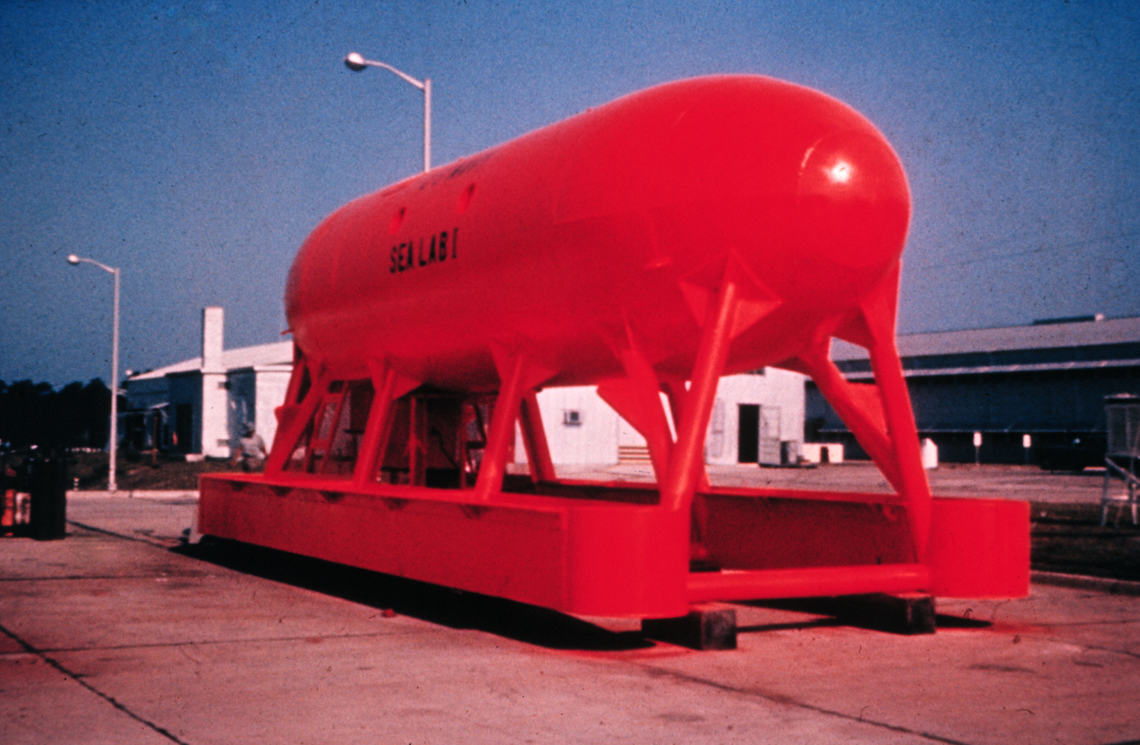
Sealab I
Sealab 1 (Public Domain)
In 1964, off the coast of Bermuda, the Navy placed an ambient-pressure cylinder 192 feet down. An umbilical connected the habitat to the surface. You’d think the station would be full of air, but high pressures of nitrogen can cause other health problems, so, instead, the divers had a helium and oxygen mix.
The crew of four was supposed to stay submerged for several weeks. However, an approaching storm cut their stay to only 11 days. Still, the experiment was a success.
It also brought up several problems. If you’ve taken a hit of helium, you know it makes your voice squeaky, which can make it difficult to communicate with other people. More importantly, though, is that helium is a good conductor of heat. Divers get cold fast hanging out in a helium-rich atmosphere.
You can see a video from the Navy in 1965 describing the program below.
As a side note, former astronaut Scott Carpenter was set to be the fifth person in Sealab I, but a scooter accident in Bermuda bumped him from the roster.
Sealab II
In 1965, the Navy tried again with Sealab II off the coast of La Jolla in California at a depth of around 200 feet. This time, Scott Carpenter made the trip.
Sealab II (Public Domain)
Sealab II was more complex with demonstration tasks and a planned mission length of up to 30 days. For a long trip like this, the same problems arise as you’d have in a space station. Carbon dioxide needs scrubbing, and oxygen levels need control. Humidity and corrosion are constant problems. Equipment noise affects people over the long term.
The new habitat was twice as large as Sealab I. There were heaters, hot showers, and refrigeration. The idea was to have a crew that rotated every 15 days, but Carpenter spent 30 days inside.
The Navy also tried to train a bottlenose dolphin — Tuffy — to act as a helper to the crew with mixed results. While the mission, overall, was a success, there were issues with the crew feeling isolated and confined, along with sleep problems due to noise and lights.
Famously, President Lyndon Johnson was to speak to Carpenter after his 30-day stay and called while Carpenter was in a decompression chamber full of helium. The resulting confusion among telephone operators is pretty funny, as you can see in the video below.
Sealab III
The next and final attempt to submerge a crew was Sealab III in 1969. At a depth of about 600 feet — 200 feet beyond the normal planned operation depth — the Sealab III mission reused the Sealab II module, refurbished and upgraded. Five teams of nine divers were scheduled to spend 12 days each in the habitat.
At such a depth, problems magnify and margins for error all but disappear. The Navy was already stretched thin in Vietnam, and Sealab III had a difficult time getting not just off the ground, but under the sea. The project was late and overbudget. Work got sloppy, and corners got cut. When the habitat developed a helium leak, four divers volunteered to repair it in place, but failed on their first attempt.
A second attempt had the divers taking amphetamines to stay awake, which went predictably wrong. A diver, Berry Cannon, died. At the time, it was chalked up to improper setup of his rebreather, although a more modern investigation speculates that he may have been electrocuted. Either way, it was enough to end the program. The Navy gave up on the program and focused on other undersea programs, such as submarines. If there are any undersea bases, they are too secret for us to know about them.
You can see a Navy video showing the progress of Sealab III before the accident below. Unfortunately, the audio track isn’t present, so it isn’t always clear what the message is.
The End?
You might wonder why someone didn’t continue this work. We don’t have underwater bases, farms, mines, or hotels. Why not? It is true, of course, that the Navy continued to use limited saturation diving for certain, sometimes clandestine, purposes.
Well, the answer is complicated. The Navy’s work on Sealab directly created the tech and techniques used every day by saturation divers around the world, many of whom maintain underwater petroleum production equipment. However, that’s very specialized, and even then, a modern remote vehicle is a better choice for many tasks. Just like space is a harsh place to live, so is the ocean floor. Everything corrodes and leaks.
Now, we build space stations, and the day of the station on the ocean floor will either never come or will be in the future. But regardless, the technology developed by these pioneers will inform human undersea operations for the foreseeable future. Meanwhile, robots are cheaper and more effective for nearly any task. Still, there are times when only a human will do.
Large language models (LLMs) aren’t actually giant computer brains. Instead, they are effectively massive vector spaces in which the probabilities of tokens occurring in a specific order is encoded. Billions of parameters, times N bits per parameter, equals N-billion bits of storage required for a full model. Since increasing the number of parameters makes the models appear smarter, most effort on reducing the storage they require has been on reducing the size of the parameters themselves.
Vector quantization (VQ) is a new method that can compress the vectors calculated during inference to take up less space without significant loss of data. Google’s recently published pre-print paper on TurboQuant covers an LLM-oriented VQ algorithm that’s claimed to provide up to a 6x compression level with no negative impact on inference times.
The tokens aren’t directly encoded in the vector space, but their associated key value is, which along with the single token per inference process creates the need for a key-value (KV) cache, the size of which scales with the size of the model. Thus by compressing the KV cache using VQ, it will reduce its size and correspondingly speed up look-ups due to the smaller size in memory. One catch here is that VQ is due to the nature of quantization some accuracy will be lost. The trick here is thus to apply VQ in such a way that it does not affect this accuracy in a noticeable manner.
Other aspects that had to be taken into account by the TurboQuant algorithm was fast computation to keep up with real-time requirements, along with compatibility with so-called ‘AI accelerator’ hardware.
Key-Value Cache
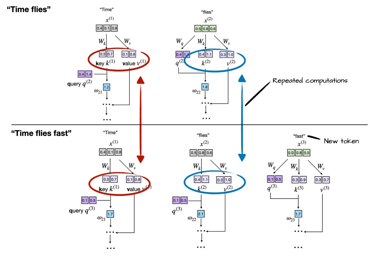
A basic way to look at the KV cache in LLMs is that it caches the results of previous inference cycles. An in-depth explanation can for example be found in this article by Sebastian Raschka. In the case of generating a phrase of three words starting with the word ‘Time’, we can see the following repeated computations:
Repeated computations in an LLM without KV cache. (Credit: Sebastian Raschka)
Considering that inference is rather expensive computation-wise, you really want to cache these calculated values. This provides a massive boost in performance and much lower CPU load, but because there’s no such thing as a free lunch the catch here is a rapidly increasing memory usage.
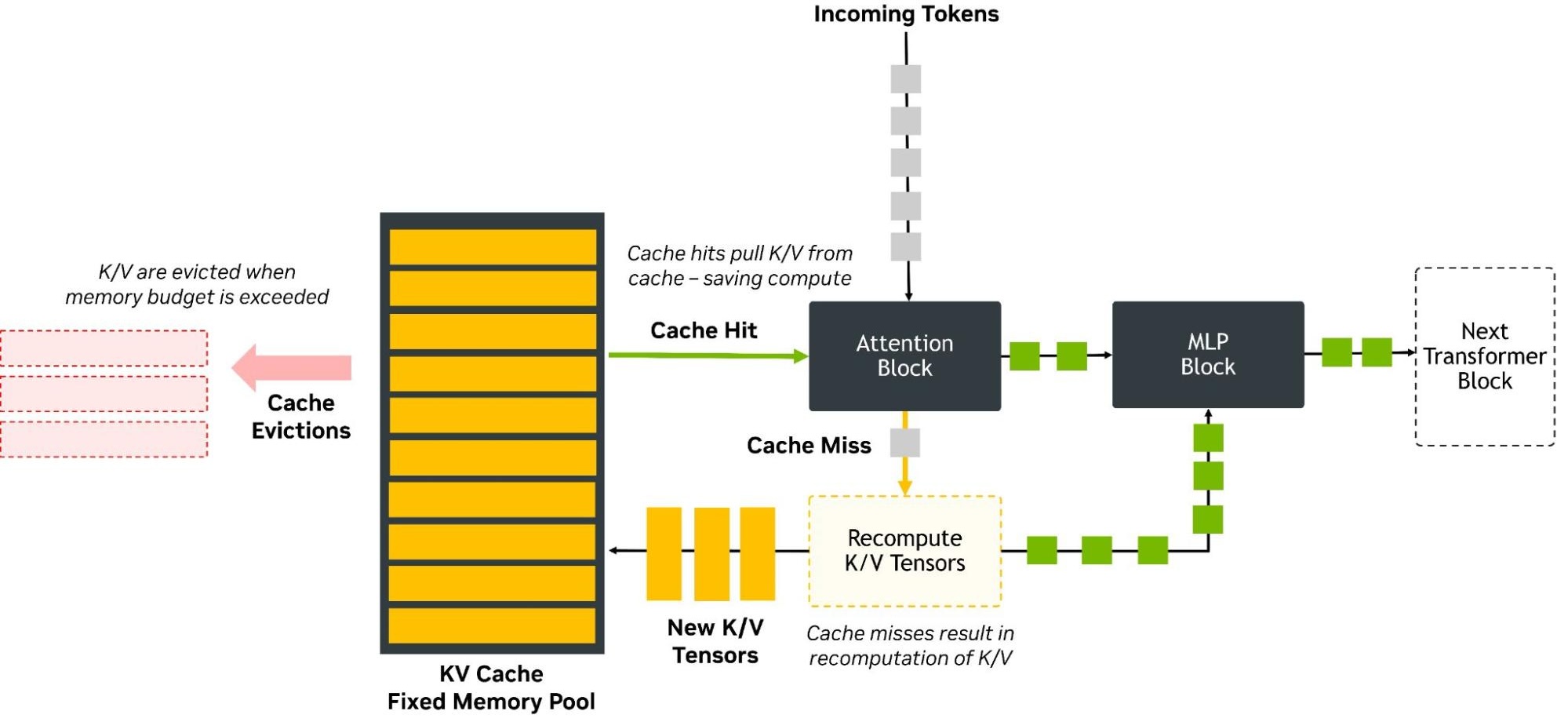
Correspondingly, we now have a big in-memory cache to manage, along with memory management routines to make sure that the KV cache doesn’t exceed its allocated memory pool:
KV cache schematic with memory pool management. (Credit: NVIDIA)
As covered in a December 2025 NVIDIA Developer article, KV cache optimization has been a topic for a while, with the article in question covering NVFP4. This is a VQ approach that reduces the precision of the KV cache from 16-bit floating point to 4-bit (FP4). Meanwhile production systems already employ 8-bit quantization, also using a floating point format (FP8).
An additional cost here is that FP4 has to be dequantized back to FP8, which would seem to be an implementation detail in the current version. Compared to FP8 quantization, FP4 reduces latency by up to 3 times and halves the required memory required, while accuracy is negatively impacted by ‘less than’ 1% compared to FP8 due to quantization error.
Accuracy here is important as it factors into the next auto-complete step when the LLM’s probability vector space is once again rummaged through for the next statistically most likely follow-up token. KV cache VQ compression is thus always a trade-off between memory use and accuracy. In short, the same issues apply as with all implementations of quantization-based compression, including the tragic absence of any free lunch.
Turbo Quantization
So what magic did Google’s intrepid engineers pull off to improve on NVIDIA’s NVFP4 approach? The key is in how the quantization is performed, as it isn’t simple a matter of truncating or throwing away data, rounding up to the nearest available value. Instead a series of steps are applied that seek to minimize the quantization error, which in the case of TurboQuant is (confusingly) an algorithm called PolarQuant followed by the QJL (quantized Johnson-Lindenstrauss) algorithm.
Annoyingly for the non-mathematically gifted/educated among us, Google didn’t simply provide a straightforward visualization like that for NVFP4 that’s understandable even for us software developers and other casuals. For NVIDIA’s format we can see that it takes the form of a single sign bit, two exponents and one mantissa (E2M1), as well as a shared FP8 scale per block of 16 values.
One step where TurboQuant appears to be differ is in the PolarQuant algorithm, that applies a polar coordinates transformation to the vectors, following which a typical normalization can apparently be skipped.
Overview of recursive polar transformation procedure. (Credit: Insu Han et al., 2026)
This polar transformation is preceded by the application of a random projection matrix as a type of preconditioning that will affect later normal distribution, with proof and the full algorithm provided in the PolarQuant arXiv paper for those who desire more detail.
Of note is that PolarQuant employs the Johson-Lindenstrauss lemma, which Google researchers used as the basis for a JL-based transform called QJL. From reading the blog post it’s not immediately clear whether QJL is directly integrated into PolarQuant or an additional step, due to the muddled messaging on Google’s end. From the benchmarking results it does appear that QJL is an additional step.
What we know is that the final format that TurboQuant ends up with is three-bit value, which would logically be 1 bit smaller than NVFP4, or an approximate 25% smaller KV cache for the same amount of data.
Judging On Merits
Comparison and benchmark data in the Google blog post and associated papers do not provide direct comparisons with NVFP4, and the few numbers that are thrown out are rather inconsistent, or unspecified. Take the claim of ‘at least 6x smaller memory size’, for example. The blog text does not clearly specify what this is relative to, while it then tosses out a 4-bit TurboQuant number of 8x performance increase compared to FP32.
Although with some more digging and poking of the available data it might be possible to glean some actual performance information from the provided files, it’s rather vexing how vague Google’s messaging is kept. Not to mention the lack of direct benchmarking against what would be the biggest competitors in the space.
It is definitely true that VQ is a thing for LLM KV cache compression, as we have seen, and NVIDIA ‘accelerator cards’ provide hardware acceleration for this feature, so this is the reality that TurboQuant would have to compete with. Based on the few clear facts that we do have it doesn’t appear that it’s quite the revolution that the hype machine has made it out to be, with it likely being just a bump over NVFP4 that NVIDIA is likely to trump again with its next quantized format.
It will of course be most interesting to see how this will play out once TurboQuant makes its way out of the laboratory into the wider world and we start seeing independent benchmarking performed.
It’s odd being a technology writer in 2026, because around you are many people who will tell you that your craft is outdated. Like the manufacturers of buggy-whips at the turn of the twentieth century, the automobile (in the form of large language model AI) is on the market, and your business will soon be an anachronism. Adapt or go extinct, they tell you. It’s an argument I’ve found myself facing a few times over the last year in my wandering existence, and it’s forced me to think about it. What are the reasons everyone is excited about AI and are those reasons valid, what is there to be scared of, and what are the real reasons people should be excited about it?
If We Gotta Take This Seriously, How Can We Do It?
The futures looking bright in the buggy-whip department! Public domain.
I’ll start by repeating my tale from a few weeks ago when I asked readers what AI applications would survive when the hype is over. The reaction of a friend with decades of software experience on trying an AI coding helper stuck with me; she referenced her grandfather who had been born in rural America in the closing years of the nineteenth century, and recalled him describing the first time he saw an automobile. I agree with her that this has the potential to be a transformative technology, and while it’s entertaining to make fun of its shortcomings as I did three years ago when the idea of what we now call vibe coding first appeared, it’s already making itself useful in some applications. Simply dismissing it is no longer appropriate, but equally, drinking freely of the Kool-Aid seems like joining yet another hype bandwagon that will inevitably derail. A middle way has to be found.
It’s likely many of us will over the last couple of years met a Guy In A Suit who’s got a little too excited about ChatGPT. I think guys like him are motivated by several things; he’s impressed with that LLM because it appears really smart to him, he’s used it to make himself appear smart to other people so it’s made him feel smarter than the engineer who’s pointing out his flaws, he thinks it’s a magic bullet that can do lots of work for him and either save or make him lots of money, and perhaps most importantly, he’s scared witless of missing out on the Next Big Thing.
Plus ça Change, When It Comes To Hype
It’s easy to take pot-shots at those motivations even it it won’t make you popular. His feeling smart will last only as long as the moment he gets it that everyone else has the same thing, or perhaps until it leads him astray into a calamitous decision. Meanwhile there’s a good chance the magic bullet will go the way that wholesale outsourcing of software development did twenty years ago, as an over reliance on something-for-nothing work will generate far more other work to fix its problems. But while those pot-shots weaken some arguments they aren’t perhaps the crushing blows one might imagine they are. LLMs have their uses, however annoying that may be if you’re sick to death of low-value slop.
The Gartner hype cycle graph. Jeremykemp, CC BY-SA 3.0.
Perhaps more worthy of examination is the fear of missing out, because that’s a more fundamental motivation. We all want to be among the Cool Kids, Hackaday readers having the latest tech toys before everyone else are not immune to this. And when you have convinced yourself that the alternative to being one of the Cool Kids is being the commercial equivalent of a buggy-whip salesman circa 1920, it assumes an extra urgency. It’s time to look at a perennial favourite, the Gartner Hype Cycle, for inspiration. Just where on a Gartner Hype Cycle curve do you have to be, to miss out?
On the left of the graph is the steep slope towards the Peak of Inflated Expectation. This is the part we most associate with tech bubbles; as an example we might point to the dotcom boom during its most intensive period in 1997 or 1998. If you pick the moment of the peak or indeed the downward slope towards the Trough of Disillusionment to jump in, then it’s obvious you have missed out. But how far back down the upward slope do you have to be to have not missed out? I’d contend that it’s much earlier, to use our dotcom boom analogy: if you weren’t in the game by 1996, perhaps you were too late. Transposing to the AI boom of today, has our Guy In A Suit already missed the boat without realising it?
They’re Looking At The Wrong Part Of The Graph
We had forgotten the pets.com mascot from the peak of the dotcom era. Jacob Bøtter, CC BY 2.0.
It pains me when I see people newly excited by AI in 2026 for the reasons listed above. To them they’re valid, but having lived and worked through so many other booms and subsequent crashes driven by similar ideas about those technologies I know how the next year or so will go. I think there are many other valid reasons to be excited here, but they lie elsewhere on the Gartner graph. Back to the dotcom boom, the whole thing was driven by sometimes outright crazy ideas surrounding e-commerce, yet it would be social media a decade later that would make many of the huge players we have today. Could someone have made Facebook in 1996? Possibly, but if anyone thought of it at that point, it seems they didn’t do it. If Guy In A Suit is looking for something to be excited about, he should be polishing his crystal balls and looking ahead to the right hand side of the Gartner graph in a decade’s time, not running with the herd.
Returning to my first paragraph and whether a writer will inevitably join the buggy-whip salesmen, I remain rather optimistic that they won’t. Hackaday is meat-based for good reason, but more generally I’m watching the consumer develop a hair-trigger response to slop. I’m certain that there will be a space for machine-generated content in the future whether we like it or not, but I’m equally sure that in my line at least, a human input will retain some value.
Having considered Guy In A Suit and then myself, perhaps it’s time to talk about you, the Hackaday reader. We probably have more AI-skeptics among us than can be found in the general public and I consider myself in part among them, but for all that skepticism I think we should channel it into seeking out the interesting things rather than turning our backs on it. I’ve mentioned the AI-based coding helpers as an example where our community has found some benefit, and as I’ve mentioned before I think that the ability to run a useful LLM locally on commodity hardware delivers huge potential over a cloud data-slurper. If we don’t believe in it, at least we should be like Fox Mulder, and want to believe.
If you’ve ever bought a suspiciously cheap Ethernet cable from an online listing, there’s a decent chance you’ve encountered Copper Clad Aluminum. Better known as CCA, it’s exactly what it sounds like—an aluminium conductor with a thin skin of copper deposited on the outside. Externally, cables made with this material look largely like any other, with perhaps the only obvious tell being that they feel somewhat lighter in the hand.
CCA is cheaper than proper copper cabling, and it conducts signals well enough to function in an Ethernet cable. And yet, it’s a prime example of corner-cutting that keeps standards bodies and professional installers up at night. But just how dangerous is this silent scourge, found lurking in so many network cabinets around the world?
Not Up To Scratch
CCA wire is typically made by wrapping an aluminium core with copper strip and then extruding it through a die. Credit: USPTO
Everything you need to know about CCA is in the name—it refers to an aluminium wire with a thin copper cladding, typically applied through a die extrusion process. The reasoning behind this exploits a real physical phenomenon called the skin effect, wherein higher-frequency AC signals tend to travel along the outer surface of a conductor. The idea goes that since most of the current moves through the outer copper skin layer anyway, the less-conductive aluminium core doesn’t unduly impact the wire’s performance. Using copper-clad aluminium wiring is, in theory, desirable because aluminium is much cheaper than copper, which can really add up over long cable runs. Imagine you’re wiring a building with with hundreds of miles of Ethernet cabling, all with eight conductors each—the savings add up pretty quickly.
There’s a problem with CCA cabling in these contexts, though. Due to prevailing cabling standards, any cable made with CCA is technically not even a real Ethernet cable at all. The relevant documents are unambiguous.
ANSI/TIA-568.2-D requires conductors in Category-rated cable to be solid or stranded copper. No other materials are acceptable, and thus CCA is explicitly excluded from use in Category cable applications. A cable with CCA conductors cannot legitimately carry a Cat5e, Cat6, or any related designation under any circumstances. Similarly, ISO/IEC 11801 has the same requirement. The U.S. National Electrical Code also states that conductors in communications cables, other than coaxial cable, shall be copper. This isn’t a suggestion or a best practice; it’s the letter of the code. Anything lesser is simply not allowed.
CCA cabling can be hard to detect, particularly where a manufacturer has intentionally hidden the fact that the inferior wiring is used. One way to be sure is to strip a wire and scrape away at the copper to see if there’s aluminium lurking inside.
The simple fact is that regulators demand a certain level of quality for communications cable, and CCA just isn’t it. In the specific case of Ethernet cabling, it is worth noting that the skin effect that makes CCA construction useful in other applications doesn’t really apply. That’s because the skin effect is frequency-dependent, and so it doesn’t apply to DC power as used in Power over Ethernet. In fact, the DC resistance of a CCA conductor of the same gauge is roughly 55% higher than copper of the same gauge. CCA cables also tend to be less flexible and more brittle than the proper all-copper equivalent. These are fundamental physical ways in which CCA doesn’t measure up to scratch. These differences aren’t enough to stop the cables working for their intended purpose in many cases, but it’s part of the reason that standards organizations mandate pure copper and nothing less.
The problem that stems from this is that installing CCA communications cable in a building can make the installation non-compliant and potentially even illegal in jurisdictions that adopt these relevant standards. Much of the concern comes down to fire ratings and insurance concerns. For example, the UL 444 standard lays out the requirements for cables to meet the CM, CMR, CMG, and CMP fire ratings you see printed on legitimate cable jackets. These rules require copper conductors. Thus, CCA cable cannot carry a valid UL listing and any install using it will not be compliant with fire safety regulations. A building with such cable installed would be potentially liable to have any insurance invalidated for not meeting basic code requirements. Any contractor installing such cable could be liable in turn.
Grabbing a cigarette lighter can also help determine if given cabling is pure copper or copper clad aluminium.
The question is, though—are CCA cables actually a real-world fire risk? That is harder to answer. The common concern is that a tightly-wrapped bundle of CCA Ethernet cables running Power over Ethernet could get hotter than intended due to increased resistance, eventually overheating, melting, or catching alight. With that said, we are yet to see any grand examples of buildings catching fire and burning to the ground because of CCA cabling. Such cables might not be to spec, and they might not do as well when used for Power over Ethernet due to their higher resistance, particularly over longer runs. However, issues are likely to be more related to insufficient power delivery rather than severe overheating. Where there’s no smoke, there usually isn’t fire. There would be plenty of photos online of melted CCA cables being pulled out of smoking rubble if this was occurring on the regular.
CCA cables are all over the Internet, but none can legitimately claim to meet Cat 6 requirements without using pure copper conductors. Credit: Amazon via screenshot
Ultimately, if you’ve got a CCA cable or two running around your house, you probably don’t have a lot to worry about. They might not survive as well as a proper copper cable, and they might be a little dodgy on long runs with PoE equipment, but they aren’t just going to burst into flames at the drop of a hat. With that said, they are technically uncompliant with all relevant standards, and if you’re trying to meet code, you should absolutely steer clear of CCA in all cases. This warning, and so many that have come before, won’t do much to stem the flow of CCA cables into the market, but it might at least stop you making a mistake the next time you’re speccing a new cable project. Stay safe out there.
These days our appetite for more data storage is larger than ever, with video files larger, photo resolutions higher, and project files easily zipping past a few hundred MB. At the same time our options for data storage are becoming more and more limited. For the longest time we could count on there always being a newer, roomier, faster, and cheaper form of storage to come along, but those days would seem to be over.
We can look back and laugh at low capacity USB Flash drives of the early 2000s, yet the first storage drive to hit 1 TB capacity did so in 2007, with a Hitachi Deskstar 7k100, only for that level of capacity in PCs to not really be exceeded nineteen years later.
We also had Blu-ray discs (BD) promise to cram the equivalent of dozens of DVDs onto a single BD, with two- and even four-layer BDs storing up to a one-hundred-and-twenty-eight GB. Yet today optical media is dying a slow death as the sole remaining cheap storage option. NAND Flash storage has only increased in price, and the options for those of us who have large cold storage requirements would seem to be decreasing every day.
So what is the economical solution here? Invest in LTO tapes using commercial left-overs, or give up and sign up for Cloud Storage for the low-low price of a monthly recurring fee?
It’s Not Hoarding, I Swear
Although there are many people today who use just a lightweight laptop with something like 256 GB of storage in it without any complaints, the problem would seem to lie mostly with those who are really into having local and offline data. This can include things like multimedia content, but also project files and resources, which especially in the case of video editing and game development can quickly balloon into pretty serious size requirements.
Over the decades of memory storage, there’s been a near-constant flurry of new innovations and technologies, always with the knowledge that in a decade there would be massively larger forms of storage or at least big price drops to look forward to. This is how my first late 90s PC didn’t have just a zippy Celeron 400 CPU, but also a massive 4 GB HDD.
Compared to the 30 MB HDD in the 386-based system that I had before this was massive, but with multimedia content flooding in courtesy of the filesharing revolution, I quickly had to pop in a 10 GB HDD. By the time that I upgraded to a new PC that was considered small, and I found myself well above 20 GB, before soon joining the 1 TB and later the 5+ TB club. By 2012 HDDs were using 2 TB platters, so this was basically becoming unavoidable.
Meanwhile a lot of files were offloaded or backed up onto optical media, both CDs and DVDs. Although ZIP disks also briefly made an appearance in my PCs, optical discs were simply far cheaper and more universally usable.
The Problem
Sony was the only manufacturer of 128GB writable Blu-Ray discs. Other manufacturers topped out at 100GB.
Even before the current ‘AI’ datacenter-induced tripling of Flash storage costs that’s also affecting USB Flash drives and HDDs, optical media had been slowly phased out for a while. Even without checking sales numbers, you don’t have to be a genius to consider it a bad sign that manufacturers like Pioneer are exiting the optical storage market and big names like Sony ceased the production of recordable Blu-ray discs along with MiniDisc and MiniDV formats.
If you have recently shopped around for internal 5.25″ optical disc drives (ODDs) in particular, you may have noticed that these are becoming increasingly more rare and expensive. Even stand-alone BD player options are becoming more limited, with that distinct ‘final gasp’ vibe that comes with a dying format, as with VHS and kin in the past.
Part of the problem can probably be attributed to the move away by content distributors – including multimedia, games and software – from physical media to online distribution methods. This takes the form of streaming services, Software-as-a-Service (SaaS), and online game stores. At this point you do not even need a BD player in your home game console, never mind PC, to install games. Neither do you need a BD player connected to your smart TV as you can just join the new brave world of terminal-based subscriptions.
So with demand for optical media massively reduced by this shift, what’s left for those of us who just want to back up our data in peace and without shelling out too much hard-earned cash?
The Future
With the prospect of cheap DVD and BD blanks becoming a thing of the past, or unusable due to a lack of new optical drives to use them with, what options remain? We can look at metrics like cost per GB to see what might conceivably make sense.
The most recent 50-disc spindle of DVD+Rs that I purchased came in at just under €15 for 235 GB, so that’s about 6 cents/GB, and I could have gotten it much cheaper by going for larger spindles and shopping around some. For comparison, SSD storage was more than triple that even before the recent price surge, and HDDs are coming in around that same price tag as well.
A quick look at LTO tapes and drives for sale shows that while tapes for the older LTO-8 standard from 2017 are pretty reasonable, the drives cost an absolute fortune, so you’d have to be pretty lucky to score one without having to pawn off a kidney.
Add to this that LTO tapes are only really guaranteed for a lifespan of 15-30 years and are incomparably slower due to being a linear format. This makes tape storage only really suitable for the coldest of cold storage, and not for keeping some videos around, or for game development resources that you would like to pop in and quickly query without dying from old age while a tape seeks to the appropriate position.
The Solution?
Even assuming that the current insane surge in pricing for RAM, NAND Flash, and even HDD storage is just a temporary blip, and that by the time 2027 rolls around the RAMpocalypse will just be a bad dream to meme about, the basic economics of cost per storage would still not have changed in any measurable way.
The advantage of optical media, especially DVDs, is that they’re a very simple technology, relatively speaking. While there is some impressive technology in the optical pick-up component of an ODD, over the decades they have become highly affordable commodity devices. Meanwhile the discs are very cheap to produce, being at their core just some plastic with a coating on which the bits are written, while being very durable if kept away from physical harm.
It’s also essentially guaranteed that a DVD+R or BD-R will not have its data altered, something which cannot be guaranteed with a USB Flash drive. Filesystem corruption and electrical issues may damage or even destroy the Flash drive.
Although it’s easy to say that one should just ‘stop hoarding data’ or subscribe to some cloud storage solution for potentially infinite money per GB, high latency and the possibility of data loss due to a datacenter issue, there are many arguments to be made in favor of keeping local, offline copies, and that this should be done on highly durable media. We just cannot be sure that optical media will remain an option in the future.
What is your take on this conundrum? How do you manage your storage needs in this modern era, and what are your plans for the future? Please feel free to sound off in the comments.
Over the history of this business, a lot of people have foreseen limits that look rather silly in hindsight– in 1943, IBM President Thomas Watson declared that “I think there is a world market for maybe five computers.” That was more than a little wrong. Depending on the definition of computers– particularly if you include microcontrollers, there’s probably trillions of the things.
We might as well include microcontrollers, considering how often we see projects replicating retrocomputers on them. The RP2350 can do a Mac 128k, and the ESP32-P4 gets you into the Quadra era. Which, honestly, covers the majority of daily tasks most people use computers for.
The RP2350 and ESP32-P4 both have more than 640kB of RAM, so that famous Bill Gates quote obviously didn’t age any better than Thomas Watson’s prediction. As Yogi Berra once said: predictions are hard, especially about the future.
Still, there must be limits. We ran an article recently pointing out that new iPhones can perform three orders of magnitude faster than a Cray 2 supercomputer from the 80s. The Cray could barely manage 2 Gigaflops– that is, two billion floating point operations per second; the iPhone can handle more than two Teraflops. Even if you take the position that it’s apples and oranges if it isn’t on the same benchmark, the comparison probably isn’t off by more than an order of magnitude. Do we really need even 100x a Cray in our pockets, never mind 1000x?
It fits in your pocket now, but somehow, we were expecting warmer colours. Image: ASCI Red by Sandia National Labs, public domain.
Going forward in time, the Teraflop Barrier was first broken in 1997 by Intel’s ASCI red, produced for the US Department of Energy for physics simulations. By 1999, it had bumped up to 3 Teraflops. I don’t know about you, but my phone doesn’t simulate nuclear detonations very often.
According to Steam’s latest hardware survey, NVidia’s RTX 5070 has become the single most common GPU, at around 9% total users. When it comes to 32-bit floating point operations, that card is good for 30.87 Teraflops. That’s close to NEC’s Earth Simulator, which was the fastest supercomputer from 2002 to 2004– NEC claimed 35.86 Teraflops there.
Is that enough? Is it ever enough? The fact is that software engineers will find a way to spend any amount of computing power you throw at them. The question is whether we’re really gaining much of anything.
At some point, you have to wonder when enough is enough. The fastest piece of hardware in this author’s house is a 2011 MacBook Pro. I don’t stress it out very much these days. For me, personally, it’s more than enough compute. If I wasn’t using YouTube I could probably drop back a couple generations to PPC days, if not all the way to the ESP32-P4 mentioned above.
Quite possibly my next workstation. Image: ESP-32-P4 Dev Board, by Waveshare.
The 3D models for my projects really aren’t more complex than what I was rendering in the 90s. Routing circuit diagrams hasn’t gotten more complicated, either, even if KiCad uses a lot more resources. For what I’m working on these days, “enough compute” is very modest, and wouldn’t come close to taxing the 2 Teraflop iPhone. That’s probably why Apple was confident they could use its guts in a laptop.
How about you? The bleeding edge has always been driven by edge cases, and it’s left me behind. Are you surfing that edge? If so, what are you doing with it? Training LLMs? Simulating nuclear explosions? Playing AAA games? Inquiring minds want to know! Furthermore, for those of you who are still at that bleeding edge that’s left me so far behind– how far do you think it will keep going? If you’re using teraflops today, will you be using petaflops tomorrow? Are you brave enough to make a prediction?
I’ll start: 640 gigaflops ought to be enough for anybody.
Nothing ever made is truly perfect and indeed, CPU architectures like x86, RISC-V, ARM, and PowerPC all have their own upsides and downsides. Today, I aim to make an architecture that learns from all these mistakes and improves architecture design for everyone.
I’ve consulted with many people opinionated on the matter, both from a software perspective, and from a hardware perspective. I have taken all their feedback in mind while creating this initial draft of the WheatForce architecture (PDF). It is inspired by pieces from many architectures: segmentation inspired by x86, hash table-like paging from PowerPC, dynamic endianness control from RISC-V and PowerPC, and more. Let’s look into each feature in a little bit more detail.
Segmentation
x86′ segmentation scheme by [John] on WikipediaSegmentation is a powerful virtual-memory feature that is tragically underused today. I believe this is due to limited flexibility, so I have added an improvement above the model that x86 had used: every single register can now use its own segment selector. With this added flexibility, one can surely make better use of the address translation powers of segmentation with minimal extra overhead.
Hash Table-Like Paging
PowerPC’s hash table-like paging makes its paging vastly superior to the likes of x86, RISC-V and ARM by decreasing the number of required cache line fetches drastically. Much like a true hash table, the keys (or input addresses) are hashed and then used as an index into the table. From there, that row of the table is searched for a cell with a matching virtual address, which can be accelerated greatly due to superior cache locality of the entries in this row.
Dynamic Endianness Control
A diagram of PowerPC’s paging structures from the PowerPC manual
RISC-V and PowerPC both have some real potential for better compatibility with their dynamic endianness control. However, both these architectures can only change the endiannes from a privileged context. To make this more flexible, WheatForce can change the data endianness at any time with a simple instruction. Now, user software can directly interoperate between big-endian and little-endian data structures, eliminating the need for a costly byte-swap sequence that would need many instructions. Finally, you can have your cake and eat it to!
Conclusion
WheatForce has observed the mistakes of all architectures before it, and integrates parts of all its predecessors. You can read the full specification on GitHub. After you’ve read it, do let me know what you think of it.
Solar power has been around for a long time now. Once upon a time, it was mostly the preserve of research projects and large-scale municipal installations. Eventually, as the technology grew ever cheaper, rooftop solar came along, and cashed-up homeowners rushed to throw panels on their homes to slash their power bills and even make money in some cases.
Those in apartments or rented accommodations had largely been left out of the solar revolution. That was, until the advent of balcony solar. Popular in Germany, but little known in the rest of the world, the concept has brought home power generation to a larger market than ever.
Pop One On
Photovoltaic solar panels were very expensive to manufacture, a long time ago. This made it difficult for solar power to compete with traditional energy sources like fossil fuels. High install costs and limited power output made the business case difficult, even if the energy from the sun itself was effectively free. However, as the desire for cleaner sources of energy ramped up over the years, solar panel production ramped up in turn. Economies of scale did their thing, and panels grew cheap enough for individuals to consider installing them on their own homes. This led to the widespread uptake of rooftop solar, with installations commonly in the 5 kW to 10 kW range with inverter hardware to allow feeding energy back into the grid in a safe and controlled manner.
The common term is “balkonkraftwerk” in German, which translates to “balcony power plant.” However, there’s no real need for a balcony. Anywhere you can hang them outside a building will work if you can find a way to route the wires to a power point. Credit: RobbieIanMorrison, CC BY 4.0
The problem with rooftop solar is that not everybody owns their roof. A great many people around the world live in apartments, or rent, and are not in a position to make permanent adjustments to their home. These groups were largely left out of the solar revolution. That was, until solar panels grew so cheap and power bills grew high enough that even small-scale installs started to make financial sense.
In Germany in particular, small solar installs have become quite popular, and the country has become a hotbed for so-called “balcony” solar installations. These involve simple setups of one or two solar panels which are designed to be easily mounted on a balcony or other outdoor area of a home, rather than permanently installed on a rooftop.
They come with small inverters to convert the DC output of the solar panels into AC power, which plug straight into an existing home power socket. This do-it-yourself install method eliminates the need for hiring an electrician, further improving the affordability of the system. The inverters used with these systems include anti-islanding protection so that the solar system does not power any circuits if the grid has been deenergized for service or repair.
Balcony solar does have some limitations compared to rooftop installs. Often, installation angles are imperfect for making the most of the sun available. There are also limitations to how much power you can get out of such a system. Germany’s initial regulations for “balkonkraftwerk” systems stated that feed in power had to be limited to 600 watts to avoid potential issues with household wiring and sockets that were never designed for feed-in solar power.
Updated regulations allow up to 800 watts of feed-in, with an additional regulation that the installed panels do not exceed a level of 2000 watts peak output. It might sound like a mismatch, but it’s possible to use the excess power from the panels to charge a battery when the output exceeds the 800-watt limit. Having larger panels with higher peak output is useful, too, for when the sun isn’t shining so bright. A 2000 watt peak panel setup will be outputting 800 watts or more far more often than a set of panels that only delivers 800 watts in peak conditions.
The panels are generally installed in ad-hoc fashion. Credit: Nikolai Twin, CC BY 4.0
Despite the limitations, or perhaps because of them, it’s a cinch to get yourself going with solar in Germany. Just head to your local big box store, purchase a kit, and hang it off the side of your house. Once you plug it in to the wall, you’re pretty much done. Most kits come with some sort of app for monitoring the system so you can keep an eye on how much your panels are generating. The ease of access has led to an explosion in installs, with over 1 million balcony solar setups already operating in the country.
Thus far, balcony solar has been largely a German thing. However, other parts of the world are catching on. Other European nations like Spain, France, and Belgium have all got on board the train already. In the United States, the state of Utah has already approved a framework for balcony solar installs, and Virginia is following close behind. The key has been carving out special measures to allow easy, cheap DIY installs for small solar systems.
Typically, setting up rooftop solar in most states requires signing an agreement with the local utility regarding power feed-in to the grid, as well as hiring professional contractors for the installation. This adds a huge amount of cost which a small solar system would never recoup in a reasonable amount of time. By eliminating these hurdles for small-scale plug-in setups, they become viable and far more accessible to more of the community.
Balcony solar kits are readily available at stores across Germany. An 800-watt kit can be had for as little as a few hundred Euros. Credit: Lidl via screenshot
Balcony solar is unlikely to be an instant gamechanger that drastically shakes up the power grid. Most installs are low power. Their juice is mostly sucked up to run a fridge and a TV or two, and few make major feed-in contributions to the broader grid. However, their popularity in Europe shows that there is a serious eagerness amongst the broader community to get on board the solar train any which way or how. At the very least, balcony solar is a grand business opportunity and one that is bringing sustainability to more corners of the urban and suburban landscape than ever before.
If you know much about radios and espionage, you’ve probably encountered number stations. These are mysterious stations that read out groups of numbers or otherwise encoded messages to… well… someone. Most of the time, we don’t know who is receiving the messages. You’d be excused for thinking that this is an old technology. After all, satellite phones, the Internet, and a plethora of options now exist to allow the home base to send spies secret instructions. However, the current-day global conflict has seen at least one new number station appear, apparently associated with the United States and, presumably, targeting some recipients in Iran, according to priyom.org.
As you might expect, these stations don’t identify themselves, but the Enigma Control List names this one as V32. It broadcasts two two-hour blocks a day at 0200 UTC and a repeat at 1800 UTC. Each message starts with the Farsi word for “attention” followed by what is assumed to be some header information as two 5-digit groups. Then there is a set of 181 five-digit groups. Each message is padded out to take 20 minutes, and there are six messages in each transmission.
How Do You Know?
While this could, in theory, be from (and to) anywhere, direction finding has traced the signal to a US base near Stuttgart, Germany. In addition to using Farsi, Iran has repeatedly attempted to jam the signal, causing V32 to change frequencies a few times. There’s also a more recent, so far unidentified, jammer trying to block the signal.
In addition to direction finding, there is a surprising amount of information you can glean from the audio. The first few days of broadcasts had specific beeps in the background, which appear to be warning tones from a specific type of American military transmitter that warns the operator when encryption is not engaged. At first, a human read the numbers. Eventually, the station switched to using automated numbers.
Oops
In addition, there have been a few times when Windows 10 system sounds have leaked into the transmission. Other oddities are several cases where a word was read out in the middle of the numbers. We aren’t cryptographers, but that suggests the numbers refer to words in some sort of codebook, and that book doesn’t contain the proper words.
If you want to try your hand at decoding, you can hear the station on USB just under 8 MHz, or just listen to the recordings made by others (like the ones below or this one). You might like to read what other people say about it, too.