Some time ago, Linus Torvalds made a throwaway comment that sent ripples through the Linux world. Was it perhaps time to abandon support for the now-ancient Intel 486? Developers had already abandoned the 386 in 2012, and Torvalds openly mused if the time was right to make further cuts for the benefit of modernity.
It would take three long years, but that eventuality finally came to pass. As of version 6.15, the Linux kernel will no longer support chips running the 80486 architecture, along with a gaggle of early “586” chips as well. It’s all down to some housekeeping and precise technical changes that will make the new code inoperable with the machines of the past.
Why Won’t It Work Anymore?
The kernel has had a method to emulate the CMPXCH8B instruction for some time, but it will now be deprecated.
The big change is coming about thanks to a patch submitted by Ingo Molnar, a long time developer on the Linux kernel. The patch slashes support for older pre-Pentium CPUs, including the Intel 486 and a wide swathe of third-party chips that fell in between the 486 and Pentium generations when it came to low-level feature support.
Going forward, Molnar’s patch reconfigures the kernel to require CPUs have hardware support for the Time Stamp Counter (RDTSC) and CMPXCHG8B instructions. These became part of x86 when Intel introduced the very first Pentium processors to the market in the early 1990s. The Time Stamp Counter is relatively easy to understand—a simple 64-bit register that stores the number of cycles executed by the CPU since last reset. As for CMPXCHG8B, it’s used for comparing and exchanging eight bytes of data at a time. Earlier Intel CPUs got by with only the single-byte CMPXCHG instruction. The Linux kernel used to feature a piece of code to emulate CMPXCHG8B in order to ease interoperability with older chips that lacked the feature in hardware.
The changes remove around 15,000 lines of code. Deletions include code to emulate the CMPXCHG8B instruction for older processors that lacked the instruction, various emulated math routines, along with configuration code that configured the kernel properly for older lower-feature CPUs.
Basically, if you try to run Linux kernel 6.15 on a 486 going forward, it’s just not going to work. The kernel will make calls to instructions that the chip has never heard of, and everything will fall over. The same will be true for machines running various non-Pentium “586” chips, like the AMD 5×86 and Cyrix 5×86, as well as the AMD Elan. It’s likely even some later chips, like the Cyrix 6×86, might not work, given their questionable or non-existent support of the CMPXCHG8B instruction.
Why Now?
Molnar’s reasoning for the move was straightforward, as explained in the patch notes:
In the x86 architecture we have various complicated hardware emulation
facilities on x86-32 to support ancient 32-bit CPUs that very very few
people are using with modern kernels. This compatibility glue is sometimes
even causing problems that people spend time to resolve, which time could
be spent on other things.
Indeed, it follows on from earlier comments by Torvalds, who had noted how development was being held back by support for the ancient members of Intel’s x86 architecture. In particular, the Linux creator questioned whether modern kernels were even widely compatible with older 486 CPUs, given that various low-level features of the kernel had already begun to implement the use of instructions like RDTSC that weren’t present on pre-Pentium processors. “Our non-Pentium support is ACTIVELY BUGGY AND BROKEN right now,” Torvalds exclaimed in 2022. “This is not some theoretical issue, but very much a ‘look, ma, this has never been tested, and cannot actually work’ issue, that nobody has ever noticed because nobody really cares.”
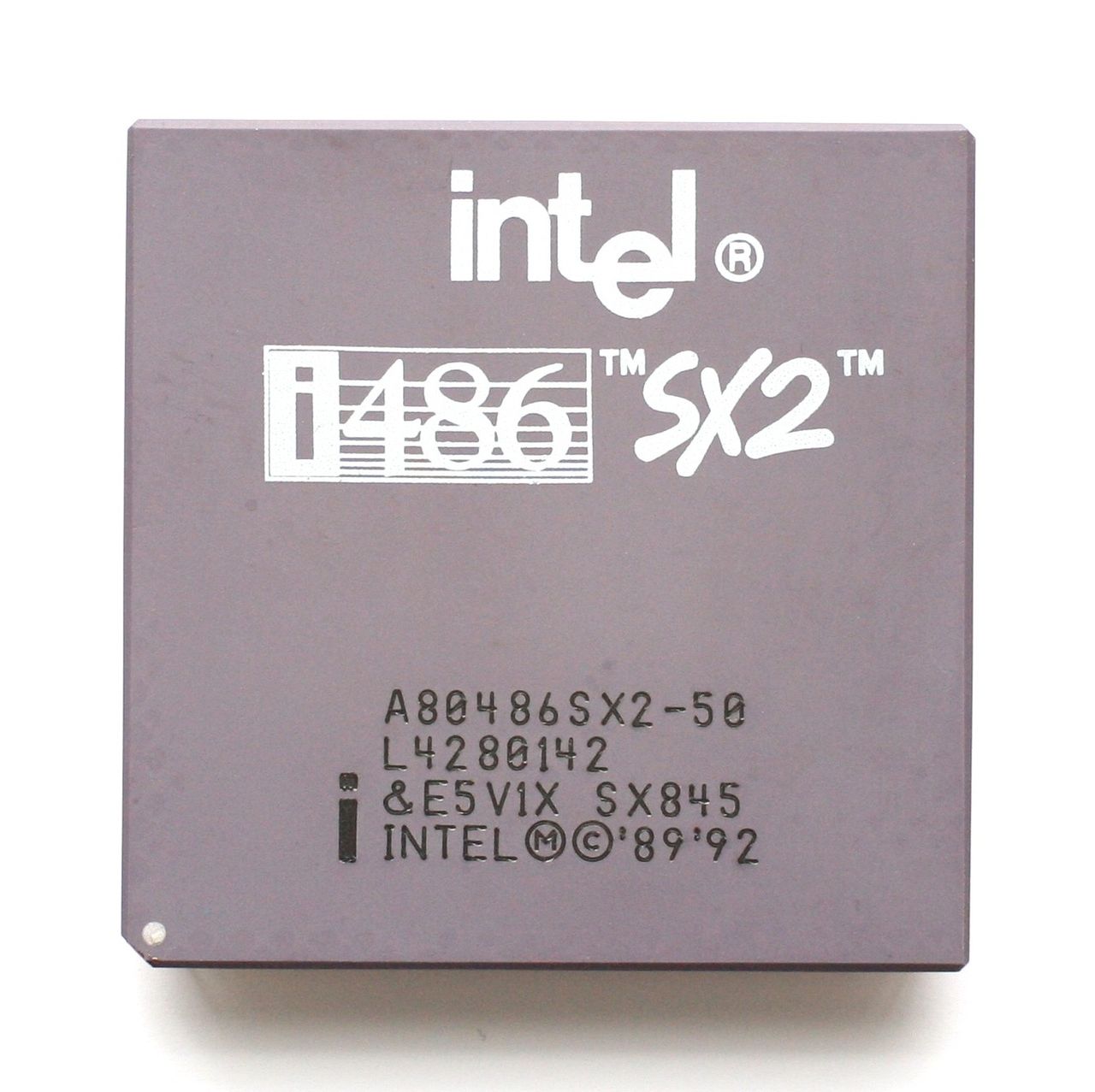
Intel kept i486 chips in production for a good 18 years, with the last examples shipped out in September 2007. Credit: Konstantin Lanzet, CC BY-SA 3.0
Basically, the user base for modern kernels on old 486 and early “586” hardware was so small that Torvalds no longer believed anyone was even checking whether up-to-date Linux even worked on those platforms anymore. Thus, any further development effort to quash bugs and keep these platforms supported was unjustified.
It’s worth acknowledging that Intel made its last shipments of i486 chips on September 28, 2007. That’s perhaps more recent than you might think for a chip that was launched in 1989. However, these chips weren’t for mainstream use. Beyond the early 1990s, the 486 was dead for desktop users, with an IBM spokesperson calling the 486 an “ancient chip” and a “dinosaur” in 1996. Intel’s production continued on beyond that point almost solely for the benefit of military, medical, industrial and other embedded users.
Third-party chips like the AMD Elan will no longer be usable, either. Credit: Phiarc, CC-BY-SA 4.0
If there was a large and vocal community calling for ongoing support for these older processors, the kernel development team might have seen things differently. However, in the month or so that the kernel patch has been public, no such furore has erupted. Indeed, there’s nothing stopping these older machines still running Linux—they just won’t be able to run the most up-to-date kernels. That’s not such a big deal.
While there are usually security implications around running outdated operating systems, the simple fact is that few to no important 486 systems should really be connected to the Internet anyway. They lack the performance to even load things like modern websites, and have little spare overhead to run antiviral software or firewalls on top of whatever software is required for their main duties. Operators of such machines won’t be missing much by being stuck on earlier revisions of the kernel.
Ultimately, it’s good to see Linux developers continuing to prune the chaff and improve the kernel for the future. It’s perhaps sad to say goodbye to the 486 and the gaggle of weird almost-Pentiums from other manufacturers, but if we’re honest, few to none were running the most recent Linux kernel anyway. Onwards and upwards!
Some Mondays are worse than others, but April 28 2025 was particularly bad for millions of people in Spain and Portugal. Starting just after noon, a number of significant grid oscillations occurred which would worsen over the course of minutes until both countries were plunged into a blackout. After a first substation tripped, in the span of only a few tens of seconds the effects cascaded across the Iberian peninsula as generators, substations, and transmission lines tripped and went offline. Only after the HVDC and AC transmission lines at the Spain-France border tripped did the cascade stop, but it had left practically the entirety of the peninsula without a functioning power grid. The event is estimated to have been the biggest blackout in Europe ever.
Following the blackout, grid operators in the affected regions scrambled to restore power, while the populace tried to make the best of being plummeted suddenly into a pre-electricity era. Yet even as power gradually came back online over the course of about ten hours, the question of what could cause such a complete grid collapse and whether it might happen again remained.
With recently a number of official investigation reports having been published, we have now finally some insight in how a big chunk of the European electrical grid suddenly tipped over.
Oscillations
Electrical grids are a rather marvelous system, with many generators cooperating across thousands of kilometers of transmission lines to feed potentially millions of consumers, generating just enough energy to meet the amount demanded without generating any more. Because physical generators turn more slowly when they are under heavier load, the frequency of the AC waveform has been the primary coordination mechanism across power plants. When a plant sees a lower grid frequency, it is fueled up to produce more power, and vice-versa. When the system works well, the frequency slowly corrects as more production comes online.
The greatest enemy of such an interconnected grid is an unstable frequency. When the frequency changes too quickly, plants can’t respond in time, and when it oscillates wildly, the maximum and minumum values can exceed thresholds that shut down or disconnect parts of the power grid.
In the case of the Iberian blackout, a number of very significant oscillations were observed in the Spanish and Portuguese grids that managed to also be observable across the entire European grid, as noted in an early analysis (PDF) by researchers at Germany’s Friedrich-Alexander-Universität (FAU).
European-wide grid oscillations prior to the Iberian peninsula blackout. (Credit: Linnert et al., FAU, 2025)
This is further detailed in the June 18th report (direct PDF link) by Spain’s Transmission System Operator (TSO) Red Eléctrica (REE). Much of that morning the grid was plagued by frequency oscillations, with voltage increases occurring in the process of damping said oscillations. None of this was out of the ordinary until a series of notable events, with the first occurring after 12:02 with an 0.6 Hz oscillation repeatedly forced by a photovoltaic (PV) solar plant in the province of Badajoz which was feeding in 250 MW at the time. After stabilizing this PV plant the oscillation ceased, but this was followed by the second event with an 0.2 Hz oscillation.
After this new oscillation was addressed through a couple of measures, the grid was suffering from low-voltage conditions caused by the oscillations, making it quite vulnerable. It was at this time that the third major event occurred just after 12:32, when a substation in Granada tripped. The speculation by REE being that its transformer tap settings had been incorrectly set, possibly due to the rapidly changing grid conditions outpacing its ability to adjust.
Subsequently more substations, solar- and wind farms began to go offline, mostly due to a loss of reactive power absorption causing power flow issues, as the cascade failure outpaced any isolation attempts and conventional generators also threw in the towel.
Reactive Power
Grid oscillations are a common manifestation in any power grid, but they are normally damped either with no or only minimal interaction required. As also noted in the earlier referenced REE report, a big issue with the addition of solar generators on the grid is that these use grid-following inverters. Unlike spinning generators that have intrinsic physical inertia, solar inverters can rapidly follow the grid voltage and thus do not dampen grid oscillations or absorb reactive power. Because they can turn on and off essentially instantaneously, these inverters can amplify oscillations and power fluctuations across the grid by boosting or injecting oscillations if the plants over-correct.
In alternating current (AC) power systems, there are a number of distinct ways to describe power flow, including real power (Watt), complex power (VA) and reactive power (var). To keep a grid stable, all of these have to be taken into account, with the reactive power management being essential for overall stability. With the majority of power at the time of the blackout being generated by PV solar farms without reactive power management, the grid fluctuations spun out of control.
Generally, capacitors are considered to create reactive power, while inductors absorb it. This is why transformer-like shunt reactors – a parallel switchyard reactor – are an integral part of any modern power grid, as are the alternators at conventional power plants which also absorb reactive power through their inertia. With insufficient reactive power absorption capacity, damping grid oscillations becomes much harder and increases the chance of a blackout.
Ultimately the cascade failure took the form of an increasing number of generators tripping, which raised the system voltage and dropped the frequency, consequently causing further generators and transmission capacity to trip, ad nauseam. Ultimately REE puts much of the blame at the lack of reactive power which could have prevented the destabilization of the grid, along with failures in voltage control. On this Monday PV solar in particular generated the brunt of grid power in Spain at nearly 60%.
Generating mix in Spain around the time of the blackout. (Credit: ENTSO-E)
Not The First Time
Despite the impression one might get, this wasn’t the first time that grid oscillations have resulted in a blackout. Both of the 1996 Western North America blackouts involved grid oscillations and a lack of reactive power absorption, and the need to dampen grid oscillations remains one of the highest priorities. This is also where much of the criticism directed towards the current Spanish grid comes from, as the amount of reactive power absorption in the system has been steadily dropping with the introduction of more variable renewable energy (VRE) generators that lack such grid-stabilizing features.
To compensate for this, wind and solar farms would have to switch to grid-forming inverters (GFCs) – as recommended by the ENTSO-E in a 2020 report – which would come with the negative effect of making VREs significantly less economically viable. Part of this is due to GFCs still being fairly new, while there is likely a strong need for grid-level storage to be added to any GFC in order to make especially Class 3 fully autonomous GFCs work.
It is telling that five years after the publication of this ENTSO-E report not much has changed, and GFCs have not yet made inroads as a necessity for stable grid operation. Although the ENTSO-E’s own investigation is still in progress with a final report not expected for a few more months at least, in light of the available information and expert reports, it would seem that we have a good idea of what caused the recent blackout.
The pertinent question is thus more likely to be what will be done about it. As Spain and Portugal move toward a power mix that relies more and more heavily on solar generation, it’s clear that these generators will need to pick up the slack in grid forming. The engineering solution is known, but it is expensive to retrofit inverters, and it’s possible that this problem will keep getting kicked down the road. Even if all of the reports are unanimous in their conclusion as to the cause, there are unfortunately strong existing incentives to push the responsibility of avoiding another blackout onto the transmission system operators, and rollout of modern grid-forming inverters in the solar industry will simply take time.
In other words, better get used to more blackouts and surviving a day or longer without power.
It’s an inconvenient fact that most of Earth’s largesse of useful minerals is locked up in, under, and around a lot of rock. Our little world condensed out of the remnants of stars whose death throes cooked up almost every element in the periodic table, and in the intervening billions of years, those elements have sorted themselves out into deposits that range from the easily accessed, lying-about-on-the-ground types to those buried deep in the crust, or worse yet, those that are distributed so sparsely within a mineral matrix that it takes harvesting megatonnes of material to find just a few kilos of the stuff.
Whatever the substance of our desires, and no matter how it is associated with the rocks and minerals below our feet, almost every mining and refining effort starts with wresting vast quantities of rock from the Earth’s crust. And the easiest, cheapest, and fastest way to do that most often involves blasting. In a very real way, explosives make the world work, for without them, the minerals we need to do almost anything would be prohibitively expensive to produce, if it were possible at all. And understanding the chemistry, physics, and engineering behind blasting operations is key to understanding almost everything about Mining and Refining.
First, We Drill
For almost all of the time that we’ve been mining minerals, making big rocks into smaller rocks has been the work of strong backs and arms supplemented by the mechanical advantage of tools like picks, pry bars, and shovels. The historical record shows that early miners tried to reduce this effort with clever applications of low-energy physics, such as jamming wooden plugs into holes in the rocks and soaking them with liquid to swell the wood and exert enough force to fracture the rock, or by heating the rock with bonfires and then flooding with cold water to create thermal stress fractures. These methods, while effective, only traded effort for time, and only worked for certain types of rock.
Mining productivity got a much-needed boost in 1627 with the first recorded use of gunpowder for blasting at a gold mine in what is now Slovakia. Boreholes were stuffed with powder that was ignited by a fuse made from a powder-filled reed. The result was a pile of rubble that would have taken weeks to produce by hand, and while the speed with which the explosion achieved that result was probably much welcomed by the miners, in reality, it only shifted their efforts to drilling the boreholes, which generally took a five-man crew using sledgehammers and striker bars to pound deep holes into the rock. Replacing that manual effort with mechanical drilling was the next big advance, but it would have to wait until the Industrial Revolution harnessed the power of steam to run drills capable of boring deep holes in rock quickly and with much smaller crews.
The basic principles of rock drilling developed in the 19th century, such as rapidly spinning a hardened steel bit while exerting tremendous down-pressure and high-impulse percussion, remain applicable today, although with advancements like synthetic diamond tooling and better methods of power transmission. Modern drills for open-cast mining fall into two broad categories: overburden drills, which typically drill straight down or at a slight angle to vertical and can drill large-diameter holes over 100 meters deep, and quarry drills, which are smaller and more maneuverable rigs that can drill at any angle, even horizontally. Most drill rigs are track-driven for greater mobility over rubble-strewn surfaces, and are equipped with soundproofed, air-conditioned cabs with safety cages to protect the operator. Automation is a big part of modern rigs, with automatic leveling systems, tool changers that can select the proper bit for the rock type, and fully automated drill chain handling, including addition of drill rod to push the bit deeper into the rock. Many drill rigs even have semi-autonomous operation, where a single operator can control a fleet of rigs from a single remote control console.
Proper Prior Planning
While the use of explosives seems brutally chaotic and indiscriminate, it’s really the exact opposite. Each of the so-called “shots” in a blasting operation is a carefully controlled, highly engineered event designed to move material in a specific direction with the desired degree of fracturing, all while ensuring the safety of the miners and the facility.
To accomplish this, a blasting plan is put together by a mining engineer. The blasting plan takes into account the mechanical characteristics of the rock, the location and direction of any pre-existing fractures or faults, and proximity to any structures or hazards. Engineers also need to account for the equipment used for mucking, which is the process of removing blasted material for further processing. For instance, a wheeled loader operating on the same level, or bench, that the blasting took place on needs a different size and shape of rubble pile than an excavator or dragline operating from the bench above. The capabilities of the rock crushing machinery that’s going to be used to process the rubble also have to be accounted for in the blasting plan.
Most blasting plans define a matrix of drill holes with very specific spacing, generally with long rows and short columns. The drill plan specifies the diameter of each hole along with its depth, which usually goes a little beyond the distance to the next bench down. The mining engineer also specifies a stem height for the hole, which leaves room on top of the explosives to backfill the hole with drill tailings or gravel.
Prills and Oil
Once the drill holes are complete and inspected, charging the holes with explosives can begin. The type of blasting agents to be used is determined by the blasting plan, but in most cases, the agent of choice is ANFO, or ammonium nitrate and fuel oil. The ammonium nitrate, which contains 60% oxygen by weight, serves as an oxidizer for the combustion of the long-chain alkanes in the fuel oil. The ideal mix is 94% ammonium nitrate to 6% fuel oil.
Filling holes with ammonium nitrate at a blasting site. Hopper trucks like this are often used to carry prilled ammonium nitrate. Some trucks also have a tank for the fuel oil that’s added to the ammonium nitrate to make ANFO. Credit: Old Bear Photo, via Adobe Stock.
How the ANFO is added to the hole depends on conditions. For holes where groundwater is not a problem, ammonium nitrate in the form of small porous beads or prills, is poured down the hole and lightly tamped to remove any voids or air spaces before the correct amount of fuel oil is added. For wet conditions, an ammonium nitrate emulsion will be used instead. This is just a solution of ammonium nitrate in water with emulsifiers added to allow the fuel oil to mix with the oxidizer.
ANFO is classified as a tertiary explosive, meaning it is insensitive to shock and requires a booster to detonate. The booster charge is generally a secondary explosive such as PETN, or pentaerythritol tetranitrate, a powerful explosive that’s chemically similar to nitroglycerine but is much more stable. PETN comes in a number of forms, with cardboard cylinders like oversized fireworks or a PETN-laced gel stuffed into a plastic tube that looks like a sausage being the most common.
Electrically operated blasting caps marked with their built-in 425 ms delay. These will easily blow your hand clean off. Source: Timo Halén, CC BY-SA 2.5.
Being a secondary explosive, the booster charge needs a fairly strong shock to detonate. This shock is provided by a blasting cap or detonator, which is a small, multi-stage pyrotechnic device. These are generally in the form of a small brass or copper tube filled with a layer of primary explosive such as lead azide or fulminate of mercury, along with a small amount of secondary explosive such as PETN. The primary charge is in physical contact with an initiator of some sort, either a bridge wire in the case of electrically initiated detonators, or more commonly, a shock tube. Shock tubes are thin-walled plastic tubing with a layer of reactive explosive powder on the inner wall. The explosive powder is engineered to detonate down the tube at around 2,000 m/s, carrying a shock wave into the detonator at a known rate, which makes propagation delays easy to calculate.
Timing is critical to the blasting plan. If the explosives in each hole were to all detonate at the same time, there wouldn’t be anywhere for the displaced material to go. To prevent that, mining engineers build delays into the blasting plan so that some charges, typically the ones closest to the free face of the bench, go off a fraction of a second before the charges behind them, freeing up space for the displaced material to move into. Delays are either built into the initiator as a layer of pyrotechnic material that burns at a known rate between the initiator and the primary charge, or by using surface delays, which are devices with fixed delays that connect the initiator down the hole to the rest of the charges that will make up the shot. Lately, electronic detonators have been introduced, which have microcontrollers built in. These detonators are addressable and can have a specific delay programmed in the field, making it easier to program the delays needed for the entire shot. Electronic detonators also require a specific code to be transmitted to detonate, which reduces the chance of injury or misuse that lost or stolen electrical blasting caps present. This was enough of a problem that a series of public service films on the dangers of playing with blasting caps appeared regularly from the 1950s through the 1970s.
“Fire in the Hole!”
When all the holes are charged and properly stemmed, the blasting crew makes the final connections on the surface. Connections can be made with wires for electrical and electronic detonators, or with shock tubes for non-electric detonators. Sometimes, detonating cord is used to make the surface connections between holes. Det cord is similar to shock tube but generally looks like woven nylon cord. It also detonates at a much faster rate (6,500 m/s) than shock tube thanks to being filled with PETN or a similar high-velocity explosive.
Once the final connections to the blasting controller are made and tested, the area is secured with all personnel and equipment removed. A series of increasingly urgent warnings are sounded on sirens or horns as the blast approaches, to alert personnel to the danger. The blaster initiates the shot at the controller, which sends the signal down trunklines and into any surface delays before being transmitted to the detonators via their downlines. The relatively weak shock wave from the detonator propagates into the booster charge, which imparts enough energy into the ANFO to start detonation of the main charge.
The ANFO rapidly decomposes into a mixture of hot gases, including carbon dioxide, nitrogen, and water vapor. The shock wave pulverizes the rock surrounding the borehole and rapidly propagates into the surrounding rock, exerting tremendous compressive force. The shock wave continues to propagate until it meets a natural crack or the interface between rock and air at the free face of the shot. These impedance discontinuities reflect the compressive wave and turn it into a tensile wave, and since rock is generally much weaker in tension than compression, this is where the real destruction begins.
The reflected tensile forces break the rock along natural or newly formed cracks, creating voids that are filled with the rapidly expanding gases from the burning ANFO. The gases force these cracks apart, providing the heave needed to move rock fragments into the voids created by the initial shock wave. The shot progresses at the set delay intervals between holes, with the initial shock from new explosions creating more fractures deeper into the rock face and more expanding gas to move the fragments into the space created by earlier explosions. Depending on how many holes are in the shot and how long the delays are, the entire thing can be over in just a few seconds, or it could go on for quite some time, as it does in this world-record blast at a coal mine in Queensland in 2019, which used 3,899 boreholes packed with 2,194 tonnes of ANFO to move 4.7 million cubic meters of material in just 16 seconds.
There’s still much for the blasting crew to do once the shot is done. As the dust settles, safety crews use monitoring equipment to ensure any hazardous blasting gases have dispersed before sending in crews to look for any misfires. Misfires can result in a reshoot, where crews hook up a fresh initiator and try to detonate the booster charge again. If the charge won’t fire, it can be carefully extracted from the rubble pile with non-sparking tools and soaked in water to inactivate it.
We take it for granted that we almost always have cell service, no matter where you go around town. But there are places — the desert, the forest, or the ocean — where you might not have cell service. In addition, there are certain jobs where you must be able to make a call even if the cell towers are down, for example, after a hurricane. Recently, a combination of technological advancements has made it possible for your ordinary cell phone to connect to a satellite for at least some kind of service. But before that, you needed a satellite phone.
On TV and in movies, these are simple. You pull out your cell phone that has a bulkier-than-usual antenna, and you make a call. But the real-life version is quite different. While some satellite phones were connected to something like a ship, I’m going to consider a satellite phone, for the purpose of this post, to be a handheld device that can make calls.
History
Satellites have been relaying phone calls for a very long time. Early satellites carried voice transmissions in the late 1950s. But it would be 1979 before Inmarsat would provide MARISAT for phone calls from sea. It was clear that the cost of operating a truly global satellite phone system would be too high for any single country, but it would be a boon for ships at sea.
Inmarsat, started as a UN organization to create a satellite network for naval operations. It would grow to operate 15 satellites and become a private British-based company in 1998. However, by the late 1990s, there were competing companies like Thuraya, Iridium, and GlobalStar.
An IsatPhone-Pro (CC-BY-SA-3.0 by [Klaus Därr])The first commercial satellite phone call was in 1976. The oil platform “Deep Sea Explorer” had a call with Phillips Petroleum in Oklahoma from the coast of Madagascar. Keep in mind that these early systems were not what we think of as mobile phones. They were more like portable ground stations, often with large antennas.
For example, here was part of a press release for a 1989 satellite terminal:
…small enough to fit into a standard suitcase. The TCS-9200 satellite terminal weighs 70lb and can be used to send voice, facsimile and still photographs… The TCS-9200 starts at $53,000, while Inmarsat charges are $7 to $10 per minute.
Keep in mind, too, that in addition to the briefcase, you needed an antenna. If you were lucky, your antenna folded up and, when deployed, looked a lot like an upside-down umbrella.
However, Iridium launched specifically to bring a handheld satellite phone service to the market. The first call? In late 1998, U.S. Vice President Al Gore dialed Gilbert Grosvenor, the great-grandson of Alexander Graham Bell. The phones looked like very big “brick” phones with a very large antenna that swung out.
Of course, all of this was during the Cold War, so the USSR also had its own satellite systems: Volna and Morya, in addition to military satellites.
Location, Location, Location
The earliest satellites made one orbit of the Earth each day, which means they orbit at a very specific height. Higher orbits would cause the Earth to appear to move under the satellite, while lower orbits would have the satellite racing around the Earth.
That means that, from the ground, it looks like they never move. This gives reasonable coverage as long as you can “see” the satellite in the sky. However, it means you need better transmitters, receivers, and antennas.
This is how Inmarsat and Thuraya worked. Unless there is some special arrangement, a geosynchronous satellite only covers about 40% of the Earth.
Getting a satellite into a high orbit is challenging, and there are only so many “slots” at the exact orbit required to be geosynchronous available. That’s why other companies like Iridium and Globalstar wanted an alternative.
That alternative is to have satellites in lower orbits. It is easier to talk to them, and you can blanket the Earth. However, for full coverage of the globe, you need at least 40 or 50 satellites.
The system is also more complex. Each satellite is only overhead for a few minutes, so you have to switch between orbiting “cell towers” all the time. If there are enough satellites, it can be an advantage because you might get blocked from one satellite by, say, a mountain, and just pick up a different one instead.
Globalstar used 48 satellites, but couldn’t cover the poles. They eventually switched to a constellation of 24 satellites. Iridium, on the other hand, operates 66 satellites and claims to cover the entire globe. The satellites can beam signals to the Earth or each other.
The Problems
There are a variety of issues with most, if not all, satellite phones. First, geosynchronous satellites won’t work if you are too far North or South since the satellite will be so low, you’ll bump into things like trees and mountains. Of course, they don’t work if you are on the wrong side of the world, either, unless there is a network of them.
Getting a signal indoors is tricky. Sometimes, it is tricky outdoors, too. And this isn’t cheap. Prices vary, but soon after the release, phones started at around $1,300, and then you paid $7 a minute to talk. The geosynchronous satellites, in particular, are subject to getting blocked momentarily by just about anything. The same can happen if you have too few satellites in the sky above you.
Modern pricing is a bit harder to figure out because of all the different plans. However, expect to pay between $50 and $150 a month, plus per-minute charges ranging from $0.25 to $1.50 per minute. In general, networks with less coverage are cheaper than those that work everywhere. Text messages are extra. So, of course, is data.
If you want to see what it really looked like to use a 1990-era Iridium phone, check out [saveitforparts] video below.
If you prefer to see an older non-phone system, check him out with an even older Inmarsat station in this video:
I ran into an old episode of Hogan’s Heroes the other day that stuck me as odd. It didn’t have a laugh track. Ironically, the show was one where two pilots were shown, one with and one without a laugh track. The resulting data ensured future shows would have fake laughter. This wasn’t the pilot, though, so I think it was just an error on the part of the streaming service.
However, it was very odd. Many of the jokes didn’t come off as funny without the laugh track. Many of them came off as cruel. That got me to thinking about how they had to put laughter in these shows to begin with. I had my suspicions, but was I way off!
Well, to be honest, my suspicions were well-founded if you go back far enough. Bing Crosby was tired of running two live broadcasts, one for each coast, so he invested in tape recording, using German recorders Jack Mullin had brought back after World War II. Apparently, one week, Crosby’s guest was a comic named Bob Burns. He told some off-color stories, and the audience was howling. Of course, none of that would make it on the air in those days. But they saved the recording.
A few weeks later, either a bit of the show wasn’t as funny or the audience was in a bad mood. So they spliced in some of the laughs from the Burns performance. You could guess that would happen, and that’s the apparent birth of the laugh track. But that method didn’t last long before someone — Charley Douglass — came up with something better.
Sweetening
The problem with a studio audience is that they might not laugh at the right times. Or at all. Or they might laugh too much, too loudly, or too long. Charley Douglass developed techniques for sweetening an audio track — adding laughter, or desweetening by muting or cutting live laughter. At first, this was laborious, but Douglass had a plan.
He built a prototype machine that was a 28-inch wooden wheel with tape glued to its perimeter. The tape had laughter recordings and a mechanical detent system to control how much it played back.
Douglass decided to leave CBS, but the prototype belonged to them. However, the machine didn’t last very long without his attention. In 1953, he built his own derivative version and populated it with laughter from the Red Skelton Show, where Red did pantomime, and, thus, there was no audio but the laughter and applause.
Do You Really Need It?
There is a lot of debate regarding fake laughter. On the one hand, it does seem to help. On the other hand, shouldn’t people just — you know — laugh when something’s funny?
There was concern, for example, that the Munsters would be scary without a laugh track. Like I mentioned earlier, some of the gags on Hogan’s Heroes are fine with laughter, but seem mean-spirited without.
Consider the Big Bang theory. If you watch a clip (below) with no laugh track, you’ll notice two things. First, it does seem a bit mean (as a commenter said: “…like a bunch of people who really hate each other…” The other thing you’ll notice is that they pause for the laugh track insertion, which, when there is no laughter, comes off as really weird.
Laugh Monopoly
Laugh tracks became very common with most single-camera shows. These were hard to do in front of an audience because they weren’t filmed in sequence. Even so, some directors didn’t approve of “mechanical tricks” and refused to use fake laughter.
Even multiple-camera shows would sometimes want to augment a weak audience reaction or even just replace laughter to make editing less noticeable. Soon, producers realized that they could do away with the audience and just use canned laughter. Douglass was essentially the only game in town, at least in the United States.
The Douglass device was used on all the shows from the 1950s through the 1970s. Andy Griffith? Yep. Betwitched? Sure. The Brady Bunch? Of course. Even the Munster had Douglass or one of his family members creating their laugh tracks.
One reason he stayed a monopoly is that he was extremely secretive about how he did his work. In 1960, he formed Northridge Electronics out of a garage. When called upon, he’d wheel his invention into a studio’s editing room and add laughs for them. No one was allowed to watch.
You can see the original “laff box” in the videos below.
The device was securely locked, but inside, we now know that the machine had 32 tape loops, each with ten laugh tracks. Typewriter-like keys allowed you to select various laughs and control their duration and intensity,
In the background, there was always a titter track of people mildly laughing that could be made more or less prominent. There were also some other sound effects like clapping or people moving in seats.
Building a laugh track involved mixing samples from different tracks and modulating their amplitude. You can imagine it was like playing a musical instrument that emits laughter.
Before you tell us, yes, there seems to be some kind of modern interface board on the top in the second video. No, we don’t know what it is for, but we’re sure it isn’t part of the original machine.
Of course, all things end. As technology got better and tastes changed, some companies — notably animation companies — made their own laugh tracks. One of Douglass’ protégés started a company, Sound One, that used better technology to create laughter, including stereo recordings and cassette tapes.
Today, laugh tracks are not everywhere, but you can still find them and, of course, they are prevalent in reruns. The next time you hear one, you’ll know the history behind that giggle.
For a world covered in oceans, getting a drink of water on Planet Earth can be surprisingly tricky. Fresh water is hard to come by even on our water world, so much so that most sources are better measured in parts per million than percentages; add together every freshwater lake, river, and stream in the world, and you’d be looking at a mere 0.0066% of all the water on Earth.
Of course, what that really says is that our endowment of saltwater is truly staggering. We have over 1.3 billion cubic kilometers of the stuff, most of it easily accessible to the billion or so people who live within 10 kilometers of a coastline. Untreated, though, saltwater isn’t of much direct use to humans, since we, our domestic animals, and pretty much all our crops thirst only for water a hundred times less saline than seawater.
While nature solved the problem of desalination a long time ago, the natural water cycle turns seawater into freshwater at too slow a pace or in the wrong locations for our needs. While there are simple methods for getting the salt out of seawater, such as distillation, processing seawater on a scale that can provide even a medium-sized city with a steady source of potable water is definitely a job for Big Chemistry.
Biology Backwards
Understanding an industrial chemistry process often starts with a look at the feedstock, so what exactly is seawater? It seems pretty obvious, but seawater is actually a fairly complex solution that varies widely in composition. Seawater averages about 3.5% salinity, which means there are 35 grams of dissolved salts in every liter. The primary salt is sodium chloride, with potassium, magnesium, and calcium salts each making a tiny contribution to the overall salinity. But for purposes of acting as a feedstock for desalination, seawater can be considered a simple sodium chloride solution where sodium anions and chloride cations are almost completely dissociated. The goal of desalination is to remove those ions, leaving nothing but water behind.
While thermal desalination methods, such as distillation, are possible, they tend not to scale well to industrial levels. Thermal methods have their place, though, especially for shipboard potable water production and in cases where fuel is abundant or solar energy can be employed to heat the seawater directly. However, in most cases, industrial desalination is typically accomplished through reverse osmosis RO, which is the focus of this discussion.
In biological systems, osmosis is the process by which cells maintain equilibrium in terms of concentration of solutes relative to the environment. The classic example is red blood cells, which if placed in distilled water will quickly burst. That’s because water from the environment, which has a low concentration of solutes, rushes across the semi-permeable cell membrane in an attempt to dilute the solutes inside the cell. All that water rushing into the cell swells it until the membrane can’t take the pressure, resulting in hemolysis. Conversely, a blood cell dropped into a concentrated salt solution will shrink and wrinkle, or crenellate, as the water inside rushes out to dilute the outside environment.
Water rushes in, water rushes out. Either way, osmosis is bad news for red blood cells. Reversing the natural osmotic flow of a solution like seawater is the key to desalination by reverse osmosis. Source: Emekadecatalyst, CC BY-SA 4.0.
Reverse osmosis is the opposite process. Rather than water naturally following a concentration gradient to equilibrium, reverse osmosis applies energy in the form of pressure to force the water molecules in a saline solution through a semipermeable membrane, leaving behind as many of the salts as possible. What exactly happens at the membrane to sort out the salt from the water is really the story, and as it turns out, we’re still not completely clear how reverse osmosis works, even though we’ve been using it to process seawater since the 1950s.
Battling Models
Up until the early 2020s, the predominant model for how reverse osmosis (RO) worked was called the “solution-diffusion” model. The SD model treated RO membranes as effectively solid barriers through which water molecules could only pass by first diffusing into the membrane from the side with the higher solute concentration. Once inside the membrane, water molecules would continue through to the other side, the permeate side, driven by a concentration gradient within the membrane. This model had several problems, but the math worked well enough to allow the construction of large-scale seawater RO plants.
The new model is called the “solution-friction” model, and it better describes what’s going on inside the membrane. Rather than seeing the membrane as a solid barrier, the SF model considers the concentrate and permeate surfaces of the membrane to communicate through a series of interconnected pores. Water is driven across the membrane not by concentration but by a pressure gradient, which drives clusters of water molecules through the pores. The friction of these clusters against the walls of the pores results in a linear pressure drop across the membrane, an effect that can be measured in the lab and for which the older SD model has no explanation.
As for the solutes in a saline solution, the SF model accounts for their exclusion from the permeate by a combination of steric hindrance (the solutes just can’t fit through the pores), the Donnan effect (which says that ions with the opposite charge of the membrane will get stuck inside it), and dielectric exclusion (the membrane presents an energy barrier that makes it hard for ions to enter it). The net result of these effects is that ions tend to get left on one side of the membrane, while water molecules can squeeze through more easily to the permeate side.
Turning these models into a practical industrial process takes a great deal of engineering. A seawater reverse osmosis or SWRO, plant obviously needs to be located close to the shore, but also needs to be close to supporting infrastructure such as a municipal water system to accept the finished product. SWRO plants also use a lot of energy, so ready access to the electrical grid is a must, as is access to shipping for the chemicals needed for pre- and post-treatment.
Pores and Pressure
Seawater processing starts with water intake. Some SWRO plants use open intakes located some distance out from the shoreline, well below the lowest possible tides and far from any potential source of contamination or damage, such a ship anchorages. Open intakes generally have grates over them to exclude large marine life and debris from entering the system. Other SWRO plants use beach well intakes, with shafts dug into the beach that extend below the water table. Seawater filters through the sand and fills the well; from there, the water is pumped into the plant. Beach wells have the advantage of using the beach sand as a natural filter for particulates and smaller sea critters, but do tend to have a lower capacity than open intakes.
Aside from the salts, seawater has plenty of other unwanted bits, all of which need to come out prior to reverse osmosis. Trash racks remove any shells, sea life, or litter that manage to get through the intakes, and sand bed filters are often used to remove smaller particulates. Ultrafiltration can be used to further clarify the seawater, and chemicals such as mild acids or bases are often used to dissolve inorganic scale and biofilms. Surfactants are often added to the feedstock, too, to break up heavy organic materials.
By the time pretreatment is complete, the seawater is remarkably free from suspended particulates and silt. Pretreatment aims to reduce the turbidity of the feedstock to less than 0.5 NTUs, or nephelometric turbidity units. For context, the US Environmental Protection Agency standard for drinking water is 0.3 NTUs for 95% of the samples taken in a month. So the pretreated seawater is almost as clear as drinking water before it goes to reverse osmosis.
SWRO cartridges have membranes wound into spirals and housed in pressure vessels. Seawater under high pressure enters the membrane spiral; water molecules migrate across the membrane to a center permeate tube, leaving a reject brine that’s about twice as saline as the feedstock. Source: DuPont Water Solutions.
The heart of reverse osmosis is the membrane, and a lot of engineering goes into it. Modern RO membranes are triple-layer thin-film composites that start with a non-woven polyester support, a felt-like material that provides the mechanical strength to withstand the extreme pressures of reverse osmosis. Next comes a porous support layer, a 50 μm-thick layer of polysulfone cast directly onto the backing layer. This layer adds to the physical strength of the backing and provides a strong yet porous foundation for the active layer, a cross-linked polyamide layer about 100 to 200 nm thick. This layer is formed by interfacial polymerization, where a thin layer of liquid monomer and initiators is poured onto the polysulfone to polymerize in place.
An RO rack in a modern SWRO desalination plant. Each of the white tubes is a pressure vessel containing seven or eight RO membrane cartridges. The vessels are plumbed in parallel to increase flow through the system. Credit: Elvis Santana, via Adobe Stock.
Modern membranes can flow about 35 liters per square meter every hour, which means an SWRO plant needs to cram a lot of surface area into a little space. This is accomplished by rolling the membrane up into a spiral and inserting it into a fiberglass pressure vessel, which holds seven or eight cartridges. Seawater pumped into the vessel soaks into the backing layer to the active layer, where only the water molecules pass through and into a collection pipe at the center of the roll. The desalinated water, or permeate, exits the cartridge through the center pipe while rejected brine exits at the other end of the pressure vessel.
The pressure needed for SWRO is enormous. The natural osmotic pressure of seawater is about 27 bar (27,000 kPa), which is the pressure needed to halt the natural flow of water across a semipermeable membrane. SWRO systems must pressurize the water to at least that much plus a net driving pressure (NPD) to overcome mechanical resistance to flow through the membrane, which amounts to an additional 30 to 40 bar.
Energy Recovery
To achieve these tremendous pressures, SWRO plants use multistage centrifugal pumps driven by large, powerful electric motors, often 300 horsepower or more for large systems. The electricity needed to run those motors accounts for 60 to 80 percent of the energy costs of the typical SWRO plant, so a lot of effort is put into recovering that energy, most of which is still locked up in the high-pressure rejected brine as hydraulic energy. This energy used to be extracted by Pelton-style turbines connected to the shaft of the main pressure pump; the high-pressure brine would spin the pump shaft and reduce the mechanical load on the pump, which would reduce the electrical load. Later, the brine’s energy would be recovered by a separate turbo pump, which would boost the pressure of the feed water before it entered the main pump.
While both of these methods were capable of recovering a large percentage of the input energy, they were mechanically complex. Modern SWRO plants have mostly moved to isobaric energy recovery devices, which are mechanically simpler and require much less maintenance. Isobaric ERDs have a single moving part, a cylindrical ceramic rotor. The rotor has a series of axial holes, a little like the cylinder of an old six-shooter revolver. The rotor is inside a cylindrical housing with endcaps on each end, each with an inlet and an outlet fitting. High-pressure reject brine enters the ERD on one side while low-pressure seawater enters on the other side. The slugs of water fill the same bore in the rotor and equalize at the same pressure without much mixing thanks to the different densities of the fluids. The rotor rotates thanks to the momentum carried by the incoming water streams and inlet fittings that are slightly angled relative to the axis of the bore. When the rotor lines up with the outlet fittings in each end cap, the feed water and the brine both exit the rotor, with the feed water at a higher pressure thanks to the energy of the reject brine.
For something with only one moving part, isobaric ERDs are remarkably effective. They can extract about 98% of the energy in the reject brine, pressuring the feed water about 60% of the total needed. An SWRO plant with ERDs typically uses 5 to 6 kWh to produce a cubic meter of desalinated water; ERDs can slash that to just 2 to 3 kWh.
Isobaric energy recovery devices can recover half of the electricity used by the typical SWRO plant by using the pressure of the reject brine to pressurize the feed water. Source: Flowserve.
Finishing Up
Once the rejected brine’s energy has been recovered, it needs to be disposed of properly. This is generally done by pumping it back out into the ocean through a pipe buried in the seafloor. The outlet is located a considerable distance from the inlet and away from any ecologically sensitive areas. The brine outlet is also generally fitted with a venturi induction head, which entrains seawater from around the outlet to partially dilute the brine.
As for the permeate that comes off the RO racks, while it is almost completely desalinated and very clean, it’s still not suitable for distribution into the drinking water system. Water this clean is highly corrosive to plumbing fixtures and has an unpleasantly flat taste. To correct this, RO water is post-processed by passing it over beds of limestone chips. The RO water tends to be slightly acidic thanks to dissolved CO2, so it partially dissolves the calcium carbonate in the limestone. This raises the pH closer to neutral and adds calcium ions to the water, which increases its hardness a bit. The water also gets a final disinfection with chlorine before being released to the distribution network.
What happens when you build the largest machine in the world, but it’s still not big enough? That’s the situation the North American transmission system, the grid that connects power plants to substations and the distribution system, and which by some measures is the largest machine ever constructed, finds itself in right now. After more than a century of build-out, the towers and wires that stitch together a continent-sized grid aren’t up to the task they were designed for, and that’s a huge problem for a society with a seemingly insatiable need for more electricity.
There are plenty of reasons for this burgeoning demand, including the rapid growth of data centers to support AI and other cloud services and the move to wind and solar energy as the push to decarbonize the grid proceeds. The former introduces massive new loads to the grid with millions of hungry little GPUs, while the latter increases the supply side, as wind and solar plants are often located out of reach of existing transmission lines. Add in the anticipated expansion of the manufacturing base as industry seeks to re-home factories, and the scale of the potential problem only grows.
The bottom line to all this is that the grid needs to grow to support all this growth, and while there is often no other solution than building new transmission lines, that’s not always feasible. Even when it is, the process can take decades. What’s needed is a quick win, a way to increase the capacity of the existing infrastructure without having to build new lines from the ground up. That’s exactly what reconductoring promises, and the way it gets there presents some interesting engineering challenges and opportunities.
Bare Metal
Copper is probably the first material that comes to mind when thinking about electrical conductors. Copper is the best conductor of electricity after silver, it’s commonly available and relatively easy to extract, and it has all the physical characteristics, such as ductility and tensile strength, that make it easy to form into wire. Copper has become the go-to material for wiring residential and commercial structures, and even in industrial installations, copper wiring is a mainstay.
However, despite its advantages behind the meter, copper is rarely, if ever, used for overhead wiring in transmission and distribution systems. Instead, aluminum is favored for these systems, mainly due to its lower cost compared to the equivalent copper conductor. There’s also the factor of weight; copper is much denser than aluminum, so a transmission system built on copper wires would have to use much sturdier towers and poles to loft the wires. Copper is also much more subject to corrosion than aluminum, an important consideration for wires that will be exposed to the elements for decades.
ACSR (left) has a seven-strand steel core surrounded by 26 aluminum conductors in two layers. ACCC has three layers of trapezoidal wire wrapped around a composite carbon fiber core. Note the vastly denser packing ratio in the ACCC. Source: Dave Bryant, CC BY-SA 3.0.
Aluminum has its downsides, of course. Pure aluminum is only about 61% as conductive as copper, meaning that conductors need to have a larger circular area to carry the same amount of current as a copper cable. Aluminum also has only about half the tensile strength of copper, which would seem to be a problem for wires strung between poles or towers under a lot of tension. However, the greater diameter of aluminum conductors tends to make up for that lack of strength, as does the fact that most aluminum conductors in the transmission system are of composite construction.
The vast majority of the wires in the North American transmission system are composites of aluminum and steel known as ACSR, or aluminum conductor steel-reinforced. ACSR is made by wrapping high-purity aluminum wires around a core of galvanized steel wires. The core can be a single steel wire, but more commonly it’s made from seven strands, six wrapped around a single central wire; especially large ACSR might have a 19-wire core. The core wires are classified by their tensile strength and the thickness of their zinc coating, which determines how corrosion-resistant the core will be.
In standard ACSR, both the steel core and the aluminum outer strands are round in cross-section. Each layer of the cable is twisted in the opposite direction from the previous layer. Alternating the twist of each layer ensures that the finished cable doesn’t have a tendency to coil and kink during installation. In North America, all ACSR is constructed so that the outside layer has a right-hand lay.
ACSR is manufactured by machines called spinning or stranding machines, which have large cylindrical bodies that can carry up to 36 spools of aluminum wire. The wires are fed from the spools into circular spinning plates that collate the wires and spin them around the steel core fed through the center of the machine. The output of one spinning frame can be spooled up as finished ACSR or, if more layers are needed, can pass directly into another spinning frame for another layer of aluminum, in the opposite direction, of course.
Fiber to the Core
While ACSR is the backbone of the grid, it’s not the only show in town. There’s an entire beastiary of initialisms based on the materials and methods used to build composite cables. ACSS, or aluminum conductor steel-supported, is similar to ACSR but uses more steel in the core and is completely supported by the steel, as opposed to ACSR where the load is split between the steel and the aluminum. AAAC, or all-aluminum alloy conductor, has no steel in it at all, instead relying on high-strength aluminum alloys for the necessary tensile strength. AAAC has the advantage of being very lightweight as well as being much more resistant to core corrosion than ACSR.
Another approach to reducing core corrosion for aluminum-clad conductors is to switch to composite cores. These are known by various trade names, such as ACCC (aluminum conductor composite core) or ACCR (aluminum conductor composite reinforced). In general, these cables are known as HTLS, which stands for high-temperature, low-sag. They deliver on these twin promises by replacing the traditional steel core with a composite material such as carbon fiber, or in the case of ACCR, a fiber-reinforced metal matrix.
The point of composite cores is to provide the conductor with the necessary tensile strength and lower thermal expansion coefficient, so that heating due to loading and environmental conditions causes the cable to sag less. Controlling sag is critical to cable capacity; the less likely a cable is to sag when heated, the more load it can carry. Additionally, composite cores can have a smaller cross-sectional area than a steel core with the same tensile strength, leaving room for more aluminum in the outer layers while maintaining the same overall conductor diameter. And of course, more aluminum means these advanced conductors can carry more current.
Another way to increase the capacity in advanced conductors is by switching to trapezoidal wires. Traditional ACSR with round wires in the core and conductor layers has a significant amount of dielectric space trapped within the conductor, which contributes nothing to the cable’s current-carrying capacity. Filling those internal voids with aluminum is accomplished by wrapping round composite cores with aluminum wires that have a trapezoidal cross-section to pack tightly against each other. This greatly reduces the dielectric space trapped within a conductor, increasing its ampacity within the same overall diameter.
Unfortunately, trapezoidal aluminum conductors are much harder to manufacture than traditional round wires. While creating the trapezoids isn’t that much harder than drawing round aluminum wire — it really just requires switching to a different die — dealing with non-round wire is more of a challenge. Care must be taken not to twist the wire while it’s being rolled onto its spools, as well as when wrapping the wire onto the core. Also, the different layers of aluminum in the cable require different trapezoidal shapes, lest dielectric voids be introduced. The twist of the different layers of aluminum has to be controlled, too, just as with round wires. Trapezoidal wires can also complicate things for linemen in the field in terms of splicing and terminating cables, although most utilities and cable construction companies have invested in specialized tooling for advanced conductors.
Same Towers, Better Wires
The grid is what it is today in large part because of decisions made a hundred or more years ago, many of which had little to do with engineering. Power plants were located where it made sense to build them relative to the cities and towns they would serve and the availability of the fuel that would power them, while the transmission lines that move bulk power were built where it was possible to obtain rights-of-way. These decisions shaped the physical footprint of the grid, and except in cases where enough forethought was employed to secure rights-of-way generous enough to allow for expansion of the physical plant, that footprint is pretty much what engineers have to work with today.
Increasing the amount of power that can be moved within that limited footprint is what reconductoring is all about. Generally, reconductoring is pretty much what it sounds like: replacing the conductors on existing support structures with advanced conductors. There are certainly cases where reconductoring alone won’t do, such as when new solar or wind plants are built without existing transmission lines to connect them to the system. In those cases, little can be done except to build a new transmission line. And even where reconductoring can be done, it’s not cheap; it can cost 20% more per mile than building new towers on new rights-of-way. But reconductoring is much, much faster than building new lines. A typical reconductoring project can be completed in 18 to 36 months, as compared to the 5 to 15 years needed to build a new line, thanks to all the regulatory and legal challenges involved in obtaining the property to build the structures on. Reconductoring usually faces fewer of these challenges, since rights-of-way on existing lines were established long ago.
The exact methods of reconductoring depend on the specifics of the transmission line, but in general, reconductoring starts with a thorough engineering evaluation of the support structures. Since most advanced conductors are the same weight per unit length as the ACSR they’ll be replacing, loads on the towers should be about the same. But it’s prudent to make sure, and a field inspection of the towers on the line is needed to make sure they’re up to snuff. A careful analysis of the design capacity of the new line is also performed before the project goes through the permitting process. Reconductoring is generally performed on de-energized lines, which means loads have to be temporarily shifted to other lines, requiring careful coordination between utilities and transmission operators.
Once the preliminaries are in place, work begins. Despite how it may appear, most transmission lines are not one long cable per phase that spans dozens of towers across the countryside. Rather, most lines span just a few towers before dead-ending into insulators that use jumpers to carry current across to the next span of cable. This makes reconductoring largely a tower-by-tower affair, which somewhat simplifies the process, especially in terms of maintaining the tension on the towers while the conductors are swapped. Portable tensioning machines are used for that job, as well as for setting the proper tension in the new cable, which determines the sag for that span.
The tooling and methods used to connect advanced conductors to fixtures like midline splices or dead-end adapters are similar to those used for traditional ACSR construction, with allowances made for the switch to composite cores from steel. Hydraulic crimping tools do most of the work of forming a solid mechanical connection between the fixture and the core, and then to the outer aluminum conductors. A collet is also inserted over the core before it’s crimped, to provide additional mechanical strength against pullout.
Is all this extra work to manufacture and deploy advanced conductors worth it? In most cases, the answer is a resounding “Yes.” Advanced conductors can often carry twice the current as traditional ACSR or ACCC conductors of the same diameter. To take things even further, advanced AECC, or aluminum-encapsulated carbon core conductors, which use pretensioned carbon fiber cores covered by trapezoidal annealed aluminum conductors, can often triple the ampacity of equivalent-diameter ACSR.
Doubling or trebling the capacity of a line without the need to obtain new rights-of-way or build new structures is a huge win, even when the additional expense is factored in. And given that an estimated 98% of the existing transmission lines in North America are candidates for reconductoring, you can expect to see a lot of activity under your local power lines in the years to come.
There comes a moment in the life of any operating system when an unforeseen event will tragically cut its uptime short. Whether it’s a sloppily written driver, a bug in the handling of an edge case or just dumb luck, suddenly there is nothing more that the OS’ kernel can do to salvage the situation. With its last few cycles it can still gather some diagnostic information, attempt to write this to a log or memory dump and then output a supportive message to the screen to let the user know that the kernel really did try its best.
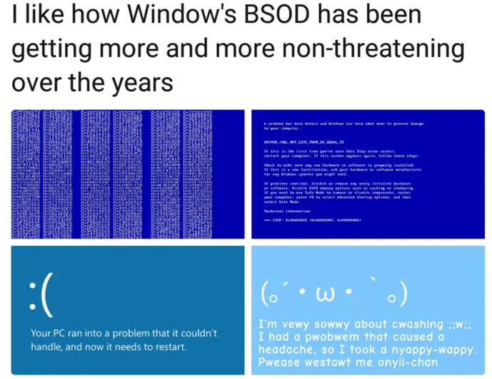
This on-screen message is called many things, from a kernel panic message on Linux to a Blue Screen of Death (BSOD) on Windows since Windows 95, to a more contemplative message on AmigaOS and BeOS/Haiku. Over the decades these Screens of Death (SoD) have changed considerably, from the highly informative screens of Windows NT to the simplified BSOD of Windows 8 onwards with its prominent sad emoji that has drawn a modicum of ridicule.
Now it seems that the Windows BSOD is about to change again, and may not even be blue any more. So what’s got a user to think about these changes? What were we ever supposed to get out of these special screens?
Meditating On A Fatal Error
AmigaOS fatal Guru Meditation error screen.
More important than the color of a fatal system error screen is what information it displays. After all, this is the sole direct clue the dismayed user gets when things go south, before sighing and hitting the reset button, followed by staring forlorn at the boot screen. After making it back into the OS, one can dig through the system logs for hints, but some information will only end up on the screen, such as when there is a storage drive issue.
The exact format of the information on these SoDs changes per OS and over time, with AmigaOS’ Guru Meditation screen being rather well-known. Although the naming was the result of an inside joke related to how the developers dealt with frequent system crashes, it stuck around in the production releases.
Interestingly, both Windows 9x and ME as well as AmigaOS have fatal and non-fatal special screens. In the case of AmigaOS you got a similar screen to the Guru Meditation screen with its error code, except in green and the optimistic notion that it might be possible to continue running after confirming the message. For Windows 9x/ME users this might be a familiar notion as well :
BSOD in Windows 95 after typing “C:\con\con” in the Run dialog.
In this series of OSes you’d get these screens, with mashing a key usually returning you to a slightly miffed but generally still running OS minus the misbehaving application or driver. It could of course happen that you’d get stuck in an endless loop of these screens until you gave up and gave the three-finger salute to put Windows out of its misery. This was an interesting design choice, which Microsoft’s Raymond Chen readily admits to being somewhat quaint. What it did do was abandon the current event and return to the event dispatcher to give things another shot.
Mac OS X 10.2 thru 10.2.8 kernel panic message.
A characteristic of these BSODs in Windows 9x/ME was also that they didn’t give you a massive amount of information to work with regarding the reason for the rude interruption. Incidentally, over on the Apple side of the fence things were not much more elaborate in this regard, with OS X’s kernel panic message getting plastered over with a ‘Nothing to see here, please restart’ message. This has been quite a constant ever since the ‘Sad Mac’ days of Apple, with friendly messages rather than any ‘technobabble’.
This quite contrasts with the world of Windows NT, where even the already trimmed BSOD of Windows XP is roughly on the level of the business-focused Windows 2000 in terms of information. Of note is also that a BSOD on Windows NT-based OSes is a true ‘Screen of Death’, from which you absolutely are not returning.
A BSOD in Windows XP. A true game over, with no continues.
These BSODs provide a significant amount of information, including the faulting module, the fault type and some hexadecimal values that can conceivably help with narrowing down the fault. Compared to the absolute information overload in Windows NT 3.1 with a partial on-screen memory dump, the level of detail provided by Windows 2000 through Windows 7 is probably just enough for the average user to get started with.
It’s here interesting that more recent versions of Windows have opted to default to restarting automatically when a BSOD occurs, which renders what is displayed on them rather irrelevant. Maybe that’s why Windows 8 began to just omit that information and opted to instead show a generic ‘collecting information’ progress counter before restarting.
Times Are Changing
People took the new BSOD screen in Windows 8 well.
Although nobody was complaining about the style of BSODs in Windows 7, somehow Windows 8 ended up with the massive sad emoji plastered on the top half of the screen and no hexadecimal values, which would now hopefully be found in the system log. Windows 10 also added a big QR code that leads to some troubleshooting instructions. This overly friendly and non-technical BSOD mostly bemused and annoyed the tech community, which proceeded to brutally make fun of it.
In this context it’s interesting to see these latest BSOD screen mockups from Microsoft that will purportedly make their way to Windows 11 soon.
These new BSOD screens seem to have a black background (perhaps a ‘Black Screen of Death’?), omit the sad emoji and reduce the text to an absolute minimum:
The new Windows 11 BSOD, as it’ll likely appear in upcoming releases.
What’s noticeable here is how it makes the stop code very small on the bottom of the screen, with the faulting module below it in an even smaller font. This remains a big departure from the BSOD formats up till Windows 7 where such information was clearly printed on the screen, along with additional information that anyone could copy over to paper or snap a picture of for a quick diagnosis.
But Why
The BSODs in ReactOS keep the Windows 2000-style format.
The crux here is whether Microsoft expects their users to use these SoDs for informative purposes, or whether they would rather that they get quickly forgotten about, as something shameful that users shouldn’t concern themselves with. It’s possible that they expect that the diagnostics get left to paid professionals, who would have to dig into the memory dumps, the system logs, and further information.
Whatever the case may be, it seems that the era of blue SoDs is well and truly over now in Windows. Gone too are any embellishments, general advice, and more in-depth debug information. This means that distinguishing the different causes behind a specific stop code, contained in the hexadecimal numbers, can only be teased out of the system log entry in Event Viewer, assuming it got in fact recorded and you’re not dealing with a boot partition or similar fundamental issue.
Although I’ll readily admit to not having seen many BSODs since probably Windows 2000 or XP — and those were on questionable hardware — the rarity of these events makes it in my view even more pertinent that these screens are as descriptive as possible, which is sadly not a feature that seems to be a priority for mainstream desktop OSes. Nor for niche OSes like Linux and BSD, tragically, where you have to know your way around the Systemd journalctl tool or equivalent to figure out where that kernel panic came from.
This is definitely a point where the SoD generated upon a fiery kernel explosion sets the tone for the user’s response.
With few exceptions, amateur radio is a notably sedentary pursuit. Yes, some hams will set up in a national or state park for a “Parks on the Air” activation, and particularly energetic operators may climb a mountain for “Summits on the Air,” but most hams spend a lot of time firmly planted in a comfortable chair, spinning the dials in search of distant signals or familiar callsigns to add to their logbook.
There’s another exception to the band-surfing tendencies of hams: fox hunting. Generally undertaken at a field day event, fox hunts pit hams against each other in a search for a small hidden transmitter, using directional antennas and portable receivers to zero in on often faint signals. It’s all in good fun, but fox hunts serve a more serious purpose: they train hams in the finer points of radio direction finding, a skill that can be used to track down everything from manmade noise sources to unlicensed operators. Or, as was done in the 1940s, to ferret out foreign agents using shortwave radio to transmit intelligence overseas.
That was the primary mission of the Radio Intelligence Division, a rapidly assembled organization tasked with protecting the United States by monitoring the airwaves and searching for spies. The RID proved to be remarkably effective during the war years, in part because it drew heavily from the amateur radio community to populate its many field stations, but also because it brought an engineering mindset to the problem of finding needles in a radio haystack.
Winds of War
America’s involvement in World War II was similar to Hemingway’s description of the process of going bankrupt: Gradually, then suddenly. Reeling from the effects of the Great Depression, the United States had little interest in European affairs and no appetite for intervention in what increasingly appeared to be a brewing military conflict. This isolationist attitude persisted through the 1930s, surviving even the recognized start of hostilities with Hitler’s sweep into Poland in 1939, at least for the general public.
But behind the scenes, long before the Japanese attack on Pearl Harbor, precipitous changes were afoot. War in Europe was clearly destined from the outset to engulf the world, and in the 1940s there was only one technology with a truly global reach: radio. The ether would soon be abuzz with signals directing troop movements, coordinating maritime activities, or, most concerningly, agents using spy radios to transmit vital intelligence to foreign governments. To be deaf to such signals would be an unacceptable risk to any nation that fancied itself a world power, even if it hadn’t yet taken a side in the conflict.
It was in that context that US President Franklin Roosevelt approved an emergency request from the Federal Communications Commission in 1940 for $1.6 million to fund a National Defense Operations section. The group would be part of the engineering department within the FCC and was tasked with detecting and eliminating any illegal transmissions originating from within the country. This was aided by an order in June of that year which prohibited the 51,000 US amateur radio operators from making any international contacts, and an order four months later for hams to submit to fingerprinting and proof of citizenship.
A Ham’s Ham
George Sterling (W1AE/W3DF). FCC commissioner in 1940, he organized and guided RID during the war. Source: National Assoc. of Broadcasters, 1948
The man behind the formation of the NDO was George Sterling. To call Sterling an early adopter of amateur radio would be an understatement. He plunged into radio as a hobby in 1908 at the tender age of 14, just a few years after Marconi and others demonstrated the potential of radio. He was licensed immediately after the passage of the Radio Act of 1927, callsign 1AE (later W1AE), and continued to experiment with spark gap stations. When the United States entered World War I, Sterling served for 19 months in France as an instructor in the Signal Corps, later organizing and operating the Corps’ first radio intelligence unit to locate enemy positions based on their radio transmissions.
After a brief post-war stint as a wireless operator in the Merchant Marine, Sterling returned to the US to begin a career in the federal government with a series of radio engineering and regulatory jobs. He rose through the ranks over the 1920s and 1930s, eventually becoming Assistant Chief of the FCC Field Division in 1937, in charge of radio engineering for the entire nation. It was on the strength of his performance in that role that he was tapped to be the first — and as it would turn out, only — chief of the NDO, which was quickly raised to the level of a new division within the FCC and renamed the Radio Intelligence Division.
To adequately protect the homeland, the RID needed a truly national footprint. Detecting shortwave transmissions is simple enough; any single location with enough radio equipment and a suitable antenna could catch most transmissions originating from within the US or its territories. But Sterling’s experience in France taught him that a network of listening stations would be needed to accurately triangulate on a source and provide a physical location for follow-up investigation.
The network that Sterling built would eventually comprise twelve primary stations scattered around the US and its territories, including Alaska, Hawaii, and Puerto Rico. Each primary station reported directly to RID headquarters in Washington, DC, by telephone, telegraph, or teletype. Each primary station supported up to a few dozen secondary stations, with further coastal monitoring stations set up as the war ground on and German U-boats became an increasingly common threat. The network would eventually comprise over 100 stations stretched from coast to coast and beyond, staffed by almost 900 agents.
Searching the Ether
The job of staffing these stations with skilled radio operators wasn’t easy, but Sterling knew he had a ready and willing pool to pull from: his fellow hams. Recently silenced and eager to put their skills to the test, hams signed up in droves for the RID. About 80% of the RID staff were composed of current or former amateur radio operators, including the enforcement branch of sworn officers who carried badges and guns. They were the sharp end of the spear, tasked with the “last mile” search for illicit transmitters and possible confrontation with foreign agents.
But before the fedora-sporting, Tommy-gun toting G-men could swoop in to make their arrest came the tedious process of detecting and classifying potentially illicit signals. This task was made easier by an emergency order issued on December 8, 1941, the day after the Pearl Harbor attack, forbidding all amateur radio transmissions below 56 MHz. This reduced the number of targets the RID listening stations had to sort through, but the high-frequency bands cover a lot of turf, and listening to all that spectrum at the same time required a little in-house innovation.
Today, monitoring wide swaths of the spectrum is relatively easy, but in the 1940s, it was another story. Providing this capability fell to RID engineers James Veatch and William Hoffert, who invented an aperiodic receiver that covered everything from 50 kHz to 60 MHz. Called the SSR-201, this radio used a grid-leak detector to rectify and amplify all signals picked up by the antenna. A bridge circuit connected the output of the detector to an audio amplifier, with the option to switch an audio oscillator into the circuit so that continuous wave transmissions — the spy’s operating mode of choice — could be monitored. There was also an audio-triggered relay that could start and stop an external recorder, allowing for unattended operation.
SSR-201 aperiodic receiver, used by the RID to track down clandestine transmitters. Note the “Magic Eye” indicator. Source: Steve Ellington (N4LQ)
The SSR-201 and a later variant, the K-series, were built by Kann Manufacturing, a somewhat grand name for a modest enterprise operating out of the Baltimore, Maryland, basement of Manuel Kann (W3ZK), a ham enlisted by the RID to mass produce the receiver. Working with a small team of radio hobbyists and broadcast engineers mainly working after hours, Kann Manufacturing managed to make about 200 of the all-band receivers by the end of the war, mainly for the RID but also for the Office of Strategic Services (OSS), the forerunner of the CIA, as well as the intelligence services of other allied nations.
These aperiodic receivers were fairly limited in terms of sensitivity and lacked directional capability, and so were good only for a first pass scan of a specific area for the presence of a signal. Consequently, they were often used in places where enemy transmitters were likely to operate, such as major cities near foreign embassies. This application relied on the built-in relay in the receiver to trigger a remote alarm or turn on a recorder, giving the radio its nickname: “The Watchdog.” The receivers were also often mounted in mobile patrol vehicles that would prowl likely locations for espionage, such as Army bases and seaports. Much later in the war, RID mobile units would drive through remote locations such as the woods around Oak Ridge, Tennessee, and an arid plateau in the high desert near Los Alamos, New Mexico, for reasons that would soon become all too obvious.
Radio G-Men
Adcock-type goniometer radio direction finder. The dipole array could be rotated 360 degrees from inside the shack to pinpoint a bearing to the transmitter. Source: Radio Boulevard
Once a candidate signal was detected and headquarters alerted to its frequency, characteristics, and perhaps even its contents, orders went out to the primary stations to begin triangulation. Primary stations were equipped with radio direction finding (RDF) equipment, including the Adcock-type goniometer. These were generally wooden structures elevated above the ground with a distinctive Adcock antenna on the roof of the shack. The antenna was a variation on the Adcock array using two vertical dipoles on a steerable mount. The dipoles were connected to the receiving gear in the shack 180 degrees out of phase. This produced a radiation pattern with very strong nulls broadside to the antenna, making it possible for operators to determine the precise angle to the source by rotating the antenna array until the signal is minimized. Multiple stations would report the angle to the target to headquarters, where it would be mapped out and a rough location determined by where the lines intersected.
With a rough location determined, RID mobile teams would hit the streets. RID had a fleet of mobile units based on commercial Ford and Hudson models, custom-built for undercover work. Radio gear partially filled the back seat area, power supplies filled the trunk, and a small steerable loop antenna could be deployed through the roof for radio direction finding on the go. Mobile units were also equipped with special radio sets for communicating back to their primary station, using the VHF band to avoid creating unwanted targets for the other stations to monitor.
Mobile units were generally capable of narrowing the source of a transmission down to a city block or so, but locating the people behind the transmission required legwork. Armed RID enforcement agents would set out in search of the transmitter, often aided by a device dubbed “The Snifter.” This was a field-strength meter specially built for covert operations; small enough to be pocketed and monitored through headphones styled to look like a hearing aid, the agents could use the Snifter to ferret out the spy, hopefully catching them in the act and sealing their fate.
A Job (Too) Well Done
For a hastily assembled organization, the RID was remarkably effective. Originally tasked with monitoring the entire United States and its territories, that scope very quickly expanded to include almost every country in South America, where the Nazi regime found support and encouragement. Between 1940 and 1944, the RID investigated tens of thousands, resulting in 400 unlicensed stations being silenced. Not all of these were nefarious; one unlucky teenager in Portland, Oregon, ran afoul of the RID by hooking an antenna up to a record player so he could play DJ to his girlfriend down the street. But other operations led to the capture of 200 spies, including a shipping executive who used his ships to refuel Nazi U-boats operating in the Gulf of Mexico, and the famous Dusquense Spy Ring operating on Long Island.
Thanks in large part to the technical prowess of the hams populating its ranks, the RID’s success contained the seeds of its downfall. Normally, such an important self-defense task as preventing radio espionage would fall to the Army or Navy, but neither organization had the technical expertise in 1940, nor did they have the time to learn given how woefully unprepared they were for the coming war. Both branches eventually caught up, though, and neither appreciated a bunch of civilians mucking around on their turf. Turf battles ensued, politics came into it, and by 1944, budget cuts effectively ended the RID as a standalone agency.
To the average person, walking into a flour- or sawmill and seeing dust swirling around is unlikely to evoke much of a response, but those in the know are quite likely to bolt for the nearest exit at this harrowing sight. For as harmless as a fine cloud of flour, sawdust or even coffee creamer may appear, each of these have the potential for a massive conflagration and even an earth-shattering detonation.
As for the ‘why’, the answer can be found in for example the working principle behind an internal combustion engine. While a puddle of gasoline is definitely flammable, the only thing that actually burns is the evaporated gaseous form above the liquid, ergo it’s a relatively slow process; in order to make petrol combust, it needs to be mixed in the right air-fuel ratio. If this mixture is then exposed to a spark, the fuel will nearly instantly burn, causing a detonation due to the sudden release of energy.
Similarly, flour, sawdust, and many other substances in powder form will burn gradually if a certain transition interface is maintained. A bucket of sawdust burns slowly, but if you create a sawdust cloud, it might just blow up the room.
This raises the questions of how to recognize this danger and what to do about it.
Welcome To The Chemical Safety Board
In an industrial setting, people will generally acknowledge that oil refineries and chemical plants are dangerous and can occasionally go boom in rather violent ways. More surprising is that something as seemingly innocuous as a sugar refinery and packing plant can go from a light sprinkling of sugar dust to a violent and lethal explosion within a second. This is however what happened in 2008 at the Georgia Imperial Sugar refinery, which killed fourteen and injured thirty-six. During this disaster, a primary and multiple secondary explosions ripped through the building, completely destroying it.
Georgia Imperial Sugar Refinery aftermath in 2008. (Credit: USCSB)
As described in the US Chemical Safety Board (USCSB) report with accompanying summary video (embedded below), the biggest cause was a lack of ventilation and cleaning that allowed for a build-up of sugar dust, with an ignition source, likely an overheated bearing, setting off the primary explosion. This explosion then found subsequent fuel to ignite elsewhere in the building, setting off a chain reaction.
What is striking is just how simple and straightforward both the build-up towards the disaster and the means to prevent it were. Even without knowing the exact air-fuel ratio for the fuel in question, there are only two points on the scale where you have a mixture that will not violently explode in the presence of an ignition source.
These are either a heavily saturated solution — too much fuel, not enough air — or the inverse. Essentially, if the dust-collection systems at the Imperial Sugar plant had been up to the task, and expanded to all relevant areas, the possibility of an ignition event would have likely been reduced to zero.
Things Like To Burn
In the context of dust explosions, it’s somewhat discomforting to realize just how many things around us are rather excellent sources of fuel. The aforementioned sugar, for example, is a carbohydrate (Cm(H2O)n). This chemical group also includes cellulose, which is a major part of wood dust, explaining why reducing dust levels in a woodworking shop is about much more than just keeping one’s lungs happy. Nobody wants their backyard woodworking shop to turn into a mini-Imperial Sugar ground zero, after all.
Carbohydrates aren’t far off from hydrocarbons, which includes our old friend petrol, as well as methane (CH4), butane (C4H10), etc., which are all delightfully combustible. All that the carbohydrates have in addition to carbon and hydrogen atoms are a lot of oxygen atoms, which is an interesting addition in the context of them being potential fuel sources. It incidentally also illustrates how important carbon is for life on this planet since its forms the literal backbone of its molecules.
Although one might conclude from this that only something which is a carbohydrate or hydrocarbon is highly flammable, there’s a whole other world out there of things that can burn. Case in point: metals.
Lit Metals
On December 9, 2010, workers were busy at the New Cumberland AL Solutions titanium plant in West Virginia, processing titanium powder. At this facility, scrap titanium and zirconium were milled and blended into a powder that got pressed into discs. Per the report, a malfunction inside one blender created a heat source that ignited the metal powder, killing three employees and injuring one contractor. As it turns out, no dust control methods were installed at the plant, allowing for uncontrolled dust build-up.
As pointed out in the USCSB report, both titanium and zirconium will readily ignite in particulate form, with zirconium capable of auto-igniting in air at room temperature. This is why the milling step at AL Solutions took place submerged in water. After ignition, titanium and zirconium require a Class D fire extinguisher, but it’s generally recommended to let large metal fires burn out by themselves. Using water on larger titanium fires can produce hydrogen, leading conceivably to even worse explosions.
The phenomenon of metal fires is probably best known from thermite. This is a mixture of a metal powder and a metal oxide. After ignited by an initial source of heat, the redox process becomes self-sustaining, providing the fuel, oxygen, and heat. While generally iron(III) oxide and aluminium are used, many more metals and metal oxides can be combined, including a copper oxide for a very rapid burn.
While thermite is intentionally kept as a powder, and often in some kind of container to create a molten phase that sustains itself, it shouldn’t be hard to imagine what happens if the metal is ground into a fine powder, distributed as a fine dust cloud in a confined room and exposed to an ignition source. At that point the differences between carbohydrates, hydrocarbons and metals become mostly academic to any survivors of the resulting inferno.
Preventing Dust Explosions
As should be quite obvious at this point, there’s no real way to fight a dust explosion, only to prevent it. Proper ventilation, preventing dust from building up and having active dust extraction in place where possible are about the most minimal precautions one should take. Complacency as happened at the Imperial Sugar plant merely invites disaster: if you can see the dust build-up on surfaces & dust in the air, you’re already at least at DEFCON 2.
A demonstration of how easy it is to create a solid dust explosion came from the Mythbusters back in 2008 when they tested the ‘sawdust cannon’ myth. This involved blowing sawdust into a cloud and igniting it with a flare, creating a massive fireball. After nearly getting their facial hair singed off with this roaring success, they then tried the same with non-dairy coffee creamer, which created an even more massive fireball.
Fortunately the Mythbusters build team was supervised by adults on the bomb range for these experiments, as it shows just how incredibly dangerous dust explosions can be. Even out in the open on a secure bomb range, never mind in an enclosed space, as hundreds have found out over the decades in the US alone. One only has to look at the USCSB’s dust explosions statistics to learn to respect the dangers a bit more.
Until the release of Windows 11, the upgrade proposition for Windows operating systems was rather straightforward: you considered whether the current version of Windows on your system still fulfilled your needs and if the answer was ‘no’, you’d buy an upgrade disc. Although system requirements slowly crept up over time, it was likely that your PC could still run the newest-and-greatest Windows version. Even Windows 7 had a graphical fallback mode, just in case your PC’s video card was a potato incapable of handling the GPU-accelerated Aero Glass UI.
This makes a lot of sense, as the most demanding software on a PC are the applications, not the OS. Yet with Windows 11 a new ‘hard’ requirement was added that would flip this on its head: the Trusted Platform Module (TPM) is a security feature that has been around for many years, but never saw much use outside of certain business and government applications. In addition to this, Windows 11 only officially supports a limited number of CPUs, which risks turning many still very capable PCs into expensive paperweights.
Although the TPM and CPU requirements can be circumvented with some effort, this is not supported by Microsoft and raises the specter of a wave of capable PCs being trashed when Windows 10 reaches EOL starting this year.
Not That Kind Of Trusted
Although ‘Trusted Platform’ and ‘security’ may sound like a positive thing for users, the opposite is really the case. The idea behind Trusted Computing (TC) is about consistent, verified behavior enforced by the hardware (and software). This means a computer system that’s not unlike a modern gaming console with a locked-down bootloader, with the TPM providing a unique key and secure means to validate that the hardware and software in the entire boot chain is the same as it was the last time. Effectively it’s an anti-tamper system in this use case that will just as happily lock out an intruder as the purported owner.
In the case of Windows 11, the TPM is used for this boot validation (Secure Boot), as well as storing the (highly controversial) Windows Hello’s biometric data and Bitlocker whole-disk encryption keys. Important to note here is that a TPM is not an essential feature for this kind of functionality, but rather a potentially more secure way to prevent tampering, while also making data recovery more complicated for the owner. This makes Trusted Computing effectively more a kind of Paranoid Computing, where the assumption is made that beyond the TPM you cannot trust anything about the hardware or software on the system until verified, with the user not being a part of the validation chain.
Theoretically, validating the boot process can help detect boot viruses, but this comes with a range of complications, not the least of which is that this would at most allow you to boot into Windows safe mode, if at all. You’d still need a virus scanner to detect and remove the infection, so using TPM-enforced Secure Boot does not help you here and can even complicate troubleshooting.
Outside of a corporate or government environment where highly sensitive data is handled, the benefits of a TPM are questionable, and there have been cases of Windows users who got locked out of their own data by Bitlocker failing to decrypt the drive, forwhateverreason. Expect support calls from family members on Windows 11 to become trickier as a result, also because firmware TPM (fTPM) bugs can cause big system issues like persistent stuttering.
Breaking The Rules
As much as Microsoft keeps trying to ram^Wgently convince us consumers to follow its ‘hard’ requirements, there are always ways to get around these. After all, software is just software, and thus Windows 11 can be installed on unsupported CPUs without a TPM or even an ‘unsupported’ version 1.2 TPM. Similarly, the ‘online Microsoft account’ requirement can be dodged with a few skillful tweaks and commands. The real question here is whether it makes sense to jump through these hoops to install Windows 11 on that first generation AMD Ryzen or Intel Core 2 Duo system from a support perspective.
Fortunately, one does not have to worry about losing access to Microsoft customer support here, because we all know that us computer peasants do not get that included with our Windows Home or Pro license. The worry is more about Windows Updates, especially security updates and updates that may break the OS installation by using CPU instructions unsupported by the local hardware.
Although Microsoft published a list of Windows 11 CPU requirements, it’s not immediately obvious what they are based on. Clearly it’s not about actual missing CPU instructions, or you wouldn’t even be able to install and run the OS. The only true hard limit in Windows 11 (for now) appears to be the UEFI BIOS requirement, but dodging the TPM 2.0 & CPU requirements is as easy as a quick dive into the Windows Registry by adding the AllowUpgradesWithUnsupportedTPMOrCPU key to HKEY_LOCAL_MACHINE\SYSTEM\Setup\MoSetup. You still need a TPM 1.2 module in this case.
When you use a tool like Rufus to write the Windows 11 installer to a USB stick you can even toggle a few boxes to automatically have all of this done for you. This even includes the option to completely disable TPM as well as the Secure Boot and 8 GB of RAM requirements. Congratulations, your 4 GB RAM, TPM-less Core 2 Duo system now runs Windows 11.
Risk Management
It remains to be seen whether Microsoft will truly enforce the TPM and CPU requirements in the future, that is requiring Secure Boot with Bitlocker. Over on the Apple side of the fence, the hardware has been performing system drive encryption along with other ‘security’ features since the appearance of the Apple T2 chip. It might be that Microsoft envisions a similar future for PCs, one in which even something as sacrilegious as dual-booting another OS becomes impossible.
Naturally, this raises the spectre of increasing hostility between users and their computer systems. Can you truly trust that Bitlocker won’t suddenly decide that it doesn’t want to unlock the boot drive any more? What if an fTPM issue bricks the system, or that a sneaky Windows 11 update a few months or years from now prevents a 10th generation Intel CPU from running the OS without crashing due to missing instructions? Do you really trust Microsoft that far?
It does seem like there are only bad options if you want to stay in the Windows ecosystem.
Strategizing
Clearly, there are no good responses to what Microsoft is attempting here with its absolutely user-hostile actions that try to push a closed, ‘AI’-infused ecosystem on its victi^Wusers. As someone who uses Windows 10 on a daily basis, this came only after running Windows 7 for as long as application support remained in place, which was years after Windows 7 support officially ended.
Perhaps for Windows users, sticking to Windows 10 is the best strategy here, while pushing software and hardware developers to keep supporting it (and maybe Windows 7 again too…). Windows 11 came preinstalled on the system that I write this on, but I erased it with a Windows 10 installation and reused the same, BIOS embedded, license key. I also disabled fTPM in the BIOS to prevent ‘accidental upgrades’, as Microsoft was so fond of doing back with Windows 7 when everyone absolutely had to use Windows 10.
I can hear the ‘just use Linux/BSD/etc.’ crowd already clamoring in the comments, and will preface this by saying that although I use Linux and BSD on a nearly basis, I would not want to use it as my primary desktop system for too many reasons to go into here. I’m still holding out some hope for ReactOS hitting its stride Any Day Now, but it’s tough to see a path forward beyond running Windows 10 into the ground, while holding only faint hope for Windows 12 becoming Microsoft’s gigantic Mea Culpa.
The seeds of the Internet were first sown in the late 1960s, with computers laced together in continent-spanning networks to aid in national defence. However, it was in the late 1990s that the end-user explosion took place, as everyday people flocked online in droves.
Many astute individuals saw the potential at the time, and rushed to establish their own ISPs to capitalize on the burgeoning market. Amongst them was a famous figure of some repute. David Bowie might have been best known for his cast of rock-and-roll characters and number one singles, but he was also an internet entrepreneur who got in on the ground floor—with BowieNet.
Is There Dialup On Mars?
The BowieNet website was very much of its era. Credit: Bowienet, screenshot
Bowie’s obsession with the Internet started early. He was well ahead of the curve of many of his contemporaries, becoming the first major artist to release a song online. Telling Lies was released as a downloadable track, which sold over 300,000 downloads, all the way back in 1996. A year later, the Earthling concert would be “cybercast” online, in an era when most home internet connections could barely handle streaming audio.
These moves were groundbreaking, at the time, but also exactly what you might expect of a major artist trying to reach fans with their music. However, Bowie’s interests in the Internet lay deeper than mere music distribution. He wanted a richer piece of the action, and his own ISP—BowieNet— was the answer.
The site was regularly updated with new styling and fresh content from Bowie’s musical output. Eventually, it became more website than ISP. Credit: BowieNet, screenshot
Bowie tapped some experts for help, enlisting Robert Goodale and Ron Roy in his nascent effort. The service first launched in the US, on September 1st 1998, starting at a price of $19.95 a month. The UK soon followed at a price of £10.00. Users were granted a somewhat awkward email address of username@davidbowie.com, along with 5MB of personal web hosting. Connectivity was provided in partnership with established network companies, with Concentric Network Corp effectively offering a turnkey ISP service, and UltraStar handling the business and marketing side of things. It was, for a time, also possible to gain a free subscription by signing up for a BowieBanc credit card, a branded front end for a banking services run by USABancShares.com. At its peak, the service reached a total of 100,000 subscribers.
Bonuses included access to a network of chatrooms. The man himself was a user of the service, regularly popping into live chats, both scheduled and casually. He’d often wind up answering a deluge of fan questions on topics like upcoming albums and whether or not he drank tea. The operation was part ISP, part Bowie content farm, with users also able to access audio and video clips from Bowie himself. BowieNet subscribers were able to access exclusive tracks from the Earthling tour live album, LiveAndWell.com, gained early access to tickets, and could explore BowieWorld, a 3D interactive city environment. To some controversy, users of other ISPs had to stump up a $5.95 fee to access content on davidbowie.com, which drew some criticism at the time.
Bowienet relied heavily on the leading Internet technologies of the time. Audio and graphics were provided via RealAudio and Flash, standards that are unbelievably janky compared to those in common use today. A 56K modem was recommended for users wishing to make the most of the content on offer. New features were continually added to the service; Christmas 2004 saw users invited to send “BowieNet E-Cards,” and the same month saw the launch of BowieNet blogs for subscribers, too.
Bowie spoke to the BBC in 1999 about his belief in the power of the Internet.
BowieNet didn’t last forever. The full-package experience was, realistically, more than people expected even from one of the world’s biggest musicians. In May 2006, the ISP was quietly shutdown, with the BowieNet web presence slimmed down to a website and fanclub style experience. In 2012, this too came to an end, and DavidBowie.com was retooled to a more typical artist website of the modern era.
Ultimately, BowieNet was an interesting experiment in the burgeoning days of the consumer-focused Internet. The most appealing features of the service were really more about delivering exclusive content and providing a connection between fans and the artist himself. It eventually became clear that Bowie didn’t need to be branding the internet connection itself to provide that.
Still, we can dream of other artists getting involved in the utilities game, just for fun. Gagaphone would have been a slam dunk back in 2009. One suspects DojaGas perhaps wouldn’t have the same instant market penetration without some kind of hit single about clean burning fuels. Speculate freely in the comments.
The life of a Hackaday writer often involves hours spent at a computer searching for all the cool hacks you love, but its perks come in not being tied to an office, and in periodically traveling around our community’s spaces. This suits me perfectly, because as well as having an all-consuming interest in technology, I am a lifelong rail enthusiast. I am rarely without an Interrail pass, and for me Europe’s railways serve as both comfortable mobile office space and a relatively stress free way to cover distance compared to the hell of security theatre at the airport. Along the way I find myself looking at the infrastructure which passes my window, and I have become increasingly fascinated with the power systems behind electric railways. There are so many different voltage and distribution standards as you cross the continent, so just how are they all accommodated? This deserves a closer look.
So Many Different Ways To Power A Train
Diesel trains like this one are for the dinosaurs.
In Europe where this is being written, the majority of main line railways run on electric power, as do many subsidiary routes. It’s not universal, for example my stomping ground in north Oxfordshire is still served by diesel trains, but in most cases if you take a long train journey it will be powered by electricity. This is a trend reflected in many other countries with large railway networks, except sadly for the United States, which has electrified only a small proportion of its huge network.
Of those many distribution standards there are two main groups when it comes to trackside, those with an overhead wire from which the train takes its power by a pantograph on its roof, or those with a third rail on which the train uses a sliding contact shoe. It’s more usual to see third rails in use on suburban and metro services, but if you take a trip to Southern England you’ll find third rail electric long distance express services. There are even four-rail systems such as the London Underground, where the fourth rail serves as an insulated return conductor to prevent electrolytic corrosion in the cast-iron tunnel linings.
These tracks in the south of England each have a 750 VDC third rail. Lamberhurst, CC BY-SA 4.0.
As if that wasn’t enough, we come to the different voltage standards. Those southern English trains run on 750 V DC while their overhead wire equivalents use 25 kV AC at 50Hz, but while Northern France also has 25 kV AC, the south of the country shares the same 3 kV DC standard as Belgium, and the Netherlands uses 1.5 kV DC. More unexpected still is Germany and most of Scandinavia, which uses 15 kV AC at only 16.7 Hz. This can have an effect on the trains themselves, for example Dutch trains are much slower than those of their neighbours because their lower voltage gives them less available energy for the same current.
This Dutch locomotive is on its 1.5 kV home turf, but it’s hauling an international service headed for the change to 3 kV DC in Belgium.
In general these different standards came about partly on national lines, but also their adoption depends upon how late the country in question electrified their network. For example aside from that southern third-rail network and a few individual lines elsewhere, the UK trains remained largely steam-powered until the early 1960s. Thus its electrification scheme used the most advanced option, 25 kV 50 Hz overhead wire. By contrast countries such as Belgium and the Netherlands had committed to their DC electrification schemes early in the 20th century and had too large an installed base to change course. That’s not to say that it’s impossible to upgrade though, as for example in India where 25 kV AC electrification has proceeded since the late 1950s and has included the upgrade of an earlier 1.5 kV DC system.
A particularly fascinating consequence of this comes at the moment when trains cross between different networks. Sometimes this is done in a station when the train isn’t moving, for example at Ashford in the UK when high-speed services switch between 25 kV AC overhead wire and 750 V DC third rail, and in other cases it happens on the move through having the differing voltages separated by a neutral section of overhead cable. Sadly I have never manged to travel to the Belgian border and witness this happening. Modern electric locomotives are often equipped to run from multiple voltages and take such changes in their stride.
Power To The People Movers
The 4-rail 750VDC system on the London Underground.
Finally, all this rail electrification infrastructure needs to get its power from somewhere. In the early days of railway electrification this would inevitably been a dedicated railway owned power station, but now it is more likely to involve a grid connection and some form of rectifier in the case of DC lines. The exception to this are systems with differing AC frequencies from their grid such as the German network, which has an entirely separate power generation and high voltage distribution system.
So that was the accumulated observations of a wandering Hackaday scribe, from the comfort of her air-conditioned express train. If I had to name my favourite of all the networks I have mentioned it would be the London Underground, perhaps because the warm and familiar embrace of an Edwardian deep tube line on a cold evening is an evocative feeling for me. When you next get the chance to ride a train keep an eye out for the power infrastructure, and may the experience be as satisfying and comfortable as it so often is for me.
The word “Schlieren” is German, and translates roughly to “streaks”. What is streaky photography, and why might you want to use it in a project? And where did this funny term come from?
Think of the heat shimmer you can see on a hot day. From the ideal gas law, we know that hot air is less dense than cold air. Because of that density difference, it has a slightly lower refractive index. A light ray passing through a density gradient faces a gradient of refractive index, so is bent, hence the shimmer.
Heat shimmer: the refractive index of the air is all over the place. Image: “Livestock crossing the road in Queensland, Australia” by [AlphaLemur]German lens-makers started talking about “Schelieren” sometime in the 19th century, if not before. Put yourself in the shoes of an early lensmaker: you’ve spent countless hours laboriously grinding away at a glass blank until it achieves the perfect curvature. Washing it clean of grit, you hold it to the light and you see aberration — maybe spatial, maybe chromatic. Schliere is the least colourful word you might say, but a schliere is at fault. Any wonder lens makers started to develop techniques to detect the invisible flaws they called schlieren?
When we talk of schlieren imagery today, we generally aren’t talking about inspecting glass blanks. Most of the time, we’re talking about a family of fluid-visualization techniques. We owe that nomenclature to German physicist August Toepler, who applied these optical techniques to visualizing fluid flow in the middle of the 19th century. There is now a whole family of schlieren imaging techniques, but at the core, they all rely on one simple fact: in a fluid like air, refractive index varies by density.
Toepler’s pioneering setup is the one we usually see in hacks nowadays. It is based on the Foucault Knife Edge Test for telescope mirrors. In Foucault’s test, a point source shines upon a concave mirror, and a razor blade is placed where the rays focus down to a point. The sensor, or Foucault’s eye, is behind the knife edge such that the returning light from the pinhole is interrupted. This has the effect of magnifying any flaws in the lens, because rays that deviate from the perfect return path will be blocked by the knife-edge and miss the eye.
[Toepler]’s single-mirror layout is quick and easy.Toepler’s photographic setup worked the same way, save for the replacement of the eye with a photographic camera, and the use of a known-good mirror. Any density changes in the air will refract the returning rays, and cause the characteristic light and dark patterns of a schlieren photograph. That’s the “classic” schlieren we’ve covered before, but it’s not the only game in town.
Fun Schlieren Tricks
A little color can make a big difference for any kind of visualization. (Image: “Colored schlieren image“ by [Settles1])For example, a small tweak that makes a big aesthetic difference is to replace the knife edge with a colour filter. The refracted rays then take on the colour of the filter. Indeed, with a couple of colour filters you can colour-code density variations: light that passes through high-density areas can be diverted through two different colored filters on either side, and the unbent rays can pass through a third. Not only is it very pretty, the human eye has an easier time picking up on variations in colour than value. Alternatively, the light from the point source can be passed through a prism. The linear spread of the frequencies from the prism has a similar effect to a line of colour filters: distortion gets color-coded.
A bigger tweak uses two convex mirrors, in two-mirror or Z-path schlieren. This has two main advantages: one, the parallel rays between the mirrors mean the test area can be behind glass, useful for keeping sensitive optics outside of a high-speed wind tunnel. (This is the technique NASA used to use.) Parallel rays also ensure that the shadow of both any objects and the fluid flow are no issue; having the light source off-centre in the classic schrilien can cause artifacts from shadows. Of course you pay for these advantages: literally, in the sense that you have to buy two mirrors, and figuratively in that alignment is twice as tricky. The same colour tricks work just as well, though, and was in often use at NASA.
The z-fold allows for parallel rays in the test area.
There’s absolutely no reason that you could not substitute lenses for mirrors, in either the Z-path or classical version, and people have to good effect in both cases. Indeed, Robert Hooke’s first experiment involved visualizing the flow of air above a candle using a converging lens, which was optically equivalent to Toepler’s classic single-mirror setup. Generally speaking, mirrors are preferred for the same reason you never see an 8” refracting telescope at a star party: big mirrors are way easier to make than large lenses.
T-34s captured in flight with NASA’s AirBOS technique. Image credit : NASA.
What if you want to visualize something that doesn’t fit in front of a mirror? There are actually several options. One is background-oriented schrilien, which we’ve covered here. With a known background, deviations from it can be extracted using digital signal processing techniques. We showed it working with a smart phone and a printed page, but you can use any non-uniform background. NASA uses the ground: by looking down, Airborn Background Oriented Schlieren (AirBOS) can provide flow visualization of shockwaves and vortices around an airplane in flight.
In the days before we all had supercomputers in our pockets, large-scale flow-visualization was still possible; it just needed an optical trick. A pair of matching grids is needed: one before the lamp, creating a projection of light and dark, and a second one before the lens. Rays deflected by density variations will run into the camera grid. This was used to good effect by Gary S. Styles to visualize HVAC airflows in 1997
Can’t find a big mirror? Try a grid.
Which gets us to another application, separate from aerospace. Wind tunnel photos are very cool, but let’s be honest: most of us are not working on supersonic drones or rocket nozzles. Of course air flow does not have to be supersonic to create density variations; subsonic wind tunnels can be equipped with schlieren optics as well.
HVAC as you’ve never seen it before. Imagine those were ABS fumes? (Image from Styles, 1997.)
Or maybe you are more concerned with airflow around components? To ID a hotspot on a board, IR photography is much easier. On the other hand, if your hotspot is due to insufficient cooling rather than component failure? Schlieren imagery can help you visualize the flow of air around the board, letting you optimize the cooling paths.
That’s probably going to be easiest with the background-oriented version: you can just stick the background on one side of your project’s enclosure and go to work. I think that if any of you start using schlieren imaging in your projects, this might be the killer app that will inspire you to do so.
Another place we use air? In the maker space. I have yet to see someone use schlieren photography to tweak the cooling ducts on their 3D printer, but you certainly could. (It has been used to see shielding gasses in welding, for example.) For that matter, depending what you print, proper exhaust of the fumes is a major health concern. Those fumes will show up easily, given the temperature difference, and possibly even the chemical composition changing the density of the air.
Remember that the key thing being imaged isn’t temperature difference, but density difference. Sound waves are density waves, can they be imaged in this way? Yes! The standing waves in ultrasonic levitation rigs are a popular target. Stroboscopic effects can be used for non-standing waves, though keep in mind that the sound pressure level is the inverse of frequency, so audible frequencies may not be practical if you like your eardrums.
Schlieren photography isn’t limited to air. Density variations in liquids and solids are game, too. Want to see how multiple solutions of varying density or tempeature are mixing? Schlieren imaging has you covered. Watch convection in a water tank? Or, if you happen to be making lenses, you could go right back to basics and use one of the schlieren techniques discussed here to help you make them perfect.
The real reason I’m writing about these techniques aren’t the varied applications I hope you hackers can put them to: it’s an excuse to collect all the pretty pictures of flow visualization I can cram into this article. So if you read this and thought “I have no practical reason to use this technique, but it does seem cool” – great! We’re in the same boat. Let’s make some pretty pictures. It still counts as a hack.
Not too long ago, I was searching for ideas for the next installment of the “Big Chemistry” series when I found an article that discussed the world’s most-produced chemicals. It was an interesting article, right up my alley, and helpfully contained a top-ten list that I could use as a crib sheet for future articles, at least for the ones I hadn’t covered already, like the Haber-Bosch process for ammonia.
Number one on the list surprised me, though: sulfuric acid. The article stated that it was far and away the most produced chemical in the world, with 36 million tons produced every year in the United States alone, out of something like 265 million tons a year globally. It’s used in a vast number of industrial processes, and pretty much everywhere you need something cleaned or dissolved or oxidized, you’ll find sulfuric acid.
Staggering numbers, to be sure, but is it really the most produced chemical on Earth? I’d argue not by a long shot, when there’s a chemical that we make 4.4 billion tons of every year: Portland cement. It might not seem like a chemical in the traditional sense of the word, but once you get a look at what it takes to make the stuff, how finely tuned it can be for specific uses, and how when mixed with sand, gravel, and water it becomes the stuff that holds our world together, you might agree that cement and concrete fit the bill of “Big Chemistry.”
Rock Glue
To kick things off, it might be helpful to define some basic terms. Despite the tendency to use them as synonyms among laypeople, “cement” and “concrete” are entirely different things. Concrete is the finished building material of which cement is only one part, albeit a critical part. Cement is, for lack of a better term, the glue that binds gravel and sand together into a coherent mass, allowing it to be used as a building material.
What did the Romans ever do for us? The concrete dome of the Pantheon is still standing after 2,000 years. Source: Image by Sean O’Neill from Flickr via Monolithic Dome Institute (CC BY-ND 2.0)
It’s not entirely clear who first discovered that calcium oxide, or lime, mixed with certain silicate materials would form a binder strong enough to stick rocks together, but it certainly goes back into antiquity. The Romans get an outsized but well-deserved portion of the credit thanks to their use of pozzolana, a silicate-rich volcanic ash, to make the concrete that held the aqueducts together and built such amazing structures as the dome of the Pantheon. But the use of cement in one form or another can be traced back at least to ancient Egypt, and probably beyond.
Although there are many kinds of cement, we’ll limit our discussion to Portland cement, mainly because it’s what is almost exclusively manufactured today. (The “Portland” name was a bit of branding by its inventor, Joseph Aspdin, who thought the cured product resembled the famous limestone from the Isle of Portland off the coast of Dorset in the English Channel.)
Portland cement manufacturing begins with harvesting its primary raw material, limestone. Limestone is a sedimentary rock rich in carbonates, especially calcium carbonate (CaCO3), which tends to be found in areas once covered by warm, shallow inland seas. Along with the fact that limestone forms between 20% and 25% of all sedimentary rocks on Earth, that makes limestone deposits pretty easy to find and exploit.
Cement production begins with quarrying and crushing vast amounts of limestone. Cement plants are usually built alongside the quarries that produce the limestone or even right within them, to reduce transportation costs. Crushed limestone can be moved around the plant on conveyor belts or using powerful fans to blow the crushed rock through large pipes. Smaller plants might simply move raw materials around using haul trucks and front-end loaders. Along with the other primary ingredient, clay, limestone is stored in large silos located close to the star of the show: the rotary kiln.
Turning and Burning
A rotary kiln is an enormous tube, up to seven meters in diameter and perhaps 80 m long, set on a slight angle from the horizontal by a series of supports along its length. The supports have bearings built into them that allow the whole assembly to turn slowly, hence the name. The kiln is lined with refractory materials to resist the flames of a burner set in the lower end of the tube. Exhaust gases exit the kiln from the upper end through a riser pipe, which directs the hot gas through a series of preheaters that slowly raise the temperature of the entering raw materials, known as rawmix.
The rotary kiln is the centerpiece of Portland cement production. While hard to see in this photo, the body of the kiln tilts slightly down toward the structure on the left, where the burner enters and finished clinker exits. Source: by nordroden, via Adobe Stock (licensed).
Preheating the rawmix drives off any remaining water before it enters the kiln, and begins the decomposition of limestone into lime, or calcium oxide:
The rotation of the kiln along with its slight slope results in a slow migration of rawmix down the length of the kiln and into increasingly hotter regions. Different reactions occur as the temperature increases. At the top of the kiln, the 500 °C heat decomposes the clay into silicate and aluminum oxide. Further down, as the heat reaches the 800 °C range, calcium oxide reacts with silicate to form the calcium silicate mineral known as belite:
Finally, near the bottom of the kiln, belite and calcium oxide react to form another calcium silicate, alite:
It’s worth noting that cement chemists have a specialized nomenclature for alite, belite, and all the other intermediary phases of Portland cement production. It’s a shorthand that looks similar to standard chemical nomenclature, and while we’re sure it makes things easier for them, it’s somewhat infuriating to outsiders. We’ll stick to standard notation here to make things simpler. It’s also important to note that the aluminates that decomposed from the clay are still present in the rawmix. Even though they’re not shown in these reactions, they’re still critical to the proper curing of the cement.
Portland cement clinker. Each ball is just a couple of centimeters in diameter. Source: مرتضا, Public domain
The final section of the kiln is the hottest, at 1,500 °C. The extreme heat causes the material to sinter, a physical change that partially melts the particles and adheres them together into small, gray lumps called clinker. When the clinker pellets drop from the bottom of the kiln, they are still incandescently hot. Blasts of air that rapidly bring the clinker down to around 100 °C. The exhaust from the clinker cooler joins the kiln exhaust and helps preheat the incoming rawmix charge, while the cooled clinker is mixed with a small amount of gypsum and ground in a ball mill. The fine gray powder is either bagged or piped into bulk containers for shipment by road, rail, or bulk cargo ship.
The Cure
Most cement is shipped to concrete plants, which tend to be much more widely distributed than cement plants due to the perishable nature of the product they produce. True, both plants rely on nearby deposits of easily accessible rock, but where cement requires limestone, the gravel and sand that go into concrete can come from a wide variety of rock types.
Concrete plants quarry massive amounts of rock, crush it to specifications, and stockpile the material until needed. Orders for concrete are fulfilled by mixing gravel and sand in the proper proportions in a mixer housed in a batch house, which is elevated above the ground to allow space for mixer trucks to drive underneath. The batch house operators mix aggregate, sand, and any other admixtures the customer might require, such as plasticizers, retarders, accelerants, or reinforcers like chopped fiberglass, before adding the prescribed amount of cement from storage silos. Water may or may not be added to the mix at this point. If the distance from the concrete plant to the job site is far enough, it may make sense to load the dry mix into the mixer truck and add the water later. But once the water goes into the mix, the clock starts ticking, because the cement begins to cure.
Cement curing is a complex process involving the calcium silicates (alite and belite) in the cement, as well as the aluminate phases. Overall, the calcium silicates are hydrated by the water into a gel-like substance of calcium oxide and silicate. For alite, the reaction is:
Scanning electron micrograph of cured Portland cement, showing needle-like ettringite and plate-like calcium oxide. Source: US Department of Transportation, Public domain
At the same time, the aluminate phases in the cement are being hydrated and interacting with the gypsum, which prevents early setting by forming a mineral known as ettringite. Without the needle-like ettringite crystals, aluminate ions would adsorb onto alite and block it from hydrating, which would quickly reduce the plasticity of the mix. Ideally, the ettringite crystals interlock with the calcium silicate gel, which binds to the surface of the sand and gravel and locks it into a solid.
Depending on which adjuvants were added to the mix, most concretes begin to lose workability within a few hours of rehydration. Initial curing is generally complete within about 24 hours, but the curing process continues long after the material has solidified. Concrete in this state is referred to as “green,” and continues to gain strength over a period of weeks or even months.
If you take two objects with fairly smooth surfaces, and put these together, you would not expect them to stick together. At least not without a liberal amount of adhesive, water or some other substance to facilitate a temporary or more permanent bond. This assumption gets tossed out of the window when it comes to optical contact bonding, which is a process whereby two surfaces are joined together without glue.
The fascinating aspect of this process is that it uses the intermolecular forces in each surface, which normally don’t play a major role, due to the relatively rough surfaces. Before intermolecular forces like Van der Waals forces and hydrogen bonds become relevant, the two surfaces should not have imperfections or contaminants on the order of more than a few nanometers. Assuming that this is the case, both surfaces will bond together in a way that is permanent enough that breaking it is likely to cause damage.
Although more labor-intensive than using adhesives, the advantages are massive when considering that it creates an effectively uninterrupted optical interface. This makes it a perfect choice for especially high-precision optics, but with absolutely zero room for error.
Intermolecular Forces
Thirty-six gauges wrung together and held horizontally. (Credit: Goodrich & Stanley, 1907)
As creatures of the macro world, we are largely only aware of the macro effects of the various forces at play around us. We mostly understand gravity, and how the friction of our hand against a glass prevents it from sliding out of our hand before shattering into many pieces on the floor. Yet add some water on the skin of our hands, and suddenly there’s not enough friction, leading to unfortunate glass slippage, or a lid on a jar of pickles that stubbornly refuses to open because we cannot generate enough friction until we manage to dry our hands sufficiently.
Many of these macro-level interactions are the result of molecular-level interactions, which range from the glass staying in one piece instead of drifting off as a cloud of atoms, to the system property that we refer to as ‘friction‘, which itself is also subdivided into static stiction and dynamic friction. The system of friction can be considered to be analogous to contact binding when we consider two plates with one placed on top of the other. If we proceed to change the angle of these stacked plates, at some point the top plate will slide off the bottom plate. This is the point where the binding forces can no longer compensate for the gravitational pull, with material type and surface finish affecting the final angle.
An interesting example of how much surface smoothness matters can be found in gauge blocks. These are precision ground and lapped blocks of metal or ceramic which match a specific thickness. Used for mainly calibration purposes, they posses the fascinating property due to their smooth surfaces that you can make multiple of them adhere together in a near-permanent manner in what is called wringing. This way you can combine multiple lengths to create a single gauge block with sub-millimeter accuracy.
Enabling all this are intermolecular forces, in particular the Van der Waals forces, including dipole-dipole electrostatic interactions. These do not rely on chemical or similar properties as they depend only on aspects like the mutual repulsion between the electron clouds of the atoms that make up the materials involved. Although these forces are very weak and drop off rapidly with distance, they are generally independent of aspects like temperature.
Hydrogen bonds can also occur if present, with each type of force having its own set of characteristics in terms of strength and effective distance.
Make It Smooth
Surface roughnesses of a SiO2 wafer (left, ≈1.01 nm RMS) and an ULE wafer (right, ≈1.03 nm RMS) (Credit: Kalkowski et al., 2011)
One does not simply polish a surface to a nanometer-perfect sheen, though as computer cooling enthusiasts and kin are aware, you can get pretty far with a smooth surface and various grits of sandpaper all the way up to ridiculously high levels. Giving enough effort and time, you can match the surface finish of something like gauge blocks and shave off another degree or two on that CPU at load.
Achieving even smoother surfaces is essentially taking this to the extreme, though it can be done without 40,000 grit sandpaper as well. The easiest way is probably found in glass and optics production, the latter of which has benefited immensely from the semiconductor industry. A good demonstration of this can be found in a 2011 paper (full PDF) by Fraunhofer researchers G. Kalkowski et al. as published in Optical Manufacturing and Testing.
They describe the use of optical contact bonding in the context of glass-glass for optical and precision engineering, specifically low-expansion fused silica (SiO2) and ultra-low expansion materials. There is significant overlap between semiconductor wafers and the wafers used here, with the same nanometer level precision, <1 nm RMS surface roughness, a given. Before joining, the surfaces are extensively cleaned of any contaminants in a vacuum environment.
Worse Than Superglue
Once the surfaces are prepared, there comes the tricky part of making both sides join together. Unlike with the gauge blocks, these super smooth surfaces will not come apart again without a fight, and there’s no opportunity to shimmy them around to get that perfect fit like when using adhesive. With the demonstrated method by Kalkowski et al., the wafers were joined followed by heating to 250 ℃ to create permanent Si-O-Si bonds between the two surfaces. In addition bonding pressure was applied for two hours at 2 MPa using either N2 or O2 gas.
This also shows another aspect of optical contact binding: although it’s not technically permanent, the bond is still just using intermolecular forces, and, as shown in this study, can be pried apart with a razorblade and some effort. By heating and applying pressure, the two surfaces can be annealed, forming molecular bonds and effectively turning the two parts into one.
Of course, there are many more considerations, such as the low-expansion materials used in the referenced study. If both sides use too dissimilar materials, the bond will be significantly more tenuous than if the materials with the same expansion properties are used. It’s also possible to use chemically activated direct bonding with a chemical activation process, all of which relies on the used materials.
In summary, optical contact bonding is a very useful technique, though you may want to have a well-equipped home lab if you want to give it a spin yourself.
Once upon a time, typing “www” at the start of a URL was as automatic as breathing. And yet, these days, most of us go straight to “hackaday.com” without bothering with those three letters that once defined the internet.
Have you ever wondered why those letters were there in the first place, and when exactly they became optional? Let’s dig into the archaeology of the early web and trace how this ubiquitous prefix went from essential to obsolete.
Where Did You Go?
The first website didn’t bother with any of that www. nonsense! Credit: author screenshot
It may shock you to find out that the “www.” prefix was actually never really a key feature or necessity at all. To understand why, we need only contemplate the very first website, created by Tim Berners-Lee at CERN in 1990. Running on a NeXT workstation employed as a server, the site could be accessed at a simple URL: “http//info.cern.ch/”—no WWW needed. Berners-Lee had invented the World Wide Web, and called it as such, but he hadn’t included the prefix in his URL at all. So where did it come from?
McDonald’s were ahead of the times – in 1999, their website featured the “mcdonalds.com” domain, no prefix, though you did need it to actually get to the site. Credit: screenshot via Web Archive
As it turns out, the www prefix largely came about due to prevailing trends on the early Internet. It had become typical to separate out different services on a domain by using subdomains. For example, a company might have FTP access on http://ftp.company.com, while the SMTP server would be accessed via the smpt.company.com subdomain. In turn, when it came to establish a server to run a World Wide Web page, network administrators followed existing convention. Thus, they would put the WWW server on the www. subdomain, creating http://www.company.com.
This soon became standard practice, and in short order, was expected by members of the broader public as the joined the Internet in the late 1990s. It wasn’t long before end users were ignoring the http:// prefix at the start of domains, as web browsers didn’t really need you to type that in. However, www. had more of a foothold in the public consciousness. Along with “.com”, it became an obvious way for companies to highlight their new fancy website in their public facing marketing materials. For many years, this was simply how things were done. Users expected to type “www” before a domain name, and thus it became an ingrained part of the culture.
Eventually, though, trends shifted. For many domains, web traffic was the sole dominant use, so it became somewhat unnecessary to fold web traffic under its own subdomain. There was also a technological shift when the HTTP/1.1 protocol was introduced in 1999, with the “Host” header enabling multiple domains to be hosted on a single server. This, along with tweaks to DNS, also made it trivial to ensure “www.yoursite.com” and “yoursite.com” went to the same place. Beyond that, fashion-forward companies started dropping the leading www. for a cleaner look in marketing. Eventually, this would become the norm, with “www.” soon looking old hat.
Visit microsoft.com in Chrome, and you might think that’s where you really are… Credit: author screenshot
Of course, today, “www” is mostly dying out, at least as far as the industry and most end users are concerned. Few of us spend much time typing in URLs by hand these days, and fewer of us could remember the last time we felt the need to include “www.” at the beginning. Of course, if you want to make your business look out of touch, you could still include www. on your marketing materials, but people might think you’re an old fuddy duddy.
…but you’re not! Click in the address bar, and Chrome will show you the real URL. www. and all. Embarrassing! Credit: author screenshotHackaday, though? We rock without the prefix. Cutting-edge out here, folks. Credit: author screenshot
Using the www. prefix can still have some value when it comes to cookies, however. If you don’t use the prefix and someone goes to yoursite.com, that cookie would be sent to all subdomains. However, if your main page is set up at http://www.yoursite.com, it’s effectively on it’s own subdomain, along with any others you might have… like store.yoursite.com, blog.yoursite.com, and so on. This allows cookies to be more effectively managed across a site spanning multiple subdomains.
In any case, most browsers have taken a stance against the significance of “www”. Chrome, Safari, Firefox, and Edge all hide the prefix even when you are technically visiting a website that does still use the www. subdomain (like http://www.microsoft.com). You can try it yourself in Chrome—head over to a www. site and watch as the prefix disappears from the taskbar. If you really want to know if you’re on a www subdomain or not, though, you can click into the taskbar and it will give you the full URL, HTTP:// or HTTPS:// included, and all.
The “www” prefix stands as a reminder that the internet is a living, evolving thing. Over time, technical necessities become conventions, conventions become habits, and habits eventually fade away when they no longer serve a purpose. Yet we still see those three letters pop up on the Web now and then, a digital vestigial organ from the early days of the web. The next time you mindlessly type a URL without those three Ws, spare a thought for this small piece of internet history that shaped how we access information for decades. Largely gone, but not yet quite forgotten.
Over the course of more than a decade, physical media has gradually vanished from public view. Once computers had an optical drive except for ultrabooks, but these days computer cases that even support an internal optical drive are rare. Rather than manuals and drivers included on a data CD you now get a QR code for an online download. In the home, DVD and Blu-ray (BD) players have given way to smart TVs with integrated content streaming apps for various services. Music and kin are enjoyed via smart speakers and smart phones that stream audio content from online services. Even books are now commonly read on screens rather than printed on paper.
With these changes, stores selling physical media have mostly shuttered, with much audiovisual and software content no longer pressed on discs or printed. This situation might lead one to believe that the end of physical media is nigh, but the contradiction here comes in the form of a strong revival of primarily what used to be considered firmly obsolete physical media formats. While CD, DVD and BD sales are plummeting off a cliff, vinyl records, cassette tapes and even media like 8-track tapes are undergoing a resurgence, in a process that feels hard to explain.
How big is this revival, truly? Are people tired of digital restrictions management (DRM), high service fees and/or content in their playlists getting vanished or altered? Perhaps it is out of a sense of (faux) nostalgia?
A Deserved End
Ask anyone who ever has had to use any type of physical media and they’ll be able to provide a list of issues with various types of physical media. Vinyl always was cumbersome, with clicking and popping from dust in the grooves, and gradual degradation of the record with a lifespan in the hundreds of plays. Audio cassettes were similar, with especially Type I cassettes having a lot of background hiss that the best Dolby noise reduction (NR) systems like Dolby B, C and S only managed to tame to a certain extent.
Add to this issues like wow and flutter, and the joy of having a sticky capstan roller resulting in tape spaghetti when you open the tape deck, ruining that precious tape that you had only recently bought. These issues made CDs an obvious improvement over both audio formats, as they were fully digital and didn’t wear out from merely playing them hundreds of times.
Although audio CDs are better in many ways, they do not lend themselves to portability very well unlike tape, with anti-shock read buffers being an absolute necessity to make portable CD players at all feasible. This same issue made data CDs equally fraught with issues, especially if you went into the business of writing your own (data or audio) CDs on CD-Rs. Burning coasters was exceedingly common for years. Yet the alternative was floppies – with LS-120 and Zip disks never really gaining much market share – or early Flash memory, whether USB sticks (MB-sized) or those inside MP3 players and early digital cameras. There were no good options, but we muddled on.
On the video side VHS had truly brought the theater into the home, even if it was at fuzzy NTSC or PAL quality with astounding color bleed and other artefacts. Much like audio cassette tapes, here too the tape would gradually wear out, with the analog video signal ensuring that making copies would result in an inferior copy.
Rewinding VHS tapes was the eternal curse, especially when popping in that tape from the rental store and finding that the previous person had neither been kind, nor rewound. Even if being able to record TV shows to watch later was an absolute game changer, you better hope that you managed to appease the VHS gods and had it start at the right time.
It could be argued that DVDs were mostly perfect aside from a lack of recording functionality by default and pressed DVDs featuring unskippable trailers and similar nonsense. One can also easily argue here that DVDs’ success was mostly due to its DRM getting cracked early on when the CSS master key leaked. DVDs would also introduce region codes that made this format less universal than VHS and made things like snapping up a movie during an overseas vacation effectively impossible.
This was a practice that BDs doubled-down on, and with the encryption still intact to this day, it means that unlike with DVDs you must pay to be allowed to watch BDs which you previously bought, whether this cost is included in the dedicated BD player, or the license cost for a BD video player for on the PC.
Thus, when streaming services gave access to a very large library for a (small) monthly fee, and cloud storage providers popped up everywhere, it seemed like a no-brainer. It was like paying to have the world’s largest rental store next door to your house, or a data storage center for all your data. All you had to do was create an account, whip out the credit card and no more worries.
Combined with increasingly faster and ubiquitous internet connections, the age of physical media seemed to have come to its natural end.
The Revival
US vinyl record sales 1995-2020. (Credit: Ippantekina with RIAA data)
Despite this perfect landscape where all content is available all the time via online services through your smart speakers, smart TVs, smart phones and so on, the number of vinyl record sales has surged the past years despite its reported death in the early 2000s. In 2024 the vinyl records market grew another few percent, with more and more new record pressing plants coming online. In addition to vinyl sales, UK cassette sales also climbed, hitting 136,000 in 2023. CD sales meanwhile have kept plummeting, but not as strongly any more.
Perhaps the most interesting part is that most of newly released vinyl are new albums, by artists like Taylor Swift, yet even the classics like Pink Floyd and Fleetwood Mac keep selling. As for the ‘why’, some suggest that it’s the social and physical experience of physical media and the associated interactions that is a driving factor. In this sense it’s more of a (cultural) statement, as a rejection of the world of digital streaming. The sleeve of a vinyl record also provides a lot of space for art and other creative expressions, all of which provides a collectible value.
Although so far CD sales haven’t really seen a revival, the much lower cost of producing these shiny discs could reinvigorate this market too for many of the same reasons. Who doesn’t remember hanging out with a buddy and reading the booklet of a CD album which they just put into the player after fetching it from their shelves? Maybe checking the lyrics, finding some fun Easter eggs or interesting factoids that the artists put in it, and having a good laugh about it with your buddy.
As some responded when asked, they like the more intimate experience of vinyl records along with having a physical item to own, while streaming music is fine for background music. The added value of physical media here is thus less about sound quality, and more about a (social) experience and collectibles.
On the video side of the fence there is no such cheerful news, however. In 2024 sales of DVDs, BDs and UHD (4K) BDs dropped by 23.4% year-over-year to below $1B in the US. This compares with a $16B market value in 2005, underlining a collapsing market amidst brick & mortar stores either entirely removing their DVD & BD section, or massively downsizing it. Recently Sony also announced the cessation of its recordable BD, MD and MiniDV media, as a further indication of where the market is heading.
Despite streaming services repeatedly bifurcating themselves and their libraries, raising prices and constantly pulling series and movies, this does not seem to hurt their revenue much, if at all. This is true for both audiovisual services like Netflix, but also for audio streaming services like Spotify, who are seeing increasing demand (per Billboard), even as digital track sales are seeing a pretty big drop year-over-year (-17.9% for Week 16 of 2025).
Perhaps this latter statistic is indicative that the idea of ‘buying’ a music album or film which – courtesy of DRM – is something that you’re technically only leasing, is falling out of favor. This is also illustrated by the end of Apple’s iPod personal music player in favor of its smart phones that are better suited for streaming music on the go. Meanwhile many series and some movies are only released on certain streaming platforms with no physical media release, which incentivizes people to keep those subscriptions.
To continue the big next-door-rental-store analogy, in 2025 said single rental store has now turned into fifty stores, each carrying a different inventory that gets either shuffled between stores or tossed into a shredder from time to time. Yet one of them will have That New Series, which makes them a great choice, unless you like more rare and older titles, in which case you get to hunt the dusty shelves over at EBay and kin.
It’s A Personal Thing
Humans aren’t automatons that have to adhere to rigid programming. They have each their own preferences, ideologies and wishes. While for some people the DRM that has crept into the audiovisual world since DVDs, Sony’s MiniDisc (with initial ATRAC requirement), rootkits on audio CDs, and digital music sales continues to be a deal-breaker, others feel no need to own all the music and videos they like and put them on their NAS for local streaming. For some the lower audio quality of Spotify and kin is no concern, much like for those who listened to 64 kbit WMA files in the early 2000s, while for others only FLACs ripped from a CD can begin to appease their tastes.
Reading through the many reports about ‘the physical media’ revival, what jumps out is that on one hand it is about the exclusivity of releasing something on e.g. vinyl, which is also why sites like Bandcamp offer the purchase of a physical album, and mainstream artists more and more often opt for this. This ties into the other noticeable reason, which is the experience around physical media. Not just that of handling the physical album and operating of the playback device, but also that of the offline experience, being able to share the experience with others without any screens or other distractions around. Call it touching grass in a socializing sense.
As I mentioned already in an earlier article on physical media and its purported revival, there is no reason why people cannot enjoy both physical media as well as online streaming. If one considers the rental store analogy, the former (physical media) is much the same as it always was, while online streaming merely replaces the brick & mortar rental store. Except that these new rental stores do not take requests for tapes or DVDs not in inventory and will instead tell you to subscribe to another store or use a VPN, but that’s another can of worms.
So far optical media seems to be still in freefall, and it’s not certain whether it will recover, or even whether there might be incentives in board rooms to not have DVDs and BDs simply die. Here the thought of having countless series and movies forever behind paywalls, with occasional ‘vanishings’ might be reason enough for more people to seek out a physical version they can own, or it may be that the feared erasure of so much media in this digital, DRM age is inevitable.
Running Up That Hill
Original Sony Walkman TPS-L2 from 1979.
The ironic thing about this revival is that it seems influenced very much by streaming services, such as with the appearance of a portable cassette player in Netflix’s Stranger Things, not to mention Rocket Raccoon’s original Sony Walkman TPS-L2 in Marvel’s Guardians of the Galaxy.
After many saw Sony’s original Walkman in the latter movie, there was a sudden surge in EBay searches for this particular Walkman, as well as replicas being produced by the bucket load, including 3D printed variants. This would seem to support the theory that the revival of vinyl and cassette tapes is more about the experiences surrounding these formats, rather than anything inherent to the format itself, never mind the audio quality.
As we’re now well into 2025, we can quite confidently state that vinyl and cassette tape sales will keep growing this year. Whether or not new (and better) cassette mechanisms (with Dolby NR) will begin to be produced again along with Type II tapes remains to be seen, but there seems to be an inkling of hope there. It was also reported that Dolby is licensing new cassette mechanisms for NR, so who knows.
Meanwhile CD sales may stabilize and perhaps even increase again, in the midst of still a very uncertain future optical media in general. Recordable optical media will likely continue its slow death, as in the PC space Flash storage has eaten its lunch and demanded seconds. Even though PCs no longer tend to have 5.25″ bays for optical drives, even a simple Flash thumb drive tends to be faster and more durable than a BD. Here the appeal of ‘cloud storage’ has been reduced after multiple incidents of data loss & leaks in favor of backing up to a local (SSD) drive.
Finally, as old-school physical audio formats experience a revival, there just remains the one question about whether movies and series will soon only be accessible via streaming services, alongside a veritable black market of illicit copies, or whether BD versions of movies and series will remain available for sale. With the way things are going, we may see future releases on VHS, to match the vibe of vinyl and cassette tapes.
In lieu of clear indications from the industry on what direction things will be heading into, any guess is probably valid at this point. The only thing that seems abundantly clear at this point is that physical media had to die first for us to learn to truly appreciate it.